
Accountancy Logo Design & Financial Brand Identity
AGN Highlands required a professional visual identity that could communicate trust, responsibility and measured financial guidance while still feeling distinctive within the accountancy sector.
The identity was developed around a recognisable stag emblem, structured typography and a disciplined visual system designed to reflect the firm's Scottish Highlands roots without becoming overly traditional or predictable.
The result is a clear and dependable brand identity created to work consistently across stationery, client documentation, digital communication and wider business applications.





Project Overview
AGN Highlands is a Scottish accountancy firm serving individuals and businesses across the Highlands and wider UK.
The brief was to create an identity that communicated professionalism, reliability and long-term trust while giving the business a more distinctive visual presence.
As an accountancy firm, credibility was especially important. The identity needed to feel structured and established without becoming too corporate, cold or visually generic.
The final direction combines a recognisable emblem with controlled typography and a practical visual system suitable for everyday financial and client-facing communication.
The Challenge
Accountancy and financial services brands operate in sectors where trust and credibility are fundamental, but many firms rely on very similar visual language.
Conservative typography, generic financial symbols and predictable corporate colour schemes can make businesses difficult to distinguish from one another.
For AGN Highlands, the challenge was to create an identity that felt dependable and professionally established while retaining enough character to make the firm recognisable.
The design also needed to acknowledge the firm's Highlands positioning without relying too heavily on obvious Scottish visual clichés.
Finally, the identity had to work clearly across documents, stationery, digital materials and other practical applications where legibility and consistency are essential.
The Solution
The final identity was developed around a distinctive stag emblem combined with a structured wordmark and restrained supporting visual system.
The stag gives the identity a clear connection to the Highlands while providing a recognisable brand asset that can work independently from the full logo.
Typography was kept disciplined and highly legible, helping the brand communicate precision, stability and professionalism.
The wider identity was intentionally straightforward so it could be reproduced consistently across everyday financial and business communications.
The final brand system included:
Custom stag emblem
Primary wordmark
Secondary logo configurations
Colour palette
Typography direction
Business cards
Letterheads
Envelopes
Client-facing stationery
Digital brand applications
Accounting Logo Design Approach
The logo was designed to communicate dependability without feeling overly conservative.
The stag emblem provides the identity with a distinctive visual asset, while its controlled construction keeps the mark professional and suitable for a financial services environment.
Careful attention was given to proportion, spacing and typography so the emblem and wordmark work equally well together and independently.
The objective was not simply to create an attractive accounting logo, but to build a recognisable identity capable of supporting the business over the long term.
This reflects the same principles behind my professional logo design services, where clarity, flexibility and real-world application are considered throughout the design process.
Brand Identity Development
The wider brand identity was intentionally restrained so the logo remained the primary point of recognition.
Typography, colour and layout were developed to create a consistent and professional visual language suitable for both formal client communication and everyday business use.
For an accountancy firm, the identity needs to support confidence rather than distract from it. The visual system therefore focuses on structure, clarity and consistency while allowing the stag emblem to provide the more distinctive element.
This broader approach to brand identity design helps ensure the business is represented consistently across every customer-facing touchpoint rather than relying on the logo alone.
Brand Applications
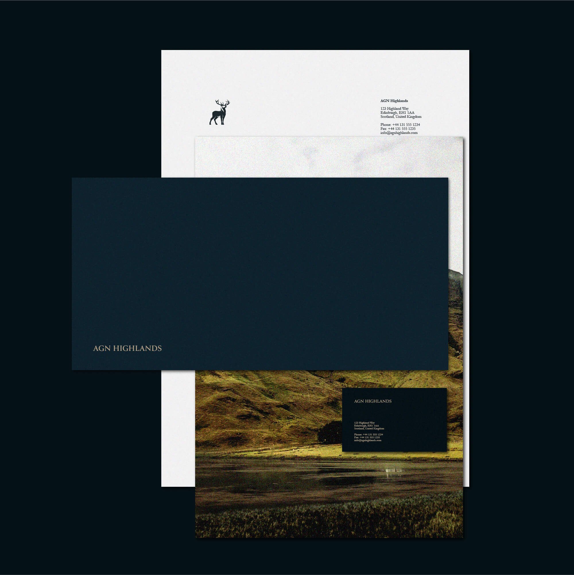
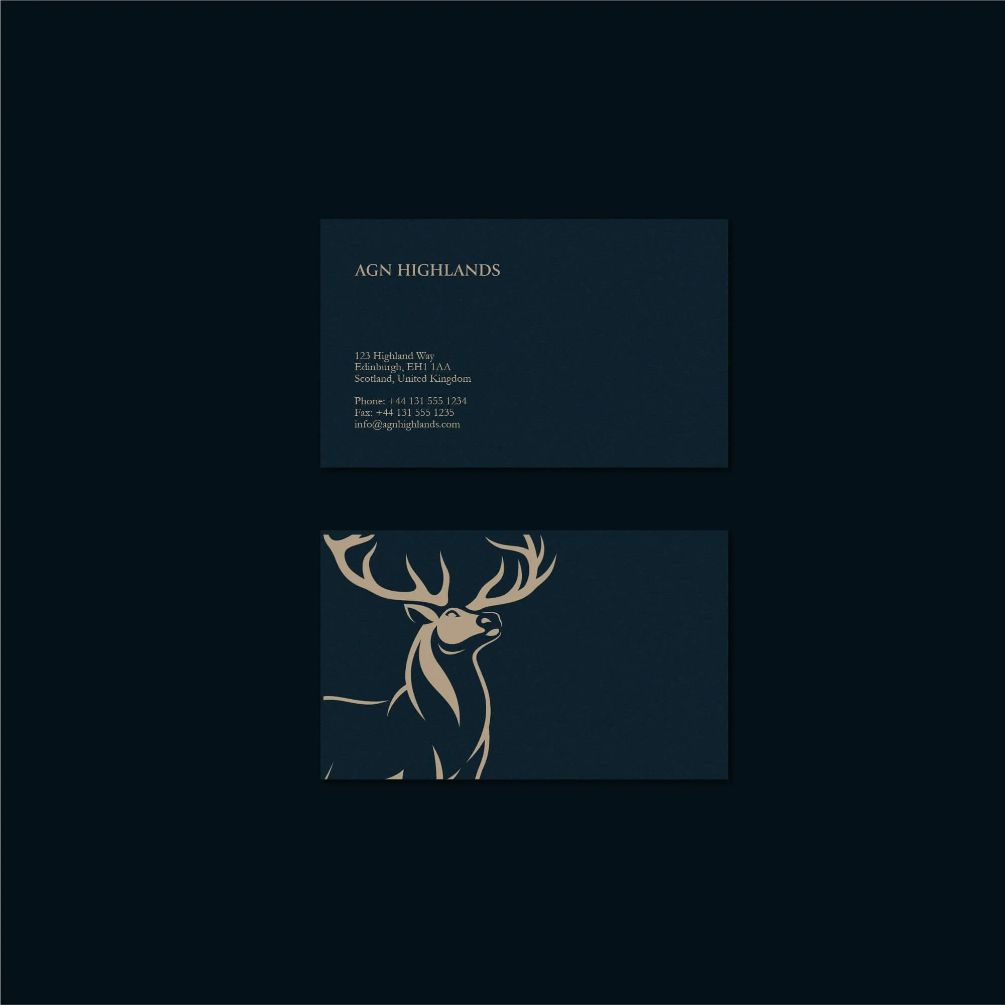
The final identity was applied across a range of practical business materials, including business cards, letterheads, envelopes and other client-facing stationery.
These applications demonstrate how the stag emblem, typography and wider visual system can remain consistent across different formats while maintaining a clear and professional appearance.
For financial services businesses in particular, these everyday applications matter because clients frequently encounter the brand through documents, correspondence and formal communications.
The completed system gives AGN Highlands a visual identity that remains recognisable whether it appears on a small business card, a formal document or a digital platform.
The Outcome
The completed identity gave AGN Highlands a stronger and more recognisable visual presence while maintaining the professionalism expected from an accountancy firm.
The stag emblem provides a distinctive connection to the firm's Highlands positioning, while the wider identity communicates stability, clarity and confidence.
The resulting visual system is flexible enough to work across formal financial documentation, stationery and digital applications without losing consistency.
Rather than relying on generic financial branding conventions, AGN Highlands now has an identity with its own recognisable character and a stronger foundation for long-term business communication.
Logo Design for Accountancy & Financial Services
For accountancy firms and financial services businesses, visual identity plays an important role in establishing confidence before a client relationship begins.
Customers are often trusting these businesses with sensitive financial decisions, which means the identity needs to communicate professionalism, stability and attention to detail from the first interaction.
At the same time, credibility does not require every accountancy brand to look identical.
A considered logo and visual identity can help a firm feel established while creating enough distinction to remain recognisable within a highly competitive professional services market.
My work with financial and professional service businesses focuses on balancing those requirements — creating identities that feel dependable and appropriate while still giving the organisation a distinctive visual presence.
Start an Accountancy or Professional Services Branding Project
If your accountancy firm, financial services business or professional organisation needs a new logo, a more refined identity or a complete brand refresh, use the project enquiry form below to tell me about your business, requirements, budget and timeframe.