
Furniture Maker Brand Identity
Barrell & Gunn required a distinctive visual identity that could reflect the craftsmanship and individuality of its handmade furniture. The Irish company creates bespoke statement pieces from reclaimed timber and reconditioned steel, combining traditional joinery with materials that already carry a history.
Project Overview
Barrell & Gunn creates handcrafted furniture and bespoke interior pieces from reclaimed timber and reconditioned gun-barrel steel. The identity needed to present the business as an individual furniture maker rather than a mass-market manufacturer, balancing the toughness and history of its materials with the precision, detail and considered finish of the completed work.
-
Furniture branding often relies on familiar symbols such as tree rings, tools and workshop equipment. Although these communicate the trade, they rarely express what makes an individual maker distinctive. For Barrell & Gunn, the character was already present in the name, materials and methods, so the challenge was to translate those qualities into a recognisable identity without using literal furniture imagery. The result also needed to feel refined enough for client correspondence while remaining at home alongside workshop photography, weathered timber and industrial surfaces.
-
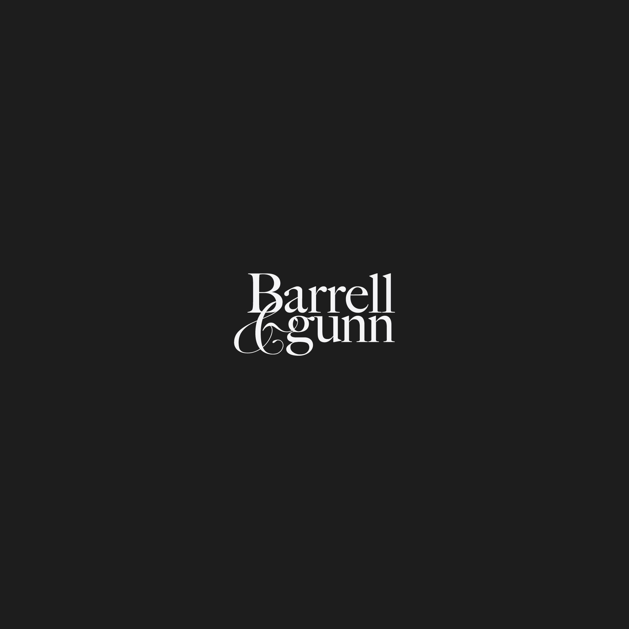
The logo is built around a tightly composed arrangement of the Barrell & Gunn name. Stacking the words creates a compact silhouette with the presence of a standalone emblem while retaining the personality and recognition of a wordmark. Serif letterforms introduce a sense of heritage and traditional craftsmanship, while their unconventional arrangement prevents the identity from feeling overly formal. Closely positioned and overlapping characters create a deliberately constructed composition, reflecting how separate materials are joined to produce a finished piece of furniture.
-
The ampersand acts as the central visual feature rather than simply connecting the two names. Its sweeping curves move through the stacked letterforms and unite the composition into one recognisable mark. The contrast between its fine curves and the stronger vertical characters reflects the balance found within the furniture itself: durable, industrial materials shaped with care and precision. By creating distinction through the typography, the identity remains concise without requiring an additional symbol.
-
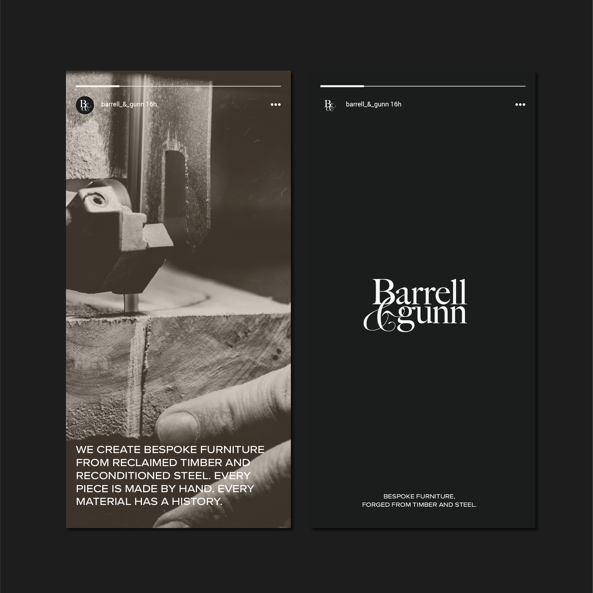
A predominantly black-and-white palette gives the identity a confident and understated appearance while allowing reclaimed timber, steel and workshop surfaces to introduce natural colour and texture. Monochrome photography extends the visual language by focusing on the making process, tools and material details behind each piece. Close crops, controlled lighting and direct statements about craftsmanship and material history create an atmospheric presentation grounded in authenticity rather than staged luxury.
-
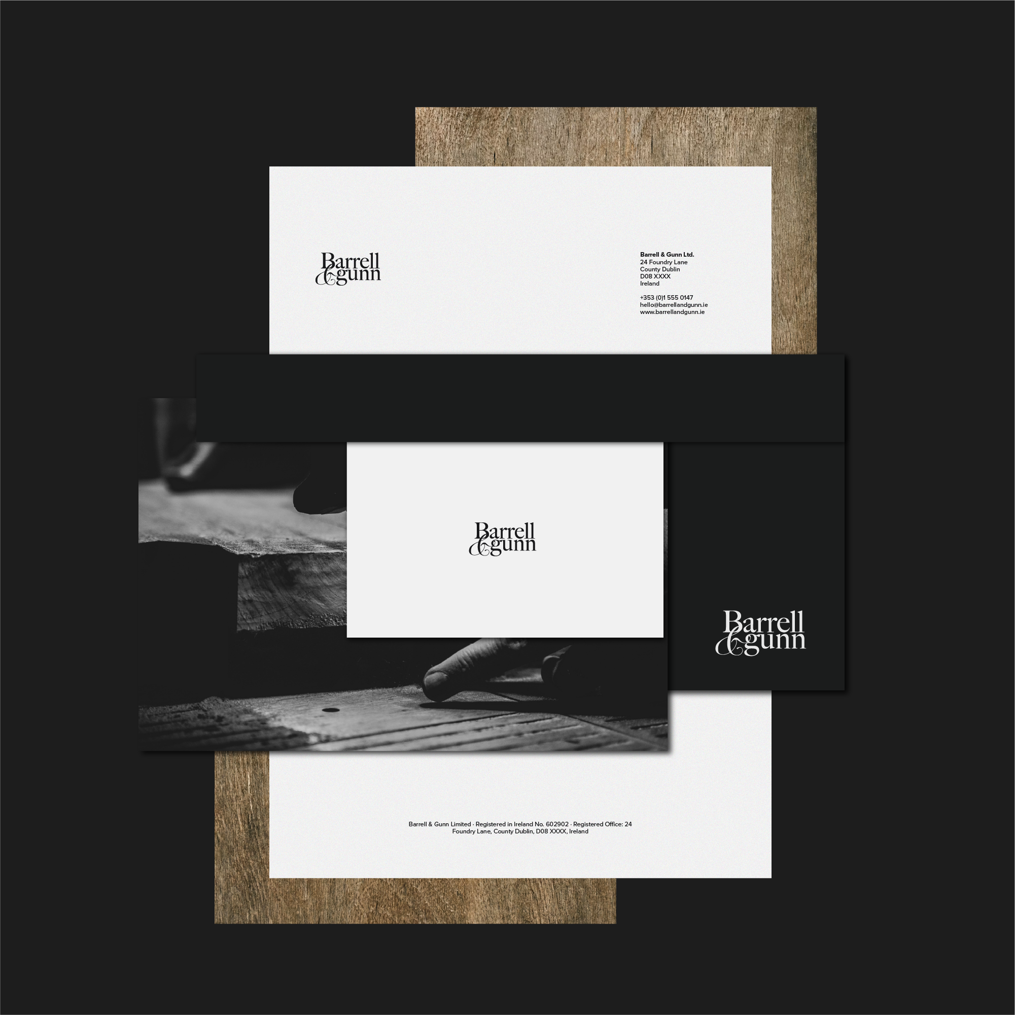
The identity was applied across stationery, presentation cards and social media concepts to demonstrate how it could move between professional and workshop-led settings. The compact wordmark creates a refined signature on correspondence, while dark backgrounds and timber textures provide a stronger, more expressive presentation for digital content. The completed system gives Barrell & Gunn an identity as individual as its furniture: polished enough for client-facing communication, but distinctive and unconventional enough to reflect a maker working with reclaimed timber and industrial steel.
Discover custom logos, visual identities and brand systems created for businesses across a wide range of industries and international markets.
Start a Bespoke Furniture Maker Project
If your furniture business needs a new logo, refined identity or complete brand refresh, use the enquiry form below to share your requirements, budget and timeframe.