
Dermatology Logo Design & Medical Brand Identity
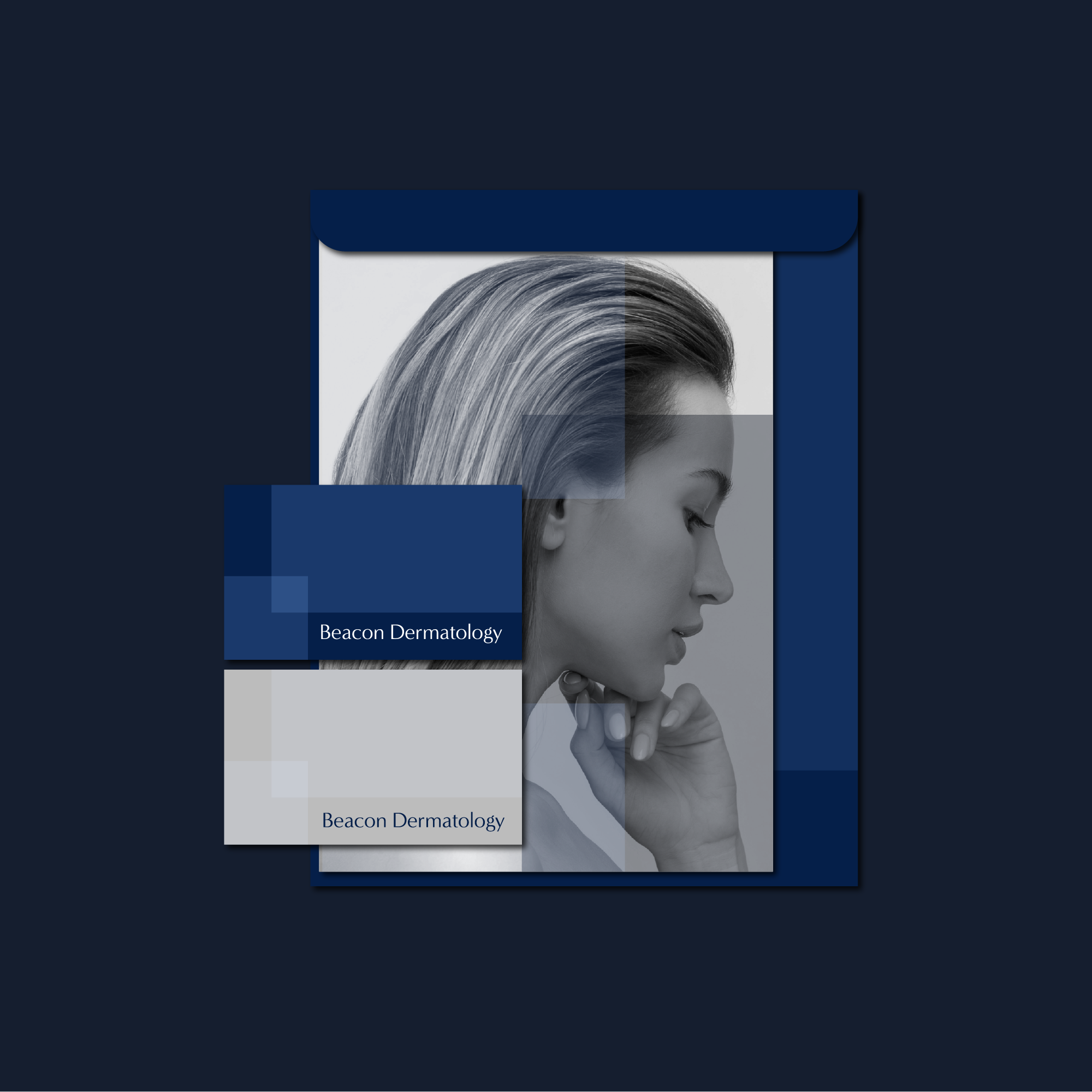
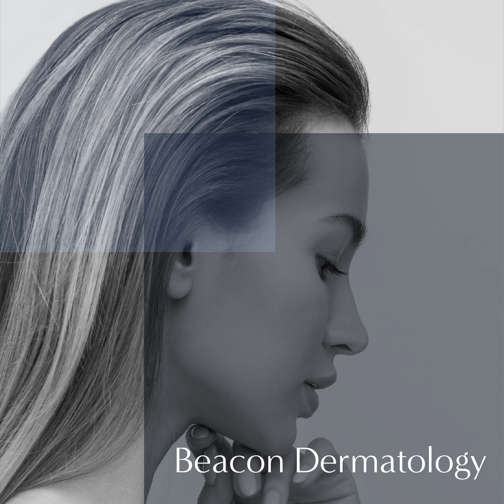
Beacon Dermatology needed a refined identity conveying care, precision and professionalism in US dermatology. A custom BD monogram with sleek, precise letterforms captures specialist skincare’s delicacy. The restrained design feels clinical yet warm, delivering an elegant, recognisable medical brand for print and digital.

Project Overview
Beacon Dermatology is a US-based dermatology practice requiring an identity that could feel contemporary, precise and appropriate for a specialist medical environment. The central objective was to create a distinctive visual signature from the clinic’s initials while maintaining the clarity and professionalism expected within healthcare branding.
-
Dermatology combines medical expertise with an understanding of the subtle details that affect a person’s skin and appearance. The identity therefore needed to communicate clinical capability without appearing severe, institutional or impersonal. Many healthcare logos rely on familiar crosses, shields and generic medical symbols, so the challenge was to establish a relevant identity through typography and form rather than predictable imagery. The design also needed to remain legible when reproduced across small digital formats and professional printed materials.
-
The final symbol combines the initials B and D within a single continuous monogram. Instead of presenting the two letters separately, their forms interact to create a compact and recognisable mark that belongs specifically to Beacon Dermatology. Fine strokes give the symbol a delicate quality, while the controlled geometry prevents it from feeling fragile. The relationship between the letterforms introduces visual interest without compromising recognition, allowing both initials to emerge naturally from the complete design.
-
A slender line weight was selected to reflect the precision associated with professional dermatological care. The clean curves and carefully balanced spacing suggest accuracy, attention to detail and a considered approach—qualities particularly relevant to a specialist working closely with the skin. Every part of the monogram was refined to maintain an even visual rhythm. This restraint gives the logo an elegant character while ensuring it still feels credible within a clinical setting.
-
The supporting typography was chosen to complement the light construction of the monogram without competing with it. Clear letterforms establish the practice name confidently, while measured spacing creates a composed and contemporary appearance. A deliberate hierarchy between “Beacon” and “Dermatology” allows the principal name to remain memorable while clearly identifying the medical field. Together, the wordmark and monogram create a cohesive professional logo design rather than two disconnected visual elements.
-
The completed identity gives Beacon Dermatology a distinctive visual presence built around precision rather than conventional medical symbolism. The custom BD monogram provides a memorable brand asset, while its fine construction introduces the delicacy and attention to detail associated with dermatological care. The result is a refined medical brand identity that feels professional, contemporary and suitable for a specialist US practice.
Discover custom logos, visual identities and brand systems created for businesses across a wide range of industries and international markets.
Start a Dermatology Branding Project
If your clinic business needs a new logo, refined identity or complete brand refresh, use the enquiry form below to share your requirements, budget and timeframe.