
Property Development Logo Design & Brand Identity
Helvesta required a refined visual identity that could communicate professionalism, long-term value and confidence within the Swiss property development market.
The business focuses on project development and portfolio management for residential and commercial properties, with an emphasis on creating and developing spaces with long-term potential.
The identity was developed around a distinctive crest, structured typography and a restrained visual system designed to feel established and premium without becoming overly corporate or generic.



Project Overview
Helvesta operates within the Swiss real-estate sector, developing and managing residential and commercial properties across the regions of Solothurn, Bern and Aargau. Its work includes the development of land, sites and existing properties, alongside the growth and management of its own portfolio.
The brief was to create a visual identity that reflected that long-term approach to property development.
The brand needed to feel credible enough for investors, partners and property stakeholders while maintaining enough distinction to avoid blending into the conservative visual language commonly seen across the sector.
The resulting direction combines a strong emblem with controlled typography and a flexible visual system suitable for digital, print and property-related applications.
The Challenge
Property development and real-estate investment brands often need to communicate several qualities at once: financial credibility, long-term thinking, stability and an understanding of the built environment.
The challenge was to express those qualities without relying on predictable real-estate imagery such as buildings, rooflines or generic architectural symbols.
Helvesta also needed an identity that could support different sides of the business, from project development and acquisitions to portfolio management and communication with investors and partners.
The visual system therefore had to feel established and authoritative while remaining flexible enough to work across websites, presentations, documents, property materials and future developments.
The Solution
The final identity was built around a distinctive crest supported by a refined wordmark and disciplined visual system.
The crest gives Helvesta a recognisable central brand asset while reinforcing ideas of stability, heritage and permanence.
Typography and layout were kept structured and understated, helping the identity communicate professionalism without appearing overly institutional.
The visual direction was then extended across a range of applications to demonstrate how the brand could maintain the same sense of confidence and consistency in both digital and printed environments.
The final system included:
Primary logo
Custom crest
Wordmark
Secondary logo configurations
Colour palette
Typography direction
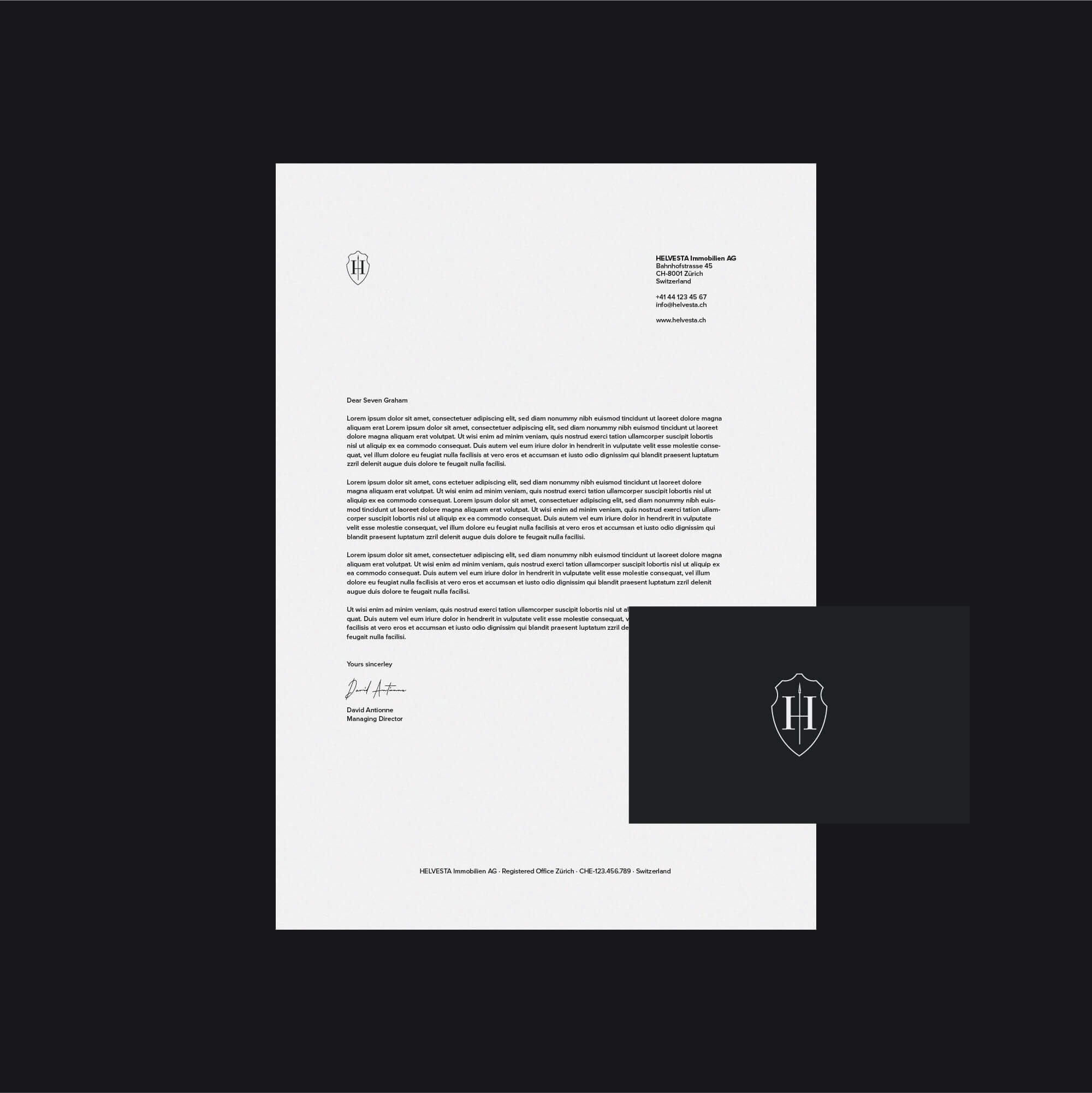
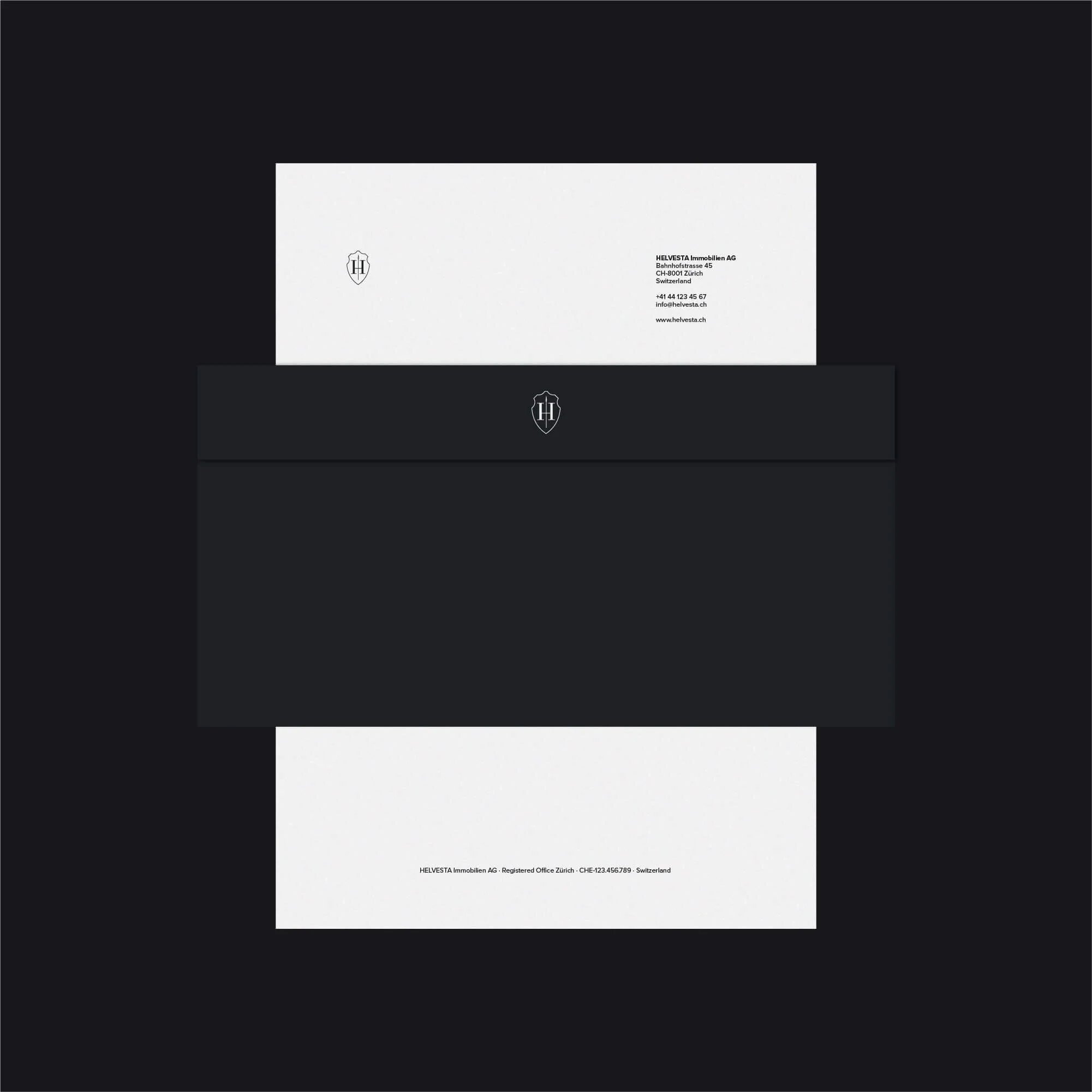
Stationery design
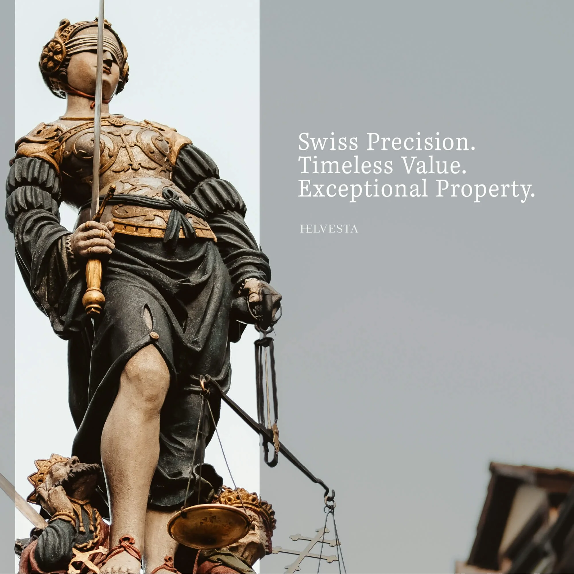
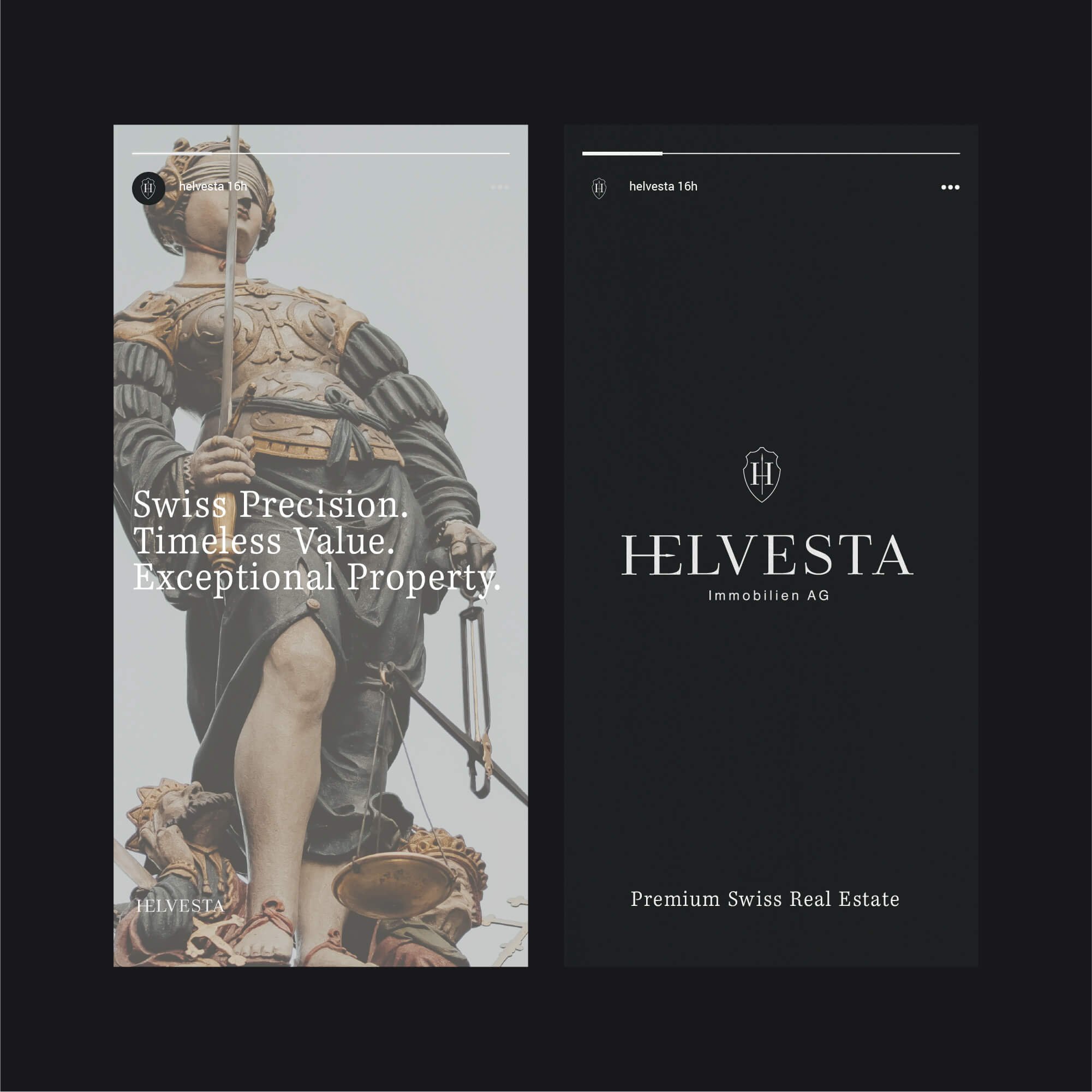
Social media applications
Digital brand layouts
Property Development Logo Design Approach
The logo was developed to feel established and long-lasting rather than trend-led.
The crest provides a strong visual anchor for the identity, giving the business a distinctive symbol that can work independently from the full wordmark when required.
Careful attention was given to proportion, spacing and typography so the identity retains a sense of precision and control across different applications.
The design avoids literal property imagery, allowing the brand to communicate a broader sense of value, confidence and permanence.
This reflects the same approach I use across my professional logo design services, where recognisability, proportion and long-term practical use are considered from the beginning.
Brand Identity Development
The wider visual identity was designed to reinforce the same qualities established by the logo.
Typography, colour and layout were kept restrained so the crest and wordmark remained the primary points of recognition.
For a property development business, consistency is especially important because the brand may appear across investor presentations, property documents, digital platforms, signage and development marketing.
The identity therefore needed enough flexibility to work across those environments while maintaining a coherent and premium appearance.
This broader approach to brand identity design allows the logo to function as part of a complete visual system rather than as an isolated graphic.
Brand Applications
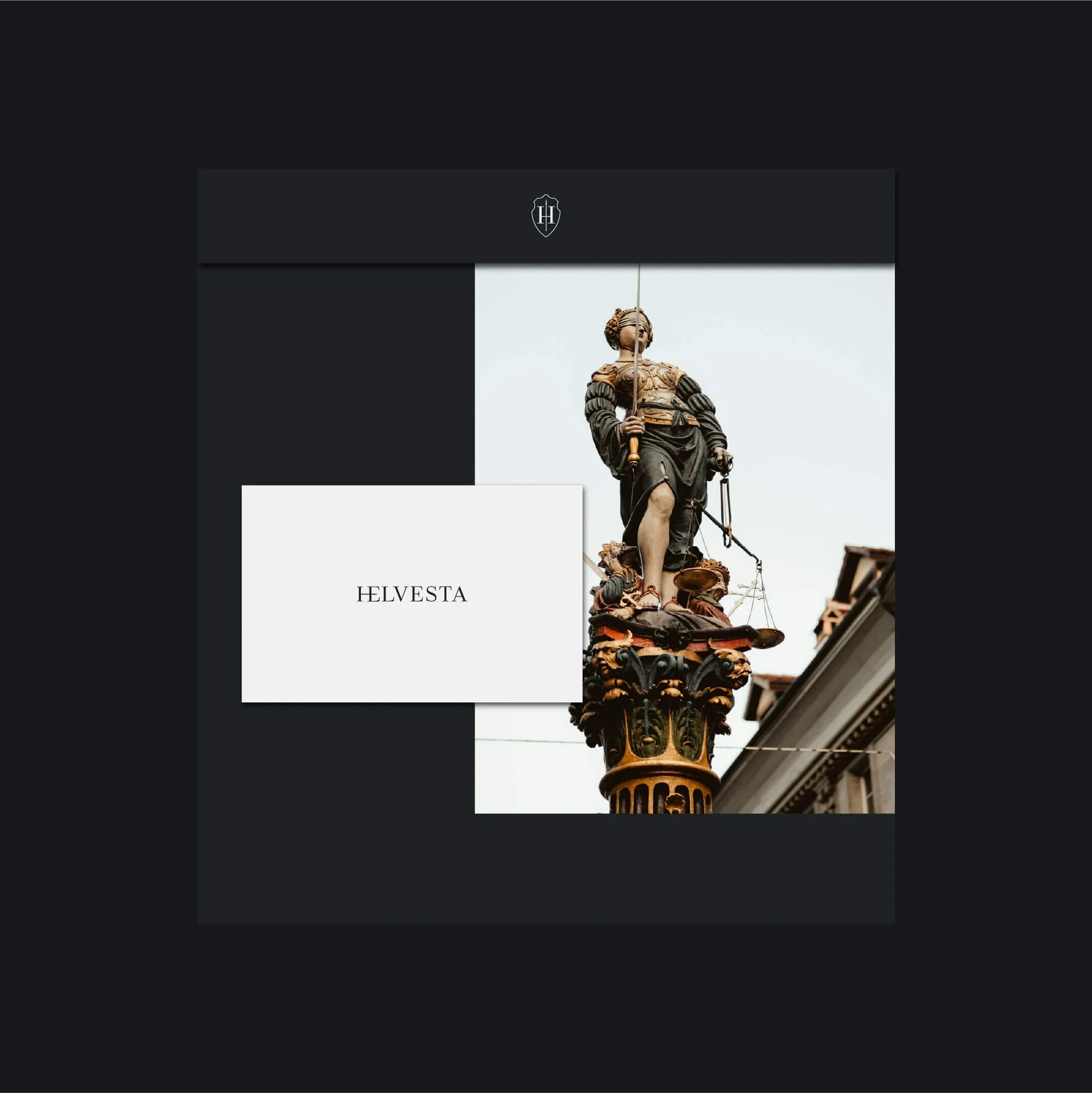
The Helvesta identity was applied across a range of digital and printed materials, including stationery and social media compositions.
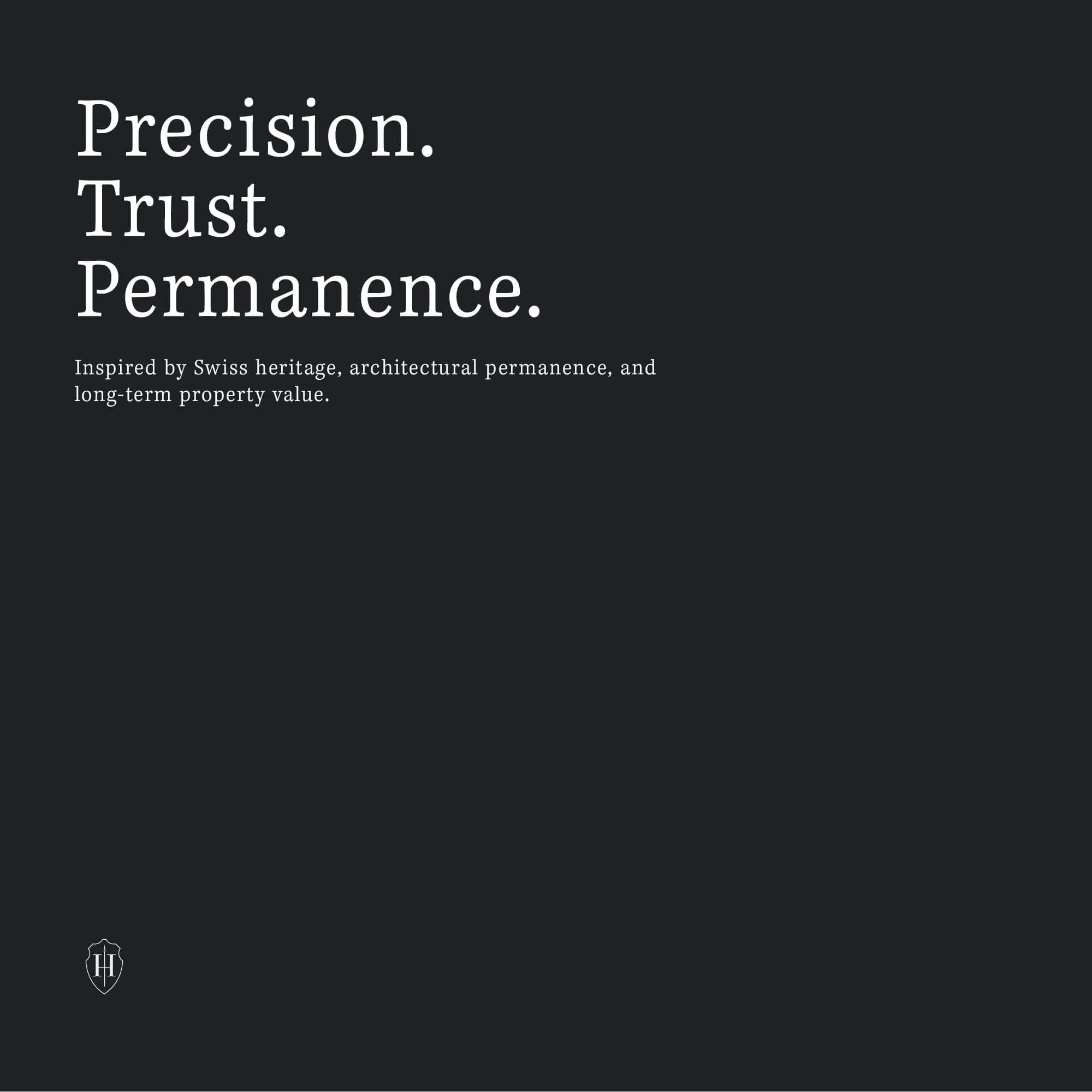
These applications demonstrate how the crest, typography and layout system can adapt to different formats while maintaining a consistent and recognisable brand presence.
The restrained visual language gives the identity enough flexibility for both corporate communication and property-focused marketing without losing the same sense of structure and credibility.
The Outcome
The final identity gives Helvesta a more distinctive and established visual presence within the Swiss property development sector.
The crest creates a recognisable central brand asset, while the supporting typography and visual system communicate stability, professionalism and long-term value.
The resulting identity feels premium without becoming overly decorative and structured without appearing generic.
It provides Helvesta with a flexible visual foundation capable of supporting project development, portfolio management and wider property communication as the business continues to grow.
Logo Design for Property Developers & Real Estate Businesses
Property developers and real-estate businesses operate in markets where trust, financial credibility and long-term thinking are especially important.
A strong visual identity can help communicate those qualities while giving the business enough distinction to stand apart from competing developers, investment companies and property groups.
The strongest property identities do not always need to rely on literal architectural symbols. Typography, proportion, colour and a distinctive brand mark can communicate stability and sophistication in a more ownable way.
My work with property businesses focuses on creating identities that feel credible, established and flexible enough to work across investor communication, property marketing, digital platforms and physical applications.
Start a Property Branding Project
If your property development, real-estate or investment business needs a new logo, refined identity or wider visual system, use the project enquiry form below to tell me about your business, requirements, budget and timeframe.