
Real Estate Logo Design & Realtor Brand Identity
Homes by Heffner required a professional real estate identity that could communicate trust, confidence and personal service while still feeling distinctive within a highly competitive residential property market.
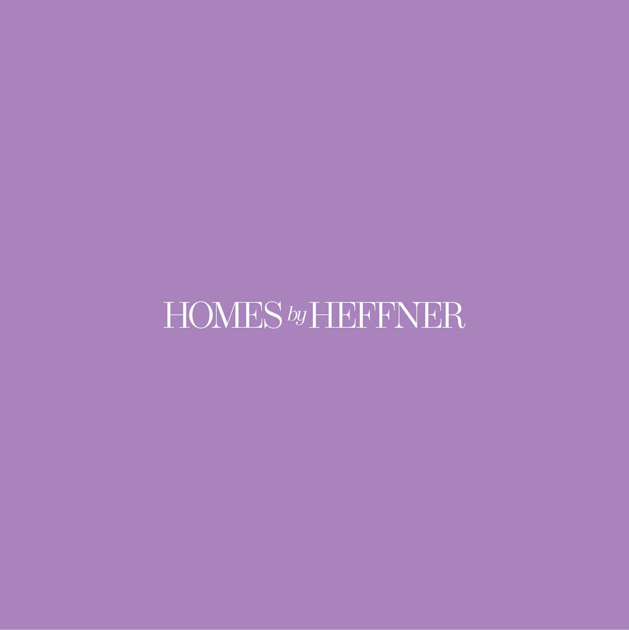
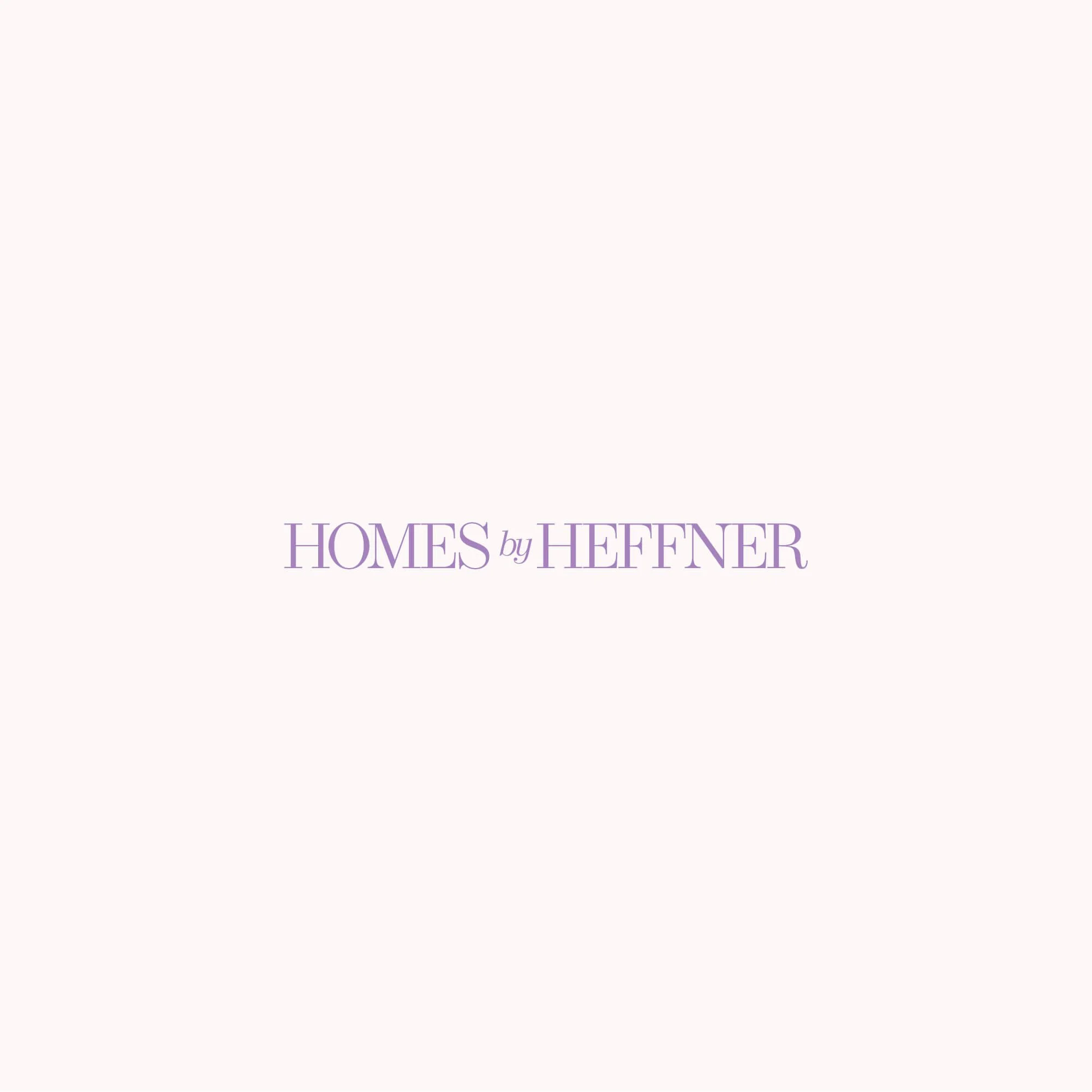
The brand was developed around a refined wordmark, custom monogram and distinctive violet colour palette, creating a visual identity that feels polished and professional without becoming overly corporate.
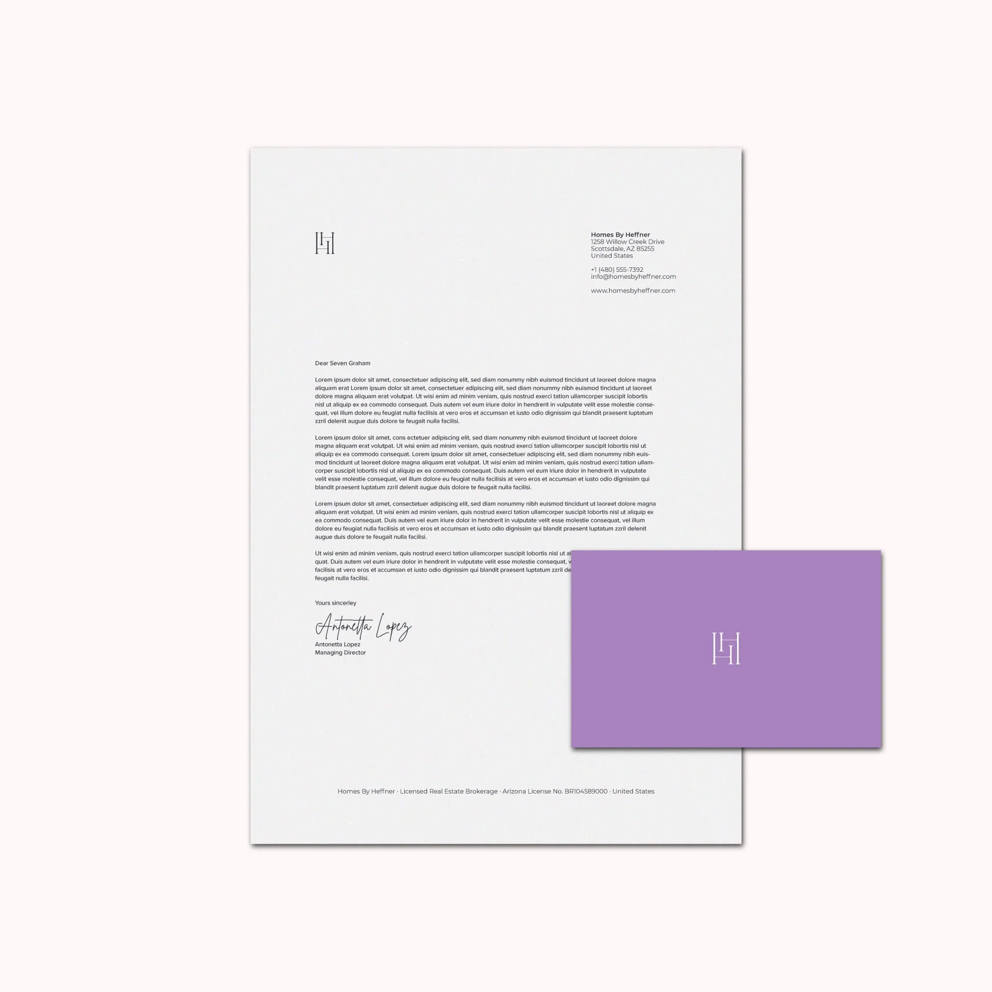
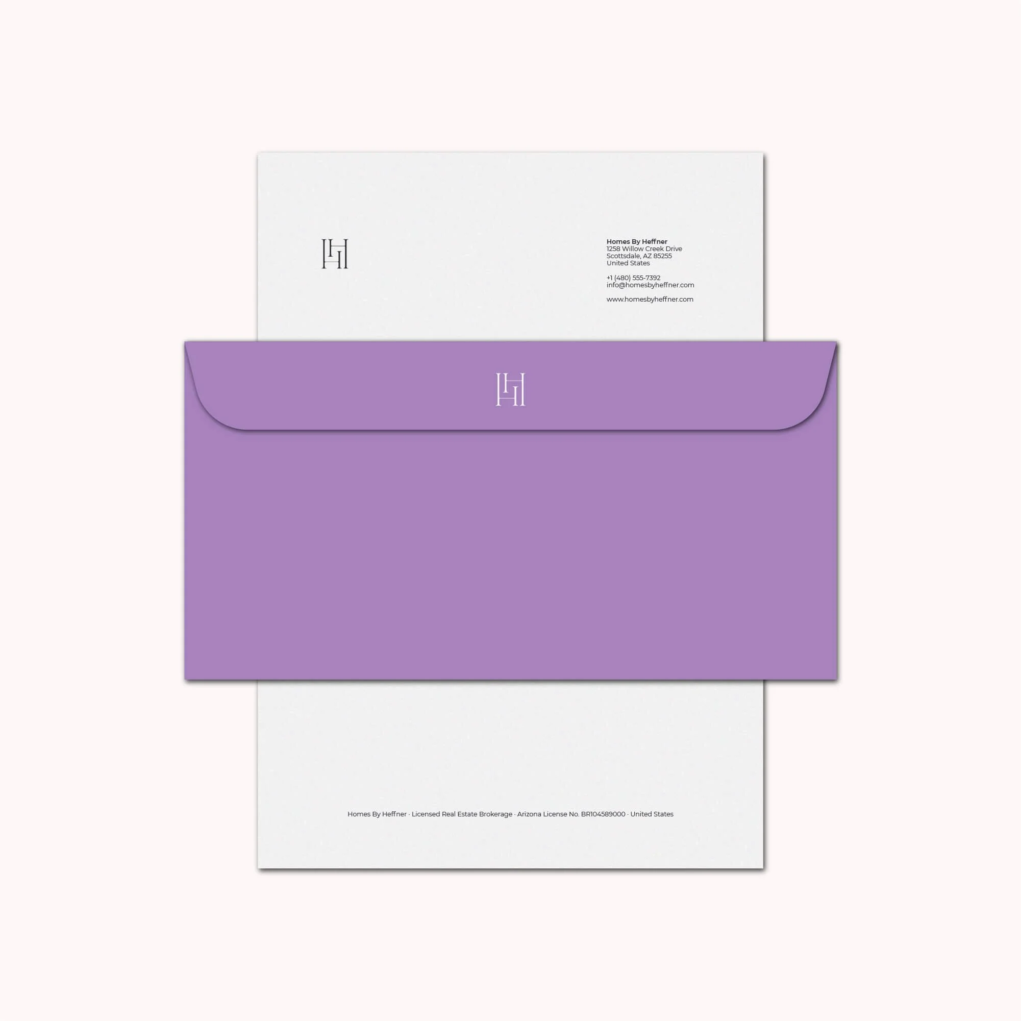
The wider system was applied across stationery, business cards, social media graphics and supporting brand elements, giving the business a consistent visual presence across both digital and printed client touchpoints.






Project Overview
Homes by Heffner is the real estate business of Erica Heffner, a St. Louis area Realtor working with clients buying, selling, building and investing in property.
Her approach places particular emphasis on understanding each client personally, providing guidance throughout the process and building relationships that continue beyond the transaction.
The identity therefore needed to communicate professional expertise while still feeling approachable and personal.
Rather than creating the kind of cold or overly corporate branding often associated with real estate, the direction focused on a more refined visual language that could balance trust, personality and premium presentation.
The Challenge
Residential real estate is a particularly crowded market from a branding perspective.
Many Realtor identities use almost identical visual conventions, including house silhouettes, rooftops, keys, initials and predictable corporate colour schemes.
The challenge for Homes by Heffner was to create a recognisable identity that still felt appropriate for the property sector without becoming another generic real estate logo.
The visual identity also needed to reflect the personal nature of Erica's service. Clients are making significant financial and emotional decisions when buying or selling a home, so the brand needed to communicate professionalism and confidence without losing warmth.
Finally, the identity had to remain consistent across multiple applications, including printed stationery, business cards and social media content.
The Solution
The final identity was built around a clean wordmark supported by a custom monogram and a distinctive visual system.
The monogram provides a compact brand asset that can be used independently from the primary wordmark, giving the identity greater flexibility across smaller digital and printed applications.
A violet-led colour palette gives Homes by Heffner a more memorable presence within a sector dominated by conservative blues, blacks and neutral tones.
Refined typography and controlled layouts reinforce the premium positioning while maintaining an approachable overall character.
The final identity included:
Primary wordmark
Custom monogram
Secondary logo configurations
Colour palette
Typography direction
Surface pattern
Business card design
Stationery design
Social media graphics
Instagram story layouts
Real Estate Logo Design Approach
The logo was designed to feel refined and recognisable without relying on literal property imagery.
Rather than using houses, rooflines or keys, the visual direction places greater emphasis on typography and the custom monogram.
This gives the identity a more ownable character while allowing it to remain appropriate for a professional real estate business.
Spacing, proportion and typography were carefully controlled so the wordmark feels established and polished without becoming overly formal.
The monogram provides a secondary point of recognition that works particularly well across social profiles, stationery and smaller applications where the full wordmark may not be practical.
This reflects the same approach I use across my professional logo design services, where recognisability, flexibility and long-term use are considered from the beginning.
Brand Identity Development
The wider visual identity was designed to reinforce the combination of professionalism and personal service at the centre of Homes by Heffner.
The violet colour creates a distinctive visual anchor, while softer supporting tones and refined typography prevent the identity from feeling too aggressive or corporate.
A repeating monogram pattern was also developed to extend the identity beyond the logo itself and provide another recognisable brand element for printed and digital applications.
Together, the logo, typography, colour and supporting graphics create a more complete visual language rather than relying on a single mark.
This broader approach to brand identity design helps Homes by Heffner maintain a consistent presence across every client-facing touchpoint.
Stationery & Business Card Design
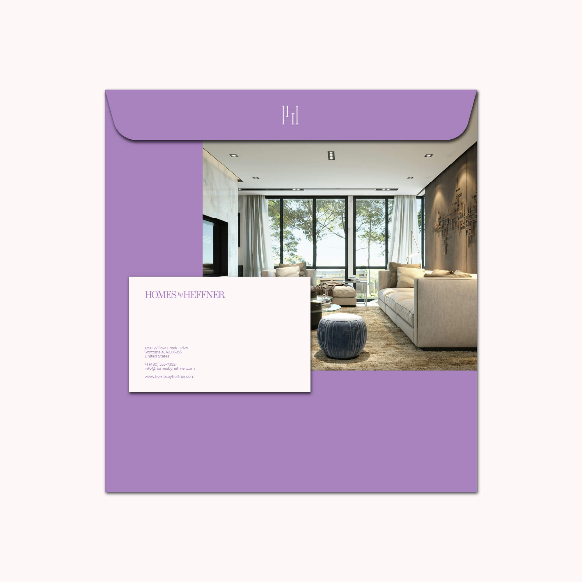
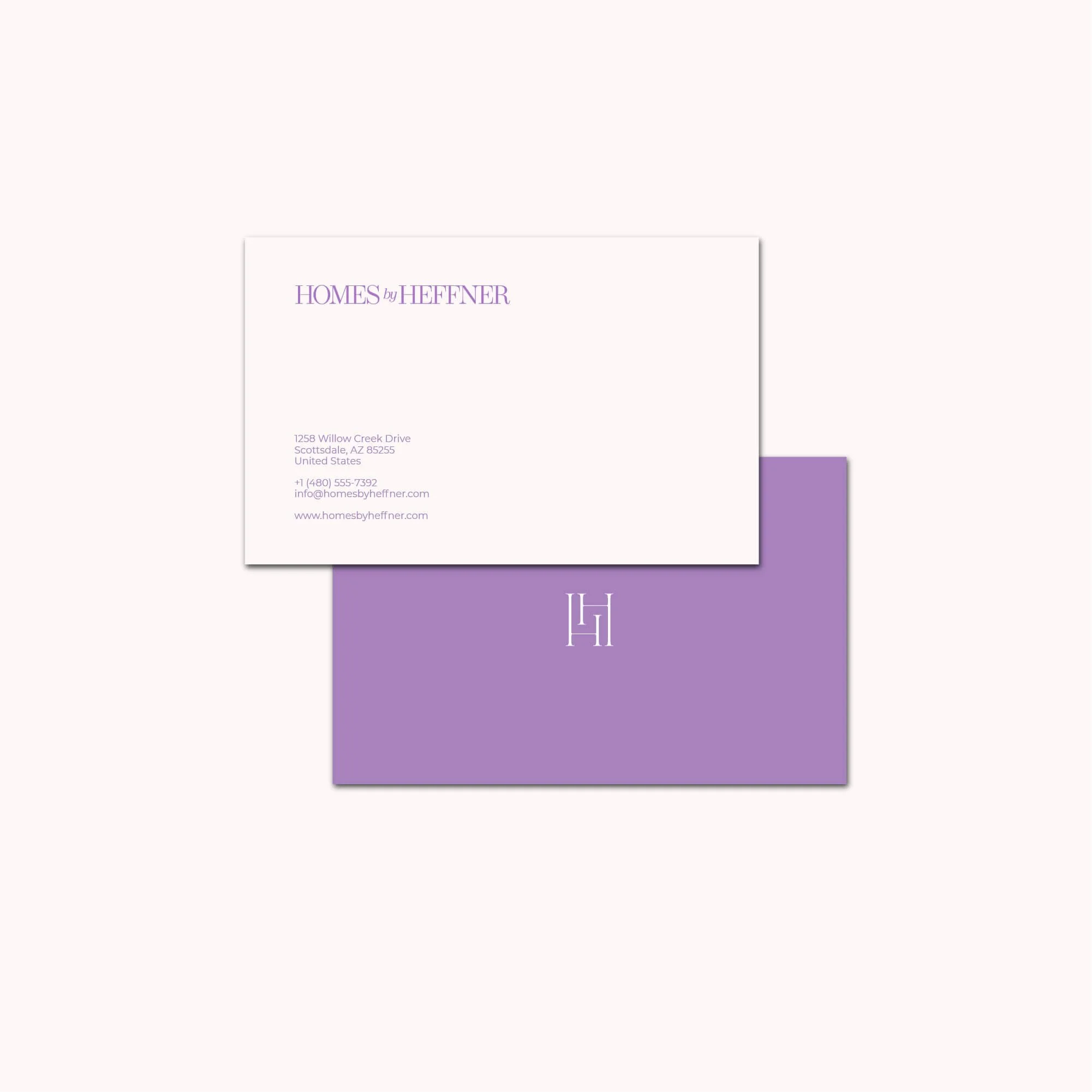
The brand identity was applied across business cards and stationery to create a professional presentation for direct client communication.
These materials use the same typography, colour palette and visual hierarchy established by the core identity, ensuring that physical applications feel connected to the wider brand.
For a Realtor, these relatively simple touchpoints can play an important role in reinforcing credibility during consultations, property viewings and ongoing client relationships.
Social Media Design
Social media is an important part of modern real estate marketing, so the identity was also extended into Instagram posts and story layouts.
The templates use the established colour palette, typography and visual language to create a more recognisable presence across property and lifestyle content.
Consistency across social channels helps the business feel more established while allowing individual posts to remain flexible enough for listings, advice, announcements and client-focused communication.
The Outcome
The final identity gives Homes by Heffner a more distinctive and cohesive presence within the residential real estate market.
The wordmark communicates professionalism, while the custom monogram and violet colour palette provide stronger recognition and personality.
Together, the stationery, social media graphics and supporting brand assets create a consistent system that can work across both traditional and digital client touchpoints.
The result is a real estate identity that feels polished and credible while retaining the warmth and accessibility required for a highly personal service business.
Logo Design for Realtors & Real Estate Professionals
For Realtors and residential property professionals, visual identity has an important role in building trust before a client relationship begins.
Buying or selling a home is a significant decision, so clients need to feel that the person representing them is credible, organised and professional.
At the same time, individual Realtors often compete against numerous other agents offering very similar services. A distinctive visual identity can help create stronger recognition and make the business feel more established.
The strongest Realtor brands balance professionalism with personality rather than simply reproducing familiar property symbols.
My work with real estate professionals focuses on creating identities that feel credible, recognisable and flexible enough to work across property marketing, social media, stationery and wider client communication.
Start a Real Estate Branding Project
If you're a Realtor, estate agent or property professional looking for a new logo, refined visual identity or broader brand system, use the project enquiry form below to tell me about your business, requirements, budget and timeframe.