
Law Firm Logo Design & Legal Brand Identity
Wendy A. Owens PC required a refined visual identity that could communicate professionalism, trust and authority while still feeling distinctive within the legal sector.
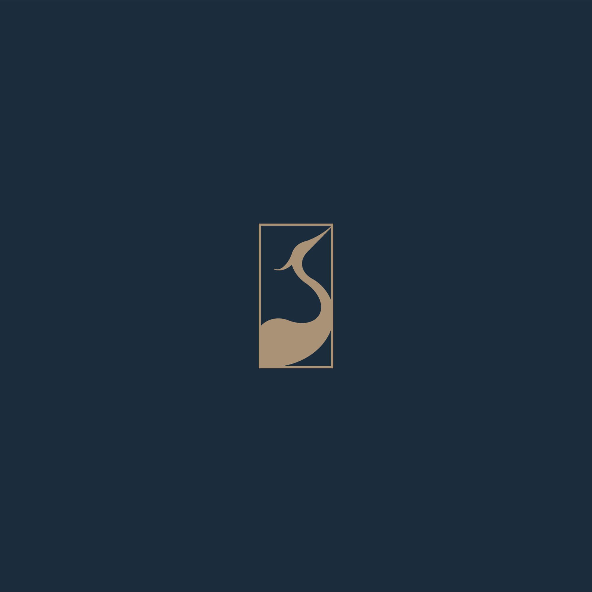
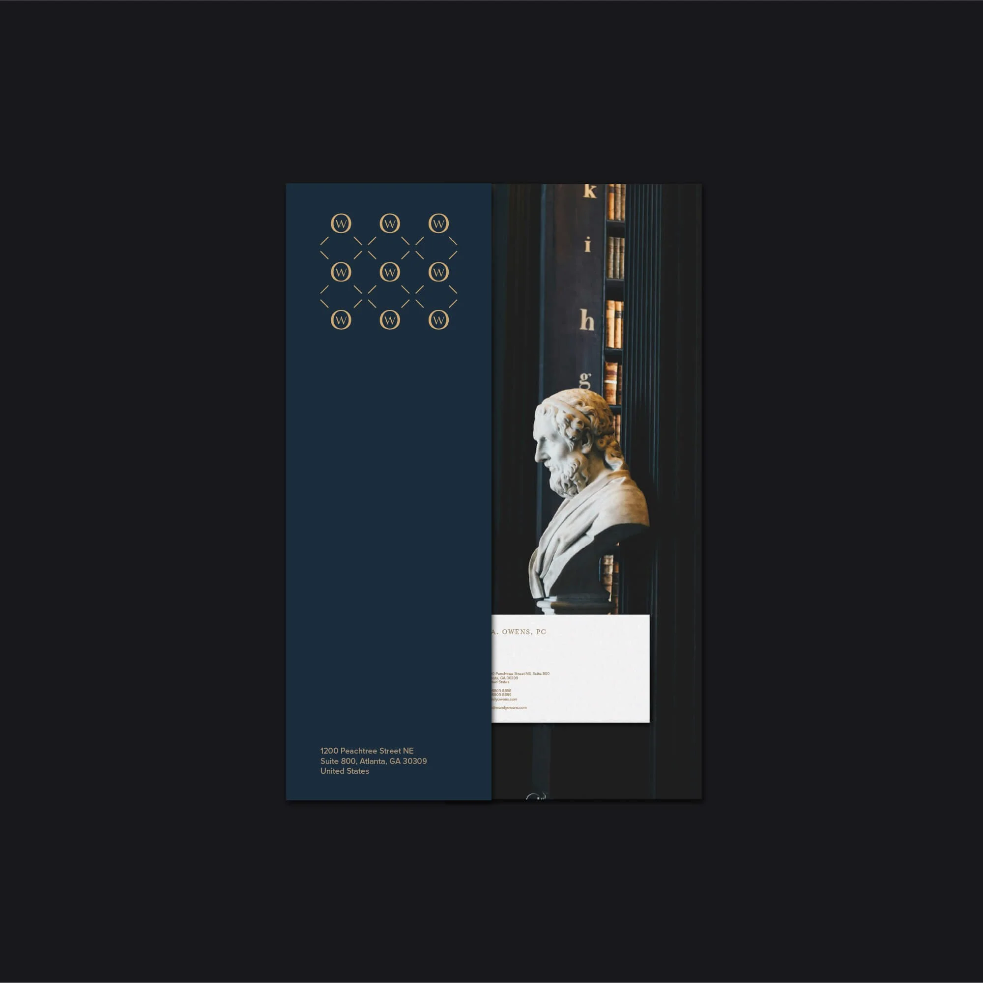
The identity was developed around a structured wordmark, custom WO monogram and distinctive heron symbol, creating a visual system that feels established, contemporary and appropriate for a professional law practice.
The result is a clear and flexible identity designed to work consistently across stationery, legal documents, digital communication and wider client-facing applications.



Project Overview
Wendy A. Owens PC required a professional legal identity that could communicate trust, authority and experience while still feeling distinctive within a traditionally conservative sector.
The brief was to create a visual system that felt established and credible without relying on the predictable visual language often associated with law firms.
The resulting direction combines a refined wordmark, custom WO monogram and distinctive heron symbol, creating an identity with both professional restraint and recognisable character.
The Challenge
Law firm branding needs to establish confidence quickly.
Clients are often approaching legal professionals during important or high-pressure situations, which means the visual identity needs to feel dependable, clear and professionally established from the outset.
At the same time, many legal brands rely on similar conventions, including conservative serif typography, scales of justice, shields, columns or generic monograms.
The challenge was to create an identity that retained the authority expected from a legal practice while introducing enough individuality to feel memorable and contemporary.
The logo also needed to remain practical across stationery, legal documents, digital communication and other client-facing applications.
The Solution
The final identity was developed around a structured wordmark supported by a custom WO monogram and heron symbol.
The wordmark provides a formal and professional primary identity, while the monogram creates a compact brand asset for smaller applications.
The heron adds a more distinctive visual element without compromising the seriousness of the brand.
Typography, spacing and visual hierarchy were kept restrained and precise, helping the identity communicate professionalism, confidence and control.
The final brand system included:
Primary law firm logo
Custom WO monogram
Heron brand symbol
Secondary logo configurations
Typography direction
Colour system
Stationery applications
Digital brand assets
Client-facing materials
Law Firm Logo Design Approach
The logo was designed around the idea that authority does not need to feel heavy or outdated.
Clean typography, controlled spacing and a restrained visual structure give the identity a professional and established character while keeping the overall appearance contemporary.
The custom WO monogram provides a flexible secondary mark, while the heron introduces a more recognisable and distinctive element into the wider identity.
The aim was to create a law firm logo that could feel timeless and credible while still possessing enough individual character to stand apart from more generic legal branding.
This reflects the same principles I use across my professional logo design services, where clarity, recognisability and long-term use are considered throughout the design process.
Brand Identity Development
The wider identity was designed to reinforce the professionalism established by the logo.
Typography, colour and layout were deliberately controlled so the brand could work confidently across formal legal applications without becoming visually distracting.
The monogram and heron symbol provide additional flexibility, allowing the identity to adapt to different formats while maintaining a recognisable connection to the primary logo.
This broader approach to brand identity design helps ensure the practice is represented consistently across stationery, documents, digital platforms and wider client communication.
Brand Applications
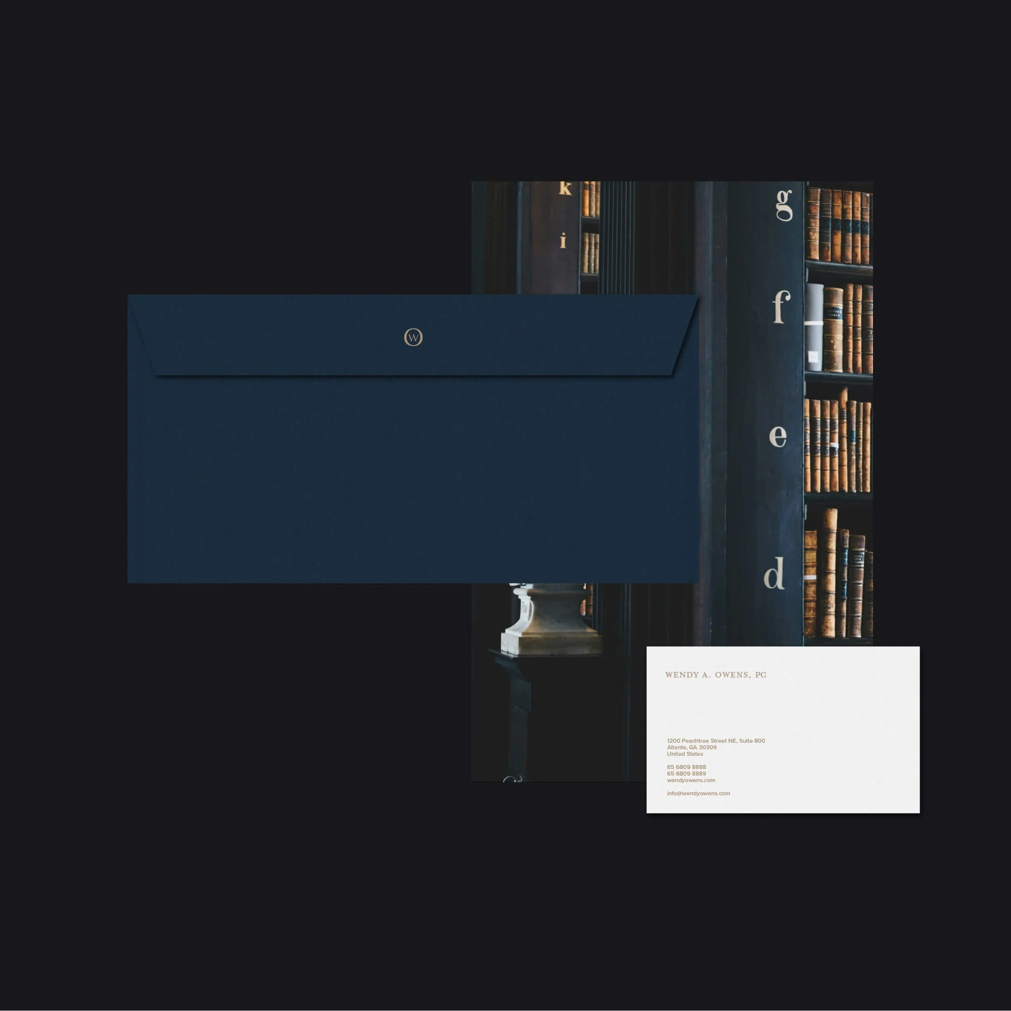
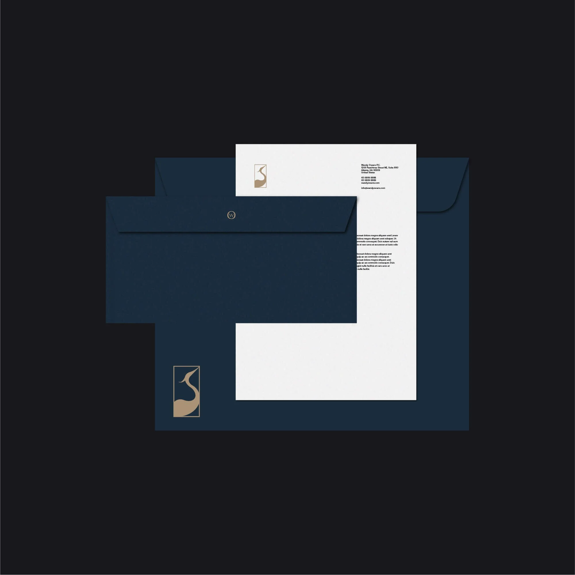
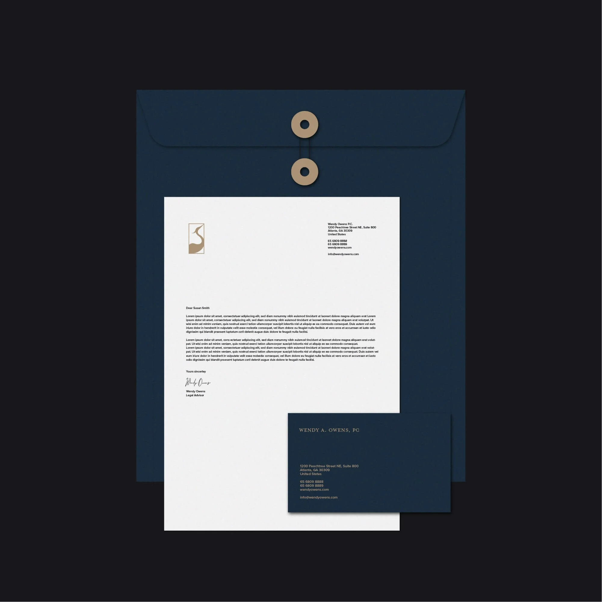
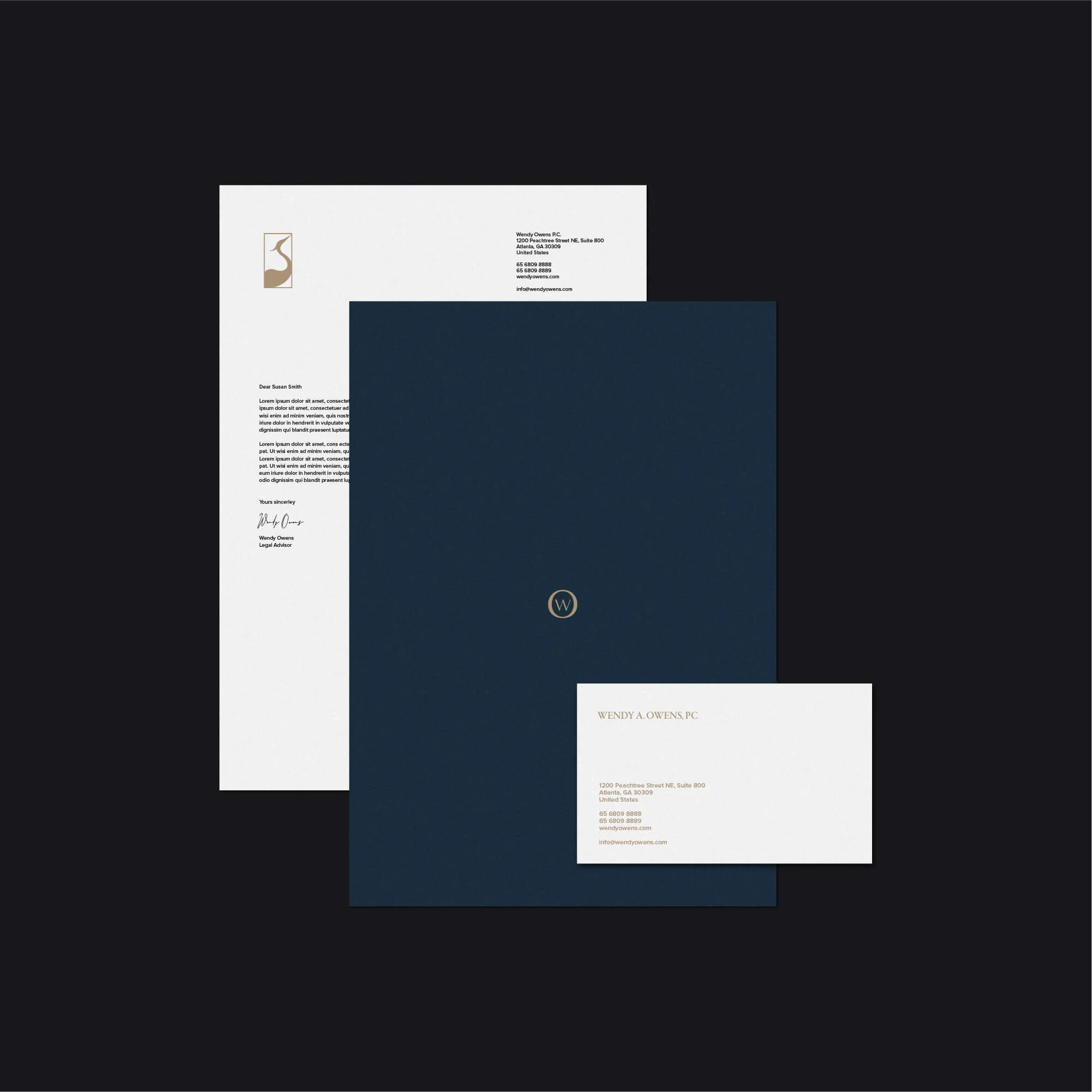
The identity was applied across a range of physical and digital materials to demonstrate how the system could work consistently in real-world use.
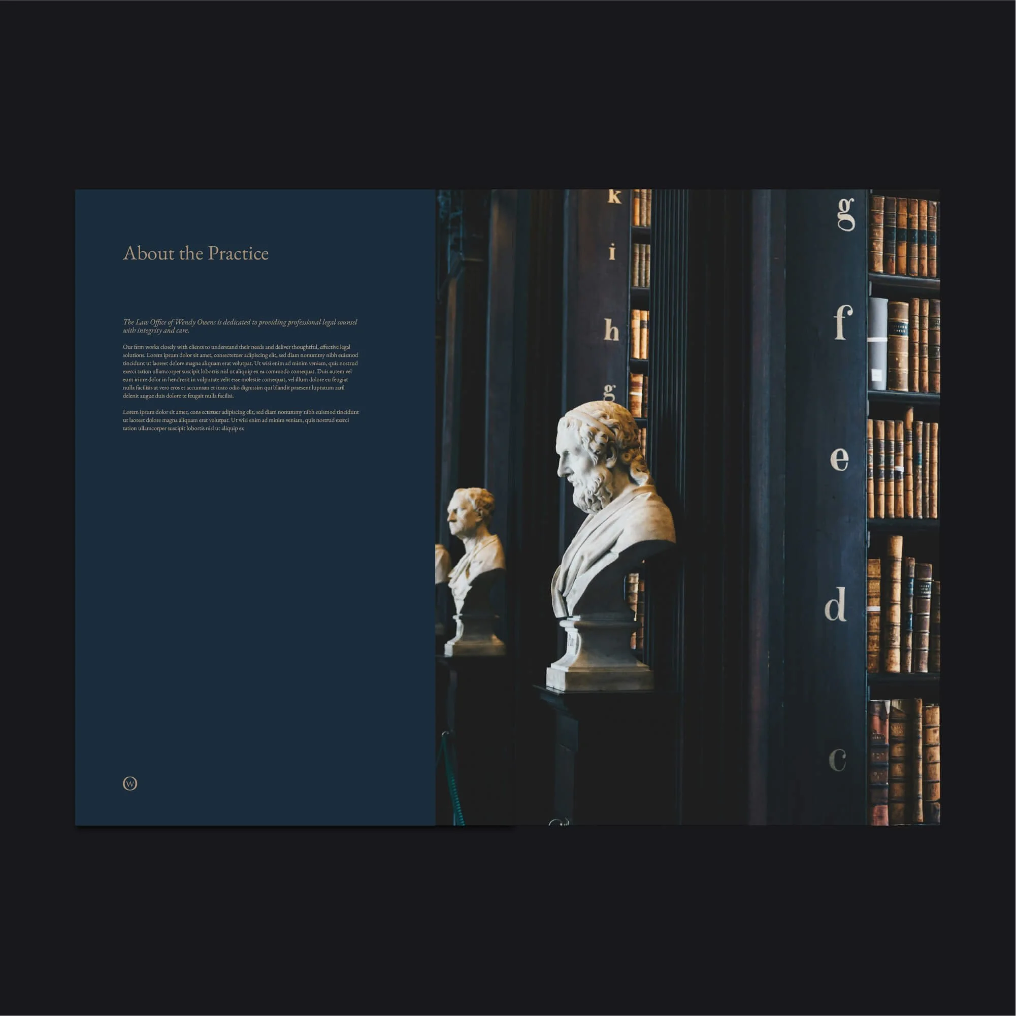
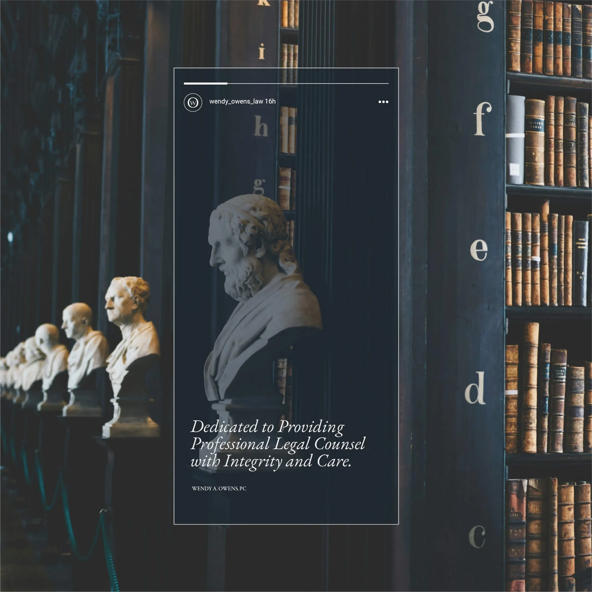
These applications included stationery, legal documents, editorial layouts and digital brand assets.
Each format uses the same typography, colour system and visual hierarchy to maintain a cohesive and professional appearance.
For a legal practice, this consistency is especially important because clients frequently interact with the brand through formal correspondence and documentation.
The Outcome
The completed identity gives Wendy A. Owens PC a more distinctive and cohesive visual presence while maintaining the credibility expected from a professional law practice.
The structured wordmark establishes authority, the WO monogram adds flexibility and the heron symbol gives the brand a more individual and recognisable character.
The result is a legal identity that feels refined and contemporary without abandoning the restraint and professionalism appropriate to the sector.
The wider system also provides a practical foundation for consistent use across print, digital communication and future client-facing materials.
Logo Design for Law Firms & Legal Professionals
For law firms and legal professionals, visual identity plays an important role in establishing credibility before a client ever begins a consultation.
A strong legal identity needs to communicate trust, authority and professionalism while still giving the practice enough distinction to remain recognisable within a competitive market.
That does not require relying on obvious legal symbols or overly traditional visual conventions.
Typography, proportion, colour and a carefully developed brand mark can create a much more ownable identity while still feeling entirely appropriate for professional legal services.
My work with law firms and professional service businesses focuses on creating identities that feel established, clear and distinctive while remaining practical across formal documents, websites, stationery and wider business communication.
Start a Law Firm Branding Project
If your law firm or legal practice needs a new logo, refined identity or complete brand refresh, use the enquiry form below to share your requirements, budget and timeframe.