
Luxury Candle Packaging Design & Fragrance Branding
Skyline London required a distinctive brand identity and packaging system that could position its scented candles as premium lifestyle products. The design combines a minimalist wordmark with intricate geometric illustrations and a refined black-and-gold colour palette.
Project Overview
Skyline is a London candle brand offering fragranced soy-wax candles in frosted glass vessels. The project involved creating a distinctive visual identity and packaging system inspired by the architecture, energy and illuminated character of the city.
-
Candle packaging must communicate the brand, fragrance and essential product information within a relatively limited space while still feeling like a desirable object. Skyline needed a system that could organise this information clearly without losing the visual impact expected from premium fragrance packaging. The design also had to create a meaningful connection with the Skyline name and remain effective when printed, folded and assembled.
-
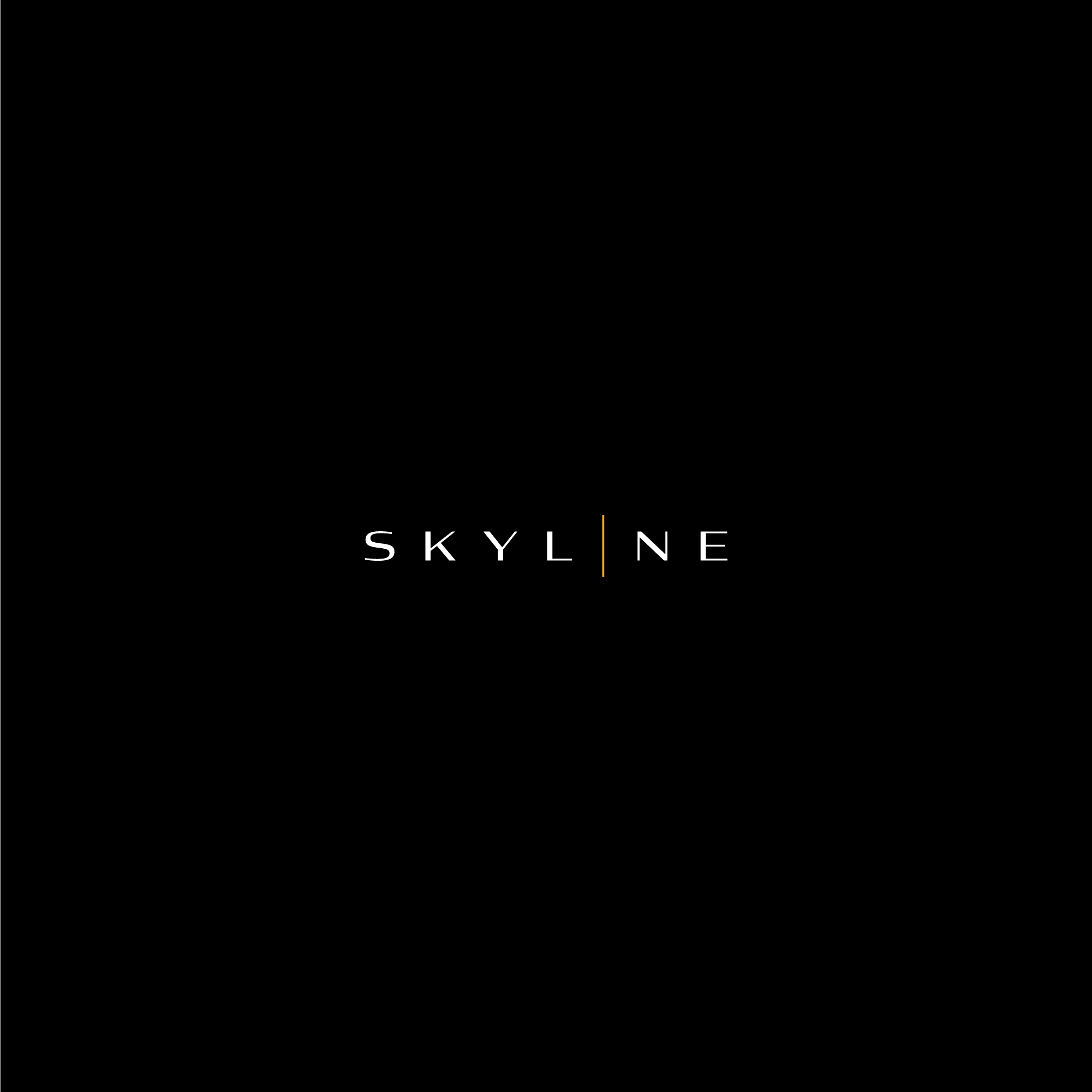
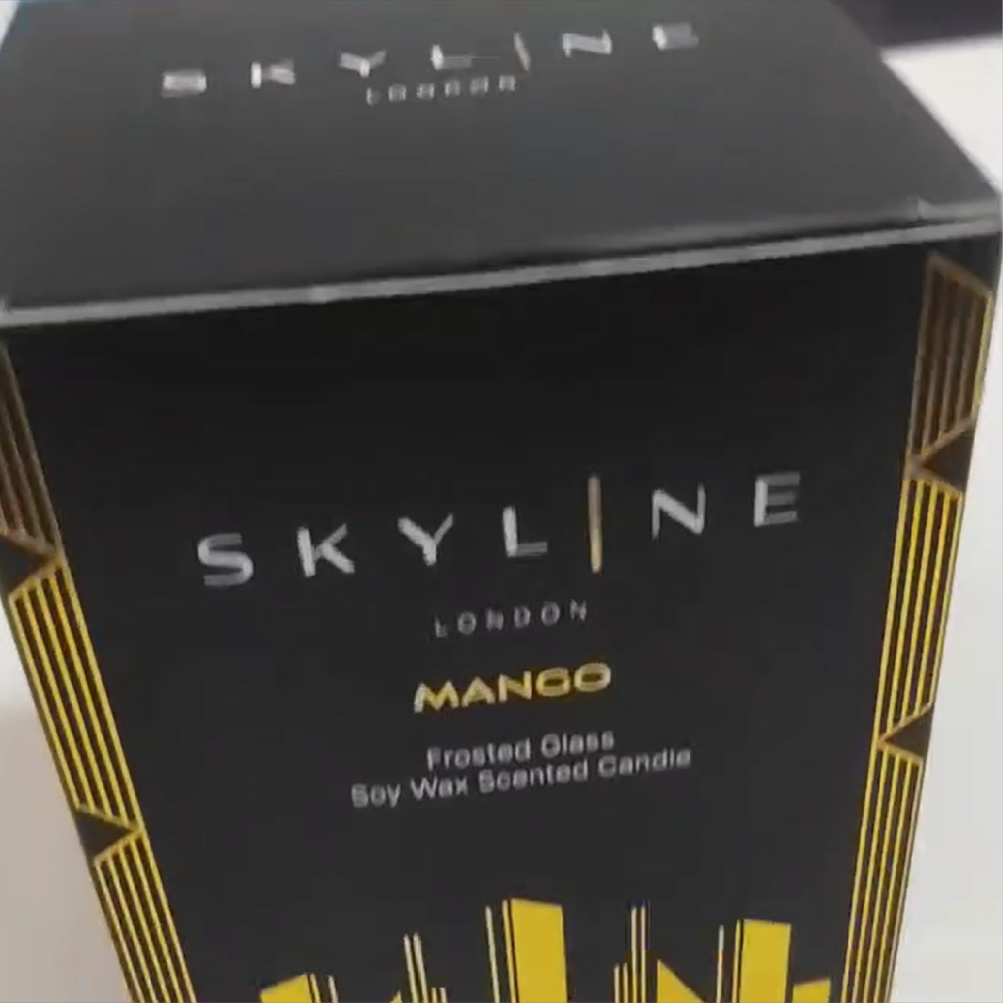
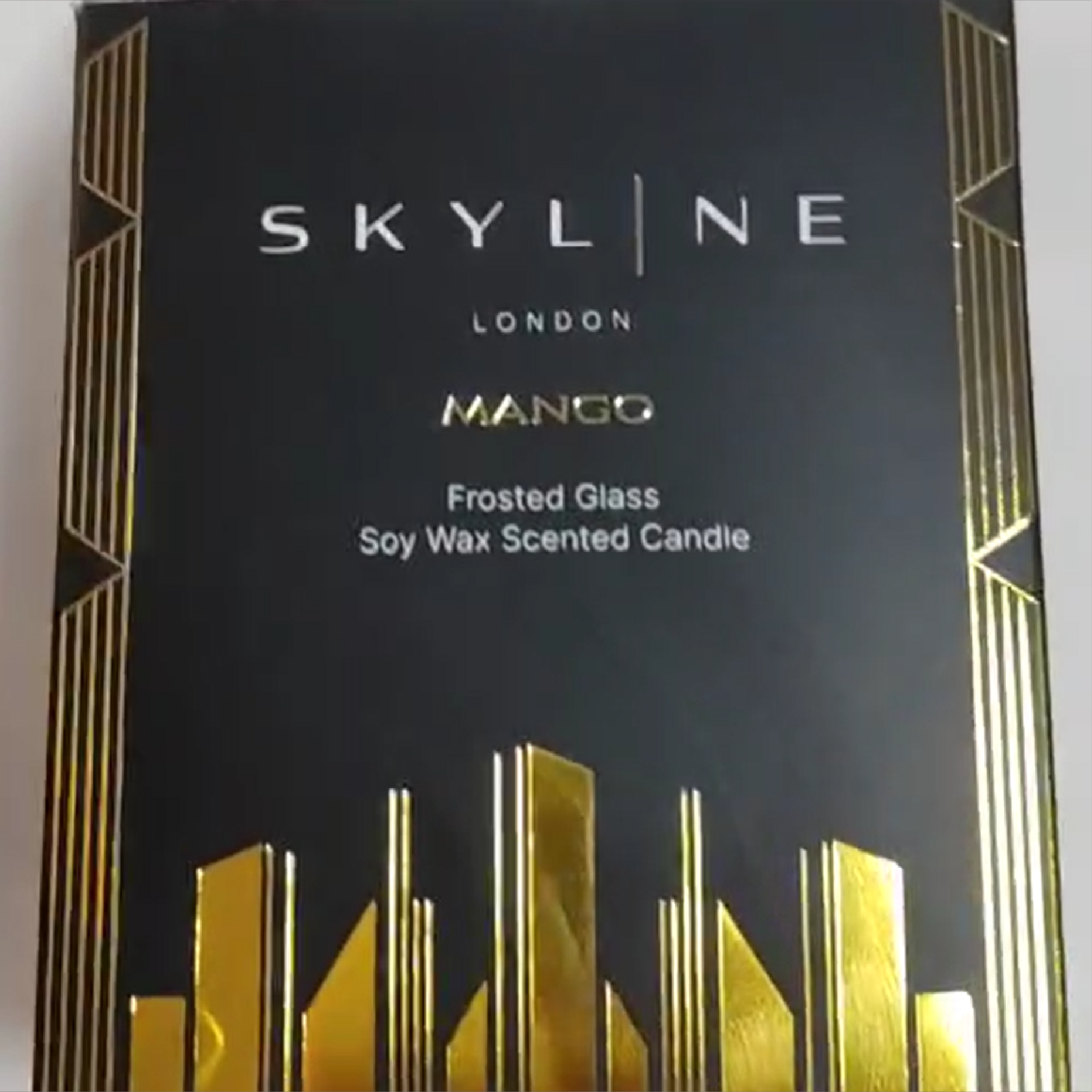
The primary logo uses widely spaced uppercase lettering to create a clean and sophisticated visual signature. A vertical gold line replaces part of the letter I and extends beyond the surrounding characters, suggesting an illuminated tower rising through a city skyline. This subtle detail gives the wordmark a distinctive point of recognition, while “London” appears beneath the principal name to establish the brand’s connection to the city without disrupting the hierarchy.
-
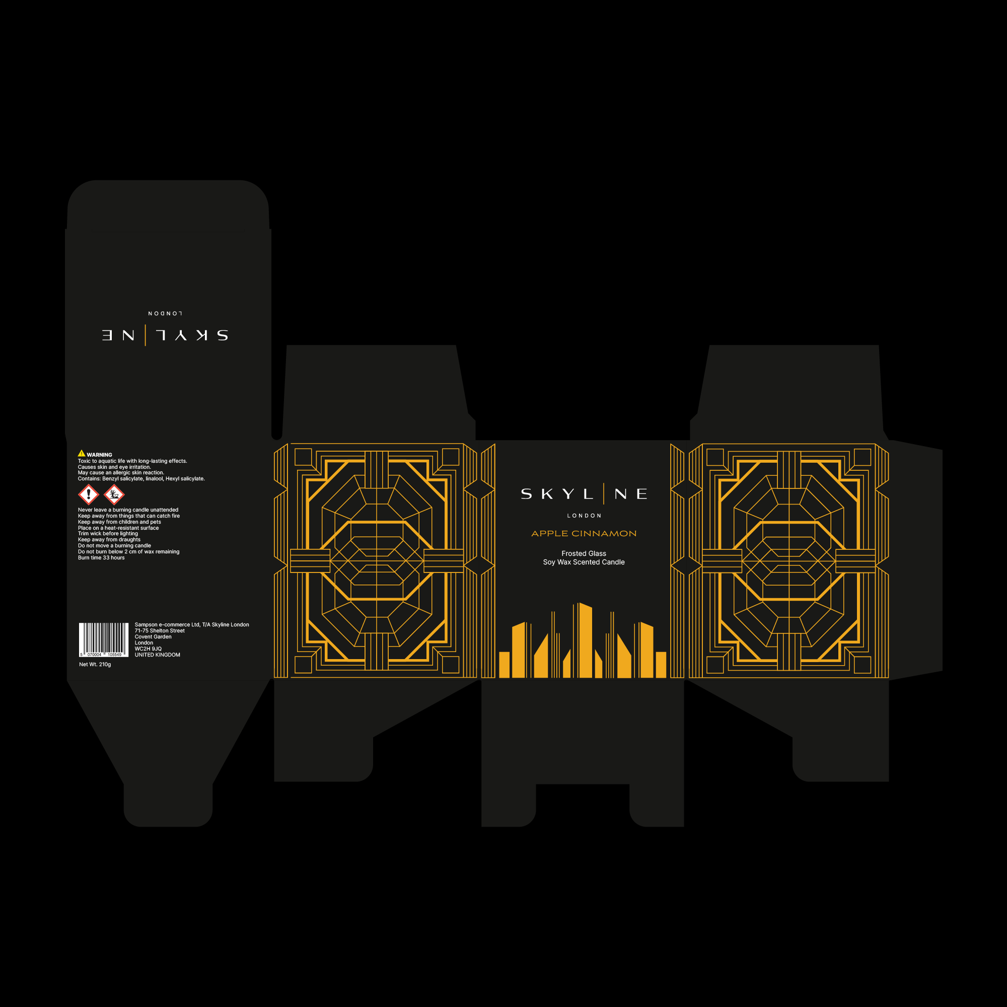
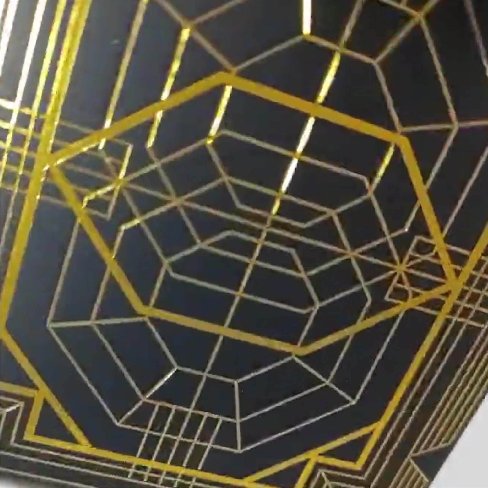
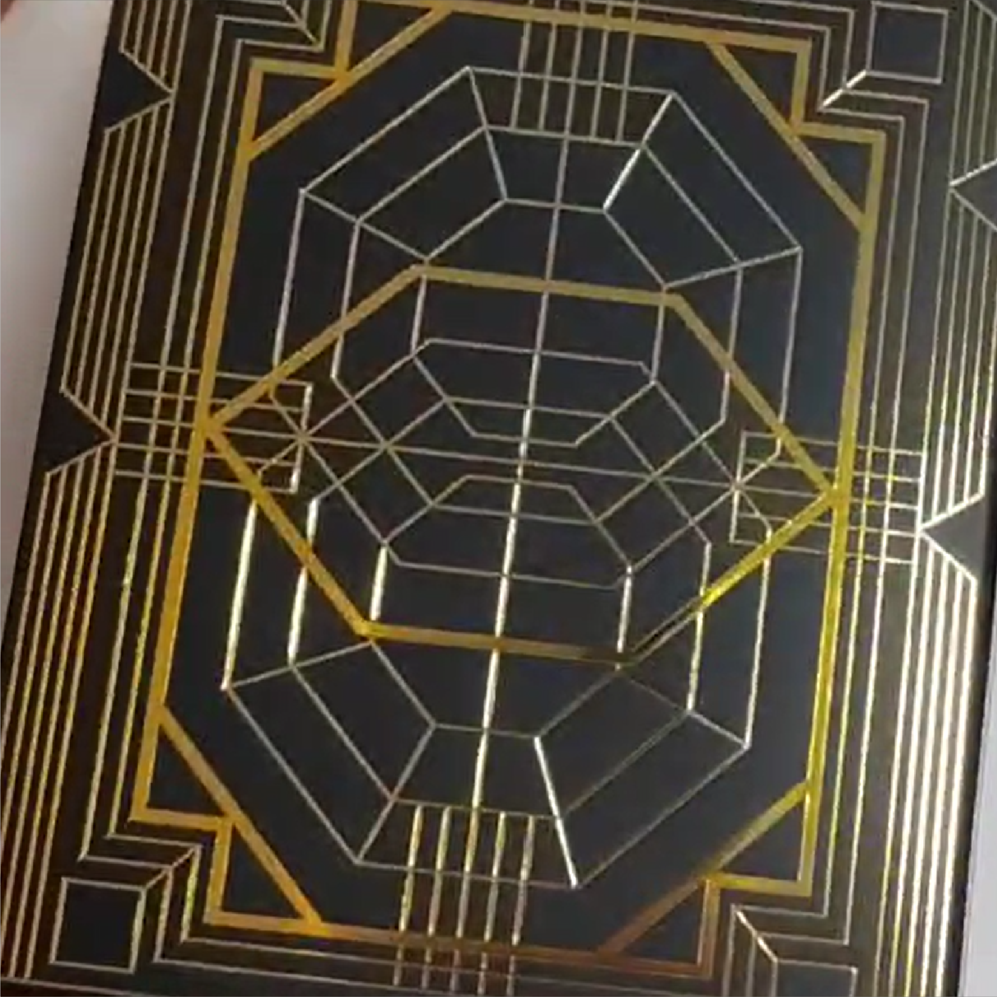
The side panels feature a custom geometric illustration influenced by Art Deco architecture, illuminated windows and the structured forms of city buildings. Repeated lines converge towards a central shape, creating depth and the impression of looking through an architectural framework. Rather than depicting a literal cityscape, the artwork interprets the skyline through symmetry, proportion and perspective, creating a visual language that feels specific to the brand.
-
The front panel uses a restrained composition to keep the Skyline wordmark, fragrance name and product information immediately accessible. A simplified gold city silhouette rises from the bottom of the panel, reinforcing the concept without competing with the typography. Across the complete dieline, each surface performs a clear role: the front introduces the product, the side panels carry the geometric artwork and the remaining areas provide space for practical information. This creates a repeatable system that can remain consistent as new fragrances are introduced.
-
Black was selected as the principal packaging colour to evoke a city at night and provide a dramatic foundation for the artwork. White typography maintains clarity, while reflective metallic gold is reserved for the architectural illustration, fragrance name and key identity details. As the box moves under changing light, the metallic lines create movement and depth across the surface. Careful control of line weight, contrast and placement ensured that the detailed artwork remained clear when printed and assembled.
-
The completed identity gives Skyline a distinctive position within the premium candle and home-fragrance market. The minimalist wordmark provides a contemporary foundation, while the geometric artwork and metallic gold finish introduce the richness expected from a luxury retail product. Most importantly, the design translated successfully from a flat production dieline into a manufactured box, retaining the detail, contrast and reflective character of the original concept. The resulting system can extend consistently across multiple fragrances while giving each product a memorable and premium presentation.
Discover custom logos, visual identities and brand systems created for businesses across a wide range of industries and international markets.
Start a Packaging & Branding Project
If your business needs a new logo, refined identity or complete brand refresh, use the enquiry form below to share your requirements, budget and timeframe.