
Piano Instructor Logo Design & Music Brand Identity
Derrick Denham Studio required a refined visual identity that could communicate professionalism, creativity and musical expertise while still feeling personal and distinctive.
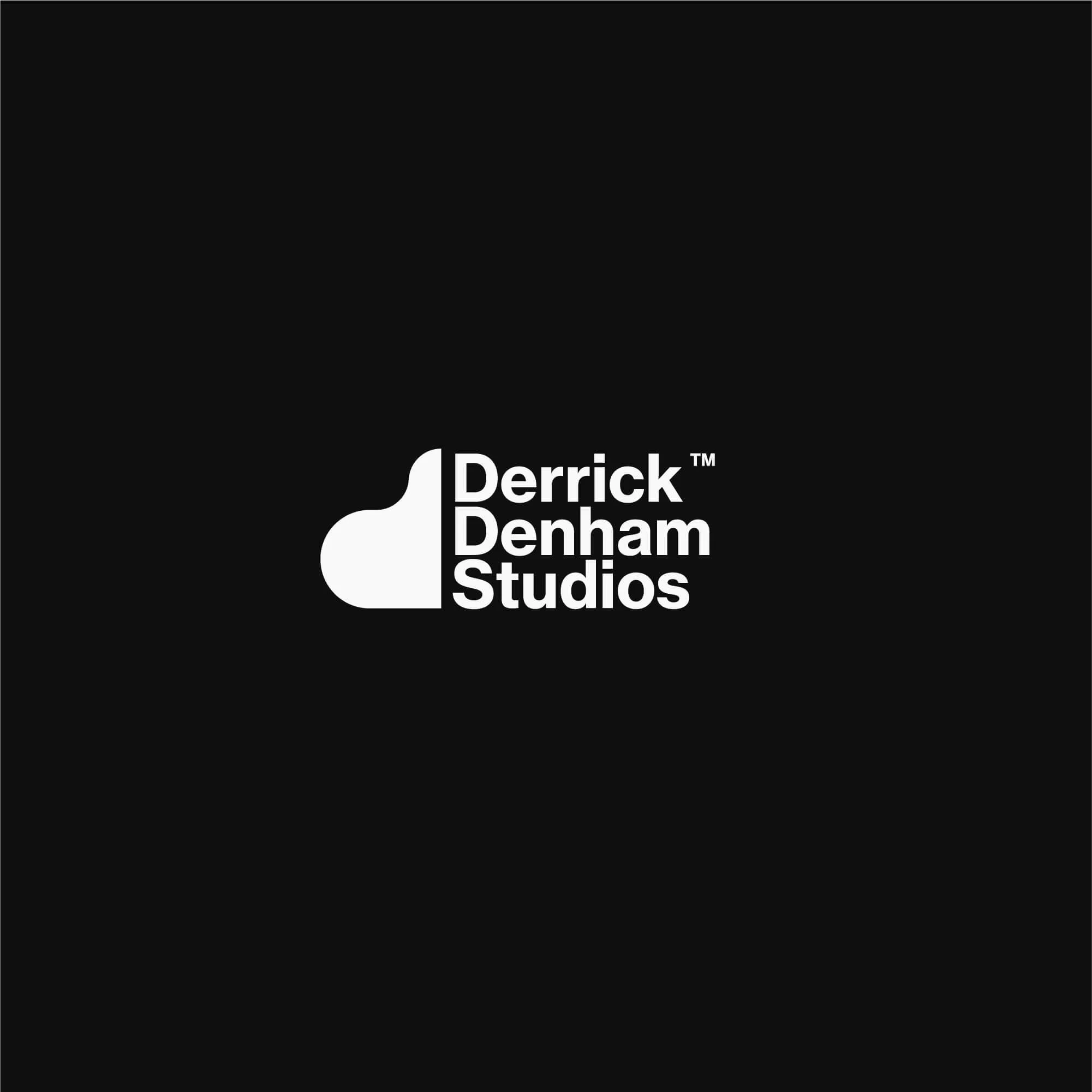
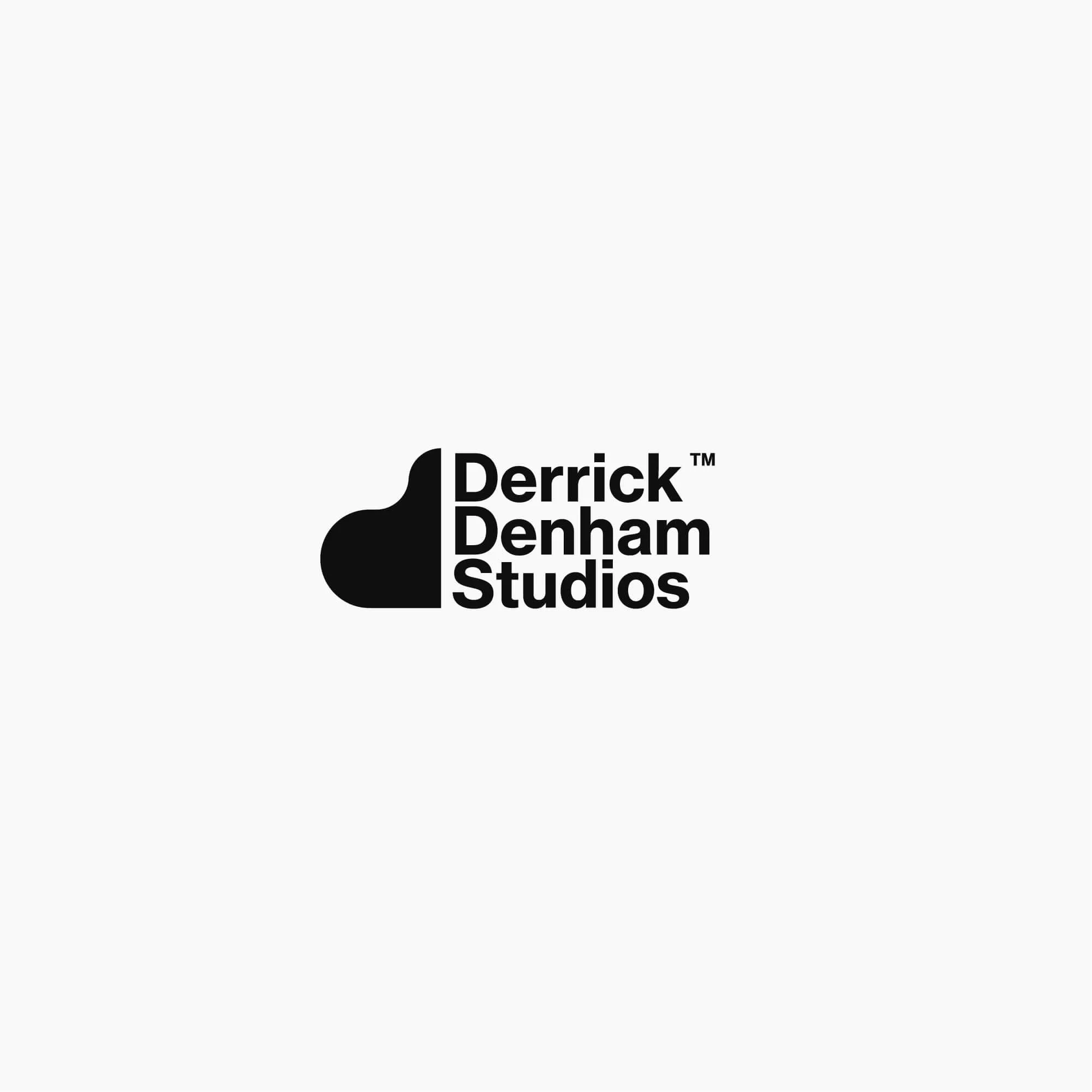
The identity was developed around a custom monogram inspired by the flowing shape of a grand piano, combining the letter “D” with a subtle reference to the instrument itself.
The result is an elegant and recognisable visual identity designed to work consistently across stationery, promotional materials, digital communication and other music-related applications.


Project Overview
Derrick Denham Studio required a professional visual identity centred around classical piano instruction, artistic expression and personal service.
The brief was to create a brand that could feel refined and credible without becoming overly formal or disconnected from the creative nature of music.
The identity needed to work across both traditional teaching materials and contemporary digital applications, giving the studio a consistent visual presence wherever students or clients encountered the brand.
The final direction combines a distinctive custom monogram with refined typography and a restrained supporting visual system.
The Challenge
Music and education brands often need to balance creativity with professionalism.
An identity that feels too formal can lose the personality and artistic character associated with music, while something too expressive can become difficult to use consistently across practical teaching and business applications.
The challenge for Derrick Denham Studio was to create a logo that clearly connected with piano instruction without relying on obvious musical symbols such as notes, keyboards or clefs.
The design also needed to feel personal enough for an independent instructor while still presenting the studio as an established and professional service.
The Solution
The final identity was developed around a custom monogram inspired by the bird’s-eye silhouette and flowing form of a grand piano.
The mark forms the letter “D” while simultaneously creating a subtle visual reference to the instrument, allowing the logo to communicate both the instructor’s name and musical specialism within a single shape.
A minimalist visual language was used throughout the identity so the monogram remained the primary point of recognition.
Refined typography and controlled layouts support the mark without competing with it, helping create a visual system that feels elegant, clear and appropriate for classical piano education.
The final identity included:
Custom D monogram
Primary logo
Secondary logo configurations
Typography direction
Colour palette
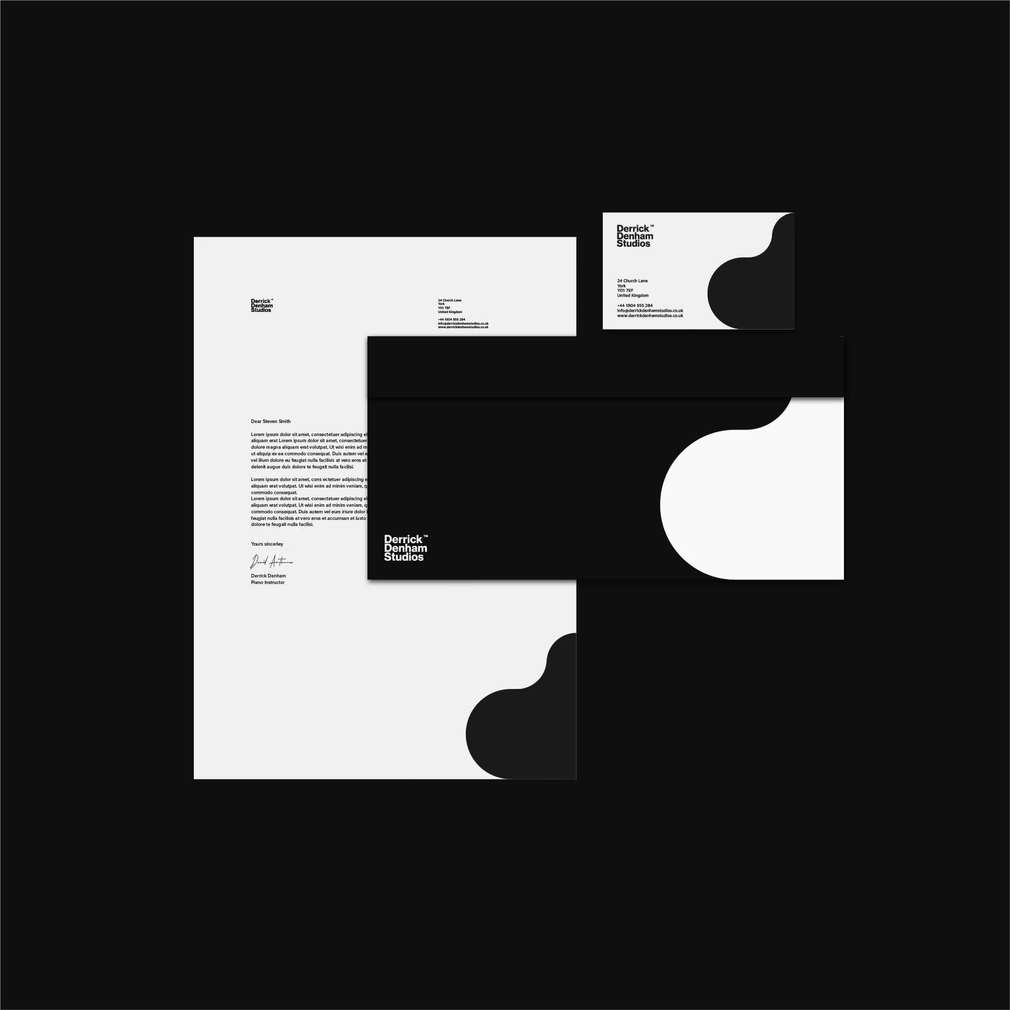
Business card design
Stationery
Promotional materials
Digital brand assets
Social media graphics
Piano Instructor Logo Design Approach
The logo was designed around the idea of creating a musical reference without using literal or predictable iconography.
The custom D monogram takes its inspiration from the curved shape of a grand piano when viewed from above, giving the mark a direct relationship with the instrument while retaining a clean and abstract appearance.
This creates a more distinctive visual identity than simply adding a musical note or keyboard symbol to the instructor’s name.
Proportion, negative space and simplicity were important throughout the design so the mark could remain recognisable at both small and large sizes.
The result is a logo that feels musically relevant, personal and refined without becoming overly decorative.
This reflects the same principles I use across my professional logo design services, where distinctiveness, clarity and long-term practical use are considered from the beginning of the project.
Brand Identity Development
The wider identity was designed to reinforce the elegance and simplicity established by the monogram.
Typography, colour and layout were kept restrained, allowing the logo to remain the main visual focus while providing enough structure for consistent use across different applications.
For a music instructor, the identity needs to feel professional without becoming impersonal.
The visual system therefore balances a refined aesthetic with enough warmth and flexibility to suit a personal teaching practice.
This broader approach to brand identity design helps ensure the studio feels consistent across stationery, promotional materials, teaching communications and digital platforms.
Brand Applications
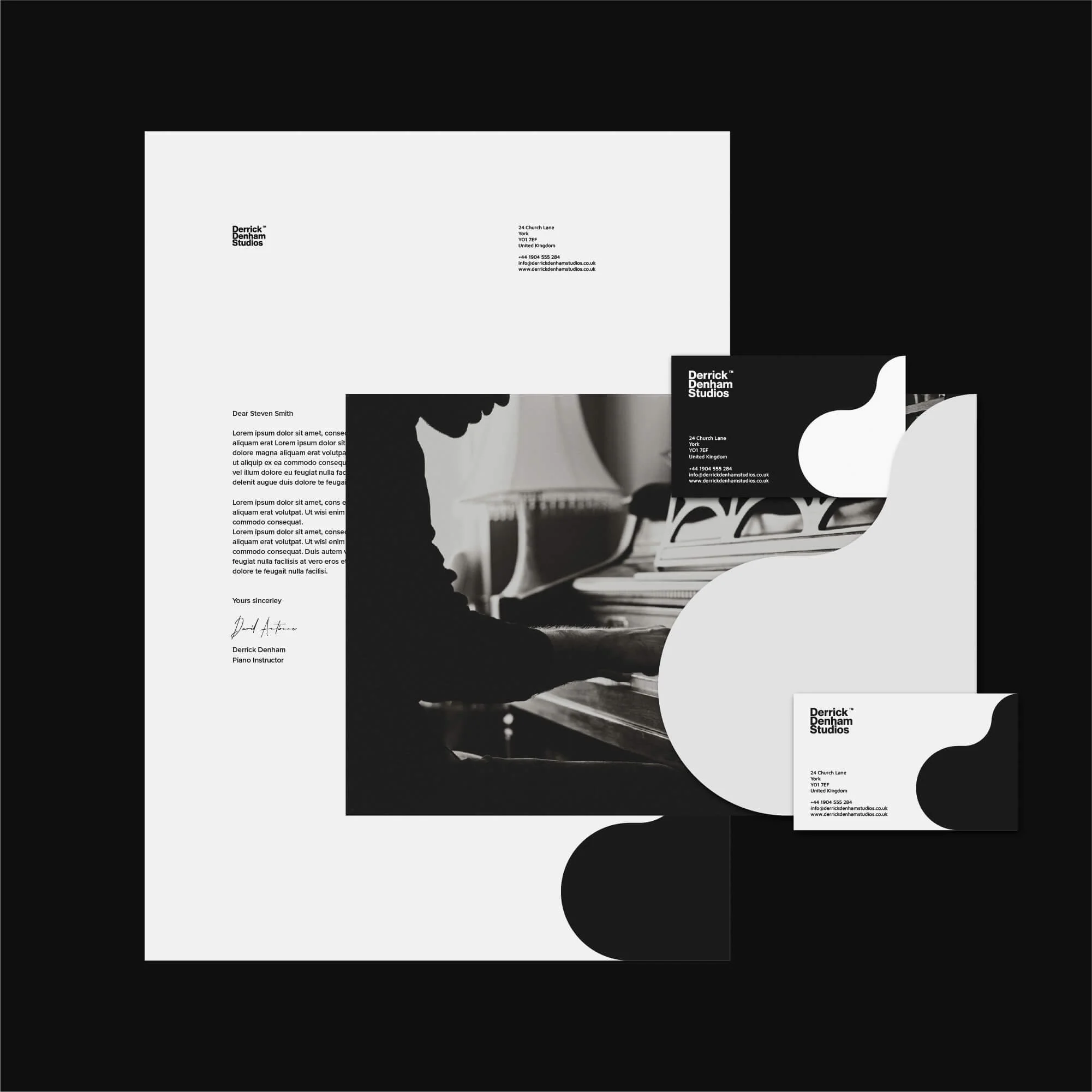
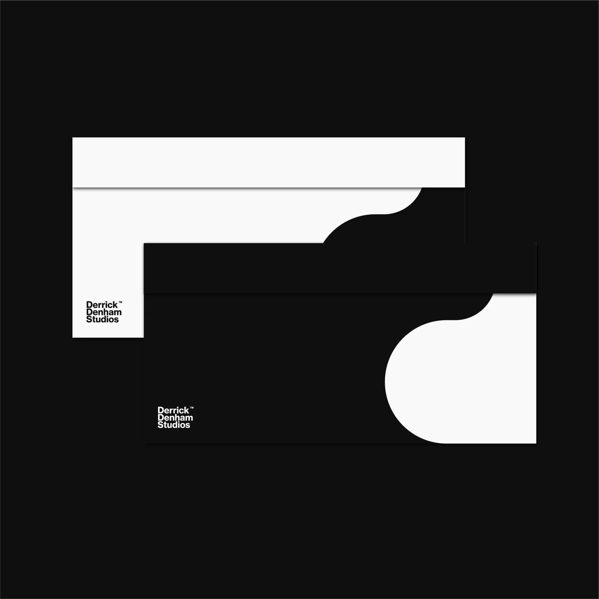
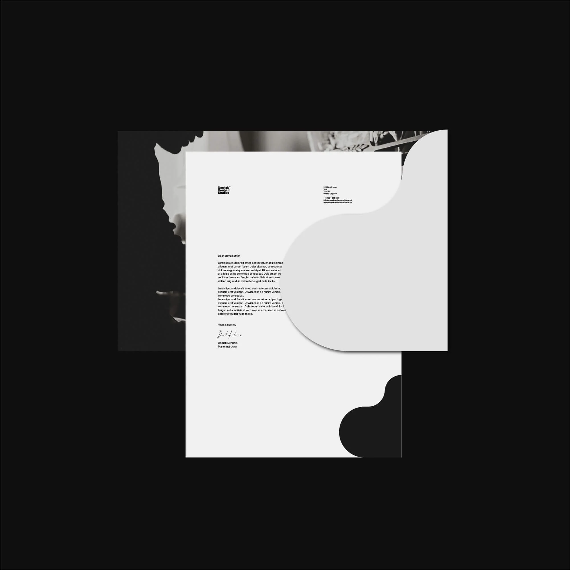
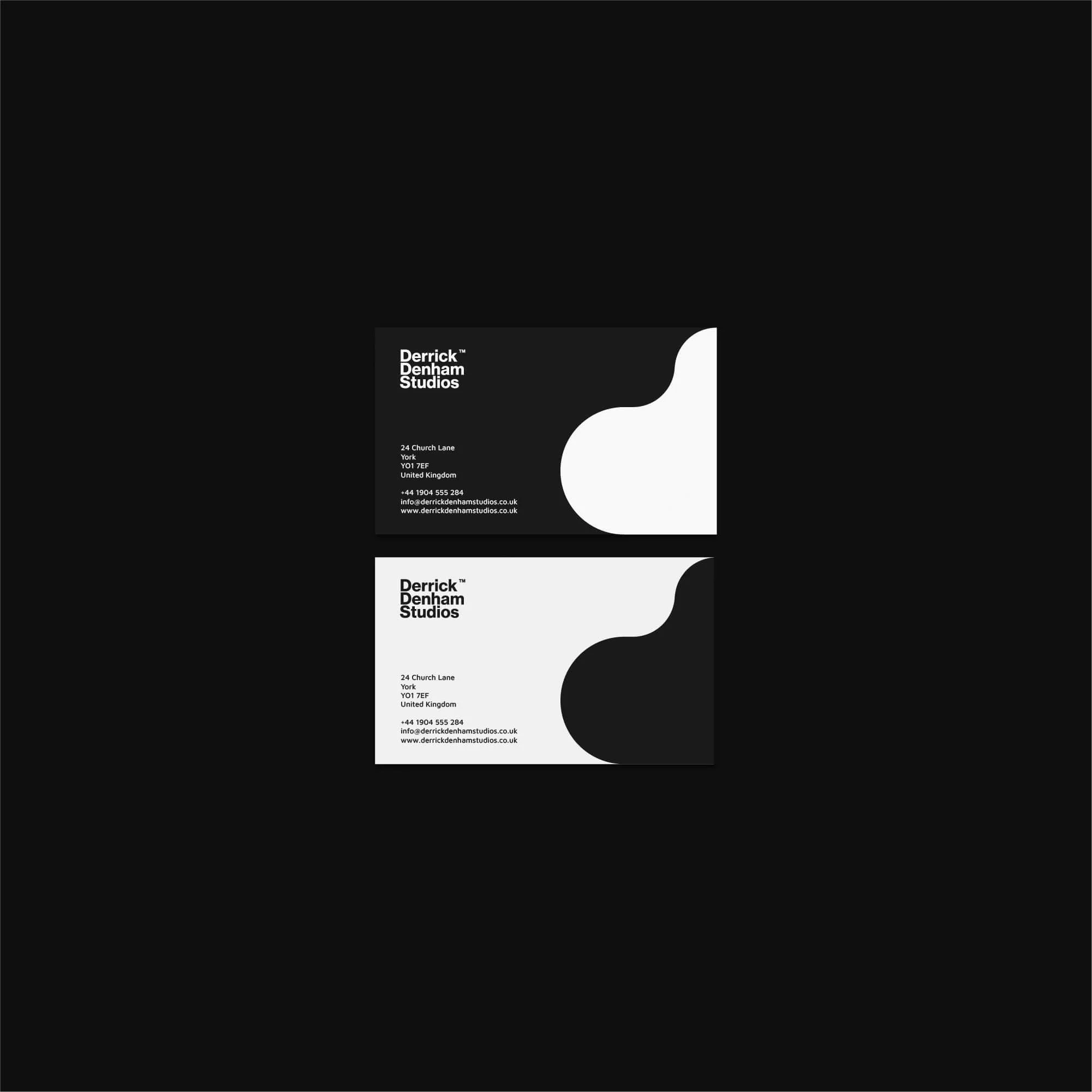
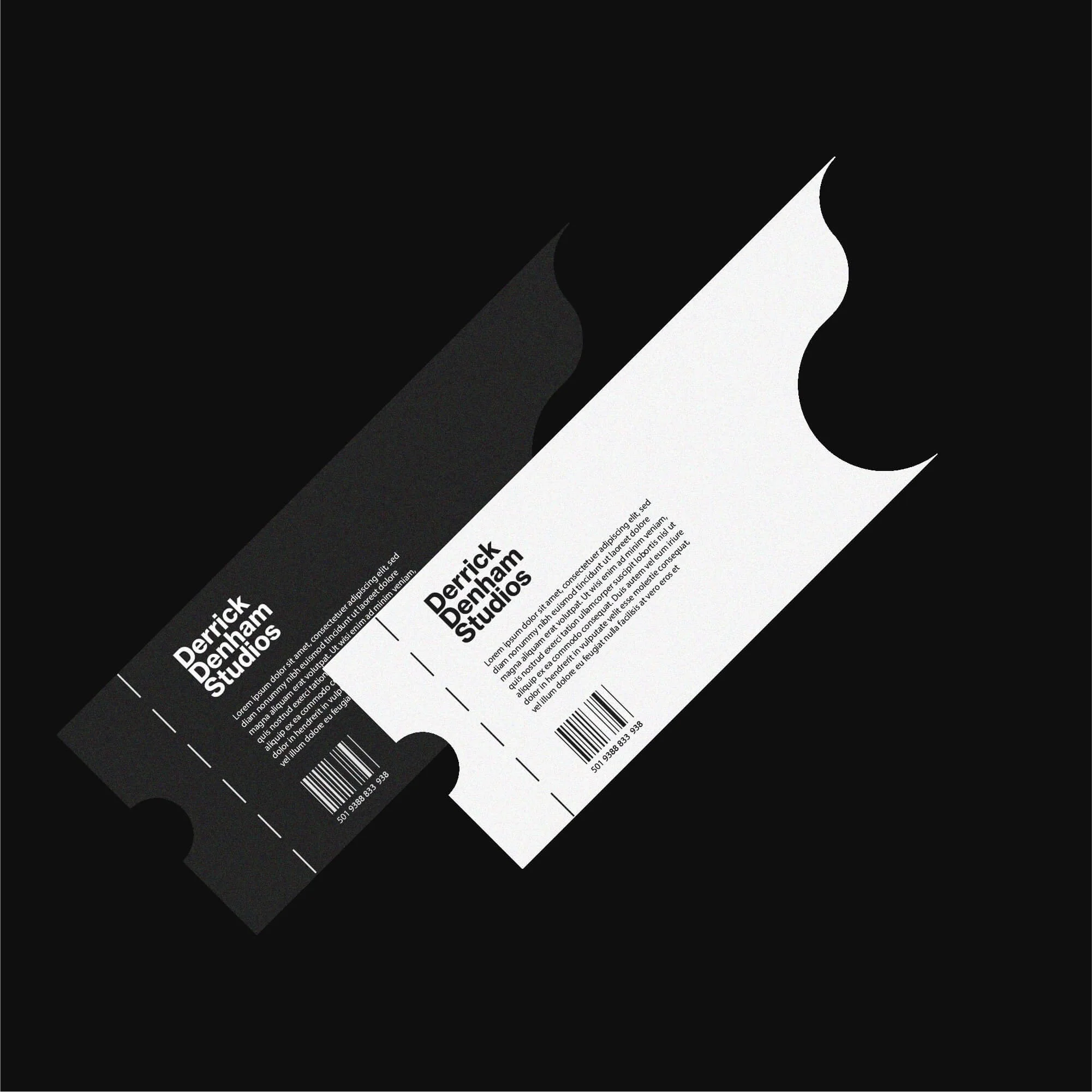
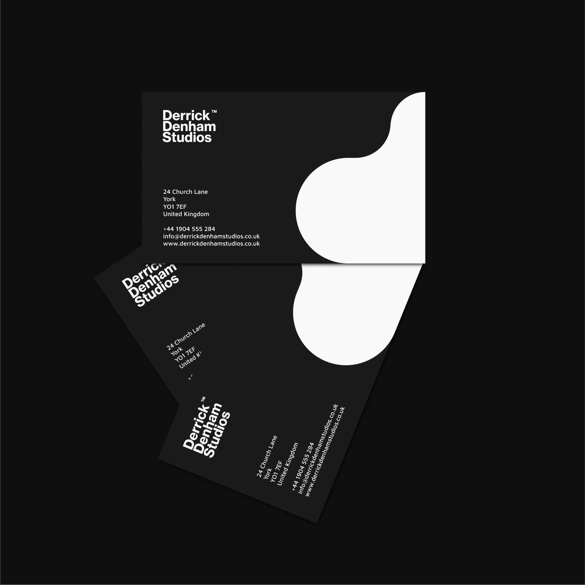
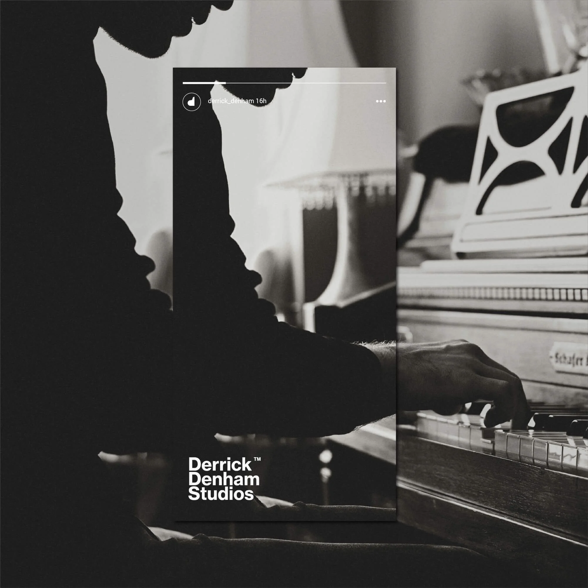
The identity was applied across a range of printed and digital touchpoints, including stationery, business cards, promotional materials, social media graphics and supporting brand compositions.
Each application uses the same typography, spacing and visual language, helping the studio maintain a coherent and professional appearance across different formats.
For an independent instructor, that consistency can make a meaningful difference in how the service is perceived, especially when clients encounter the brand across several different touchpoints before making contact.
The Outcome
The completed identity gives Derrick Denham Studio a more distinctive and professional visual presence while preserving the personal character appropriate for an independent music instructor.
The custom monogram creates a recognisable connection to both the instructor’s name and the piano itself, while the restrained supporting system reinforces clarity and refinement.
The result is a music identity that feels creative without becoming decorative and professional without becoming overly corporate.
The wider visual system also provides a flexible foundation for future teaching materials, promotional communication and digital use.
Logo Design for Music Instructors & Creative Professionals
For music instructors and other creative professionals, visual identity needs to communicate both expertise and personality.
Students and clients are often choosing an individual rather than a large organisation, which means the brand needs to feel personal while still demonstrating professionalism and credibility.
A distinctive logo can help create stronger recognition, particularly when it is built around something genuinely connected to the person or their specialism rather than generic industry symbolism.
My work with creative professionals focuses on developing identities that feel individual, clear and flexible enough to work across digital communication, promotional materials and everyday client touchpoints.
Start a Music or Creative Branding Project
If you’re a music instructor or creative professional looking for a new logo or refined visual identity, use the enquiry form below to share your requirements, budget and timeframe.