Maeving
-
Maeving is a British electric motorcycle manufacturer combining classic British heritage aesthetic with zero-emission technology. To support the brand's market expansion and position as a leader in premium urban mobility, we developed a sophisticated visual identity engineered to blend classic automotive craftsmanship with modern engineering precision.
The Objective
Heritage Meets Innovation: Balance classic cafe-racer heritage with forward-looking sustainable technology to attract design-conscious riders and urban commuters.
Premium Market Positioning: Distinguish her products from mass-market electric scooters and traditional petrol motorcycles through an elevated, design-led visual identity.
Multi-Touchpoint Consistency: Build an adaptable brand system that performs seamlessly from digital showrooms and campaign media to physical badging, apparel, and showroom environments.
Visual Strategy & Execution
Our strategy focused on translating British engineering heritage into a refined, tactile visual identity. The system is built on three core pillars:
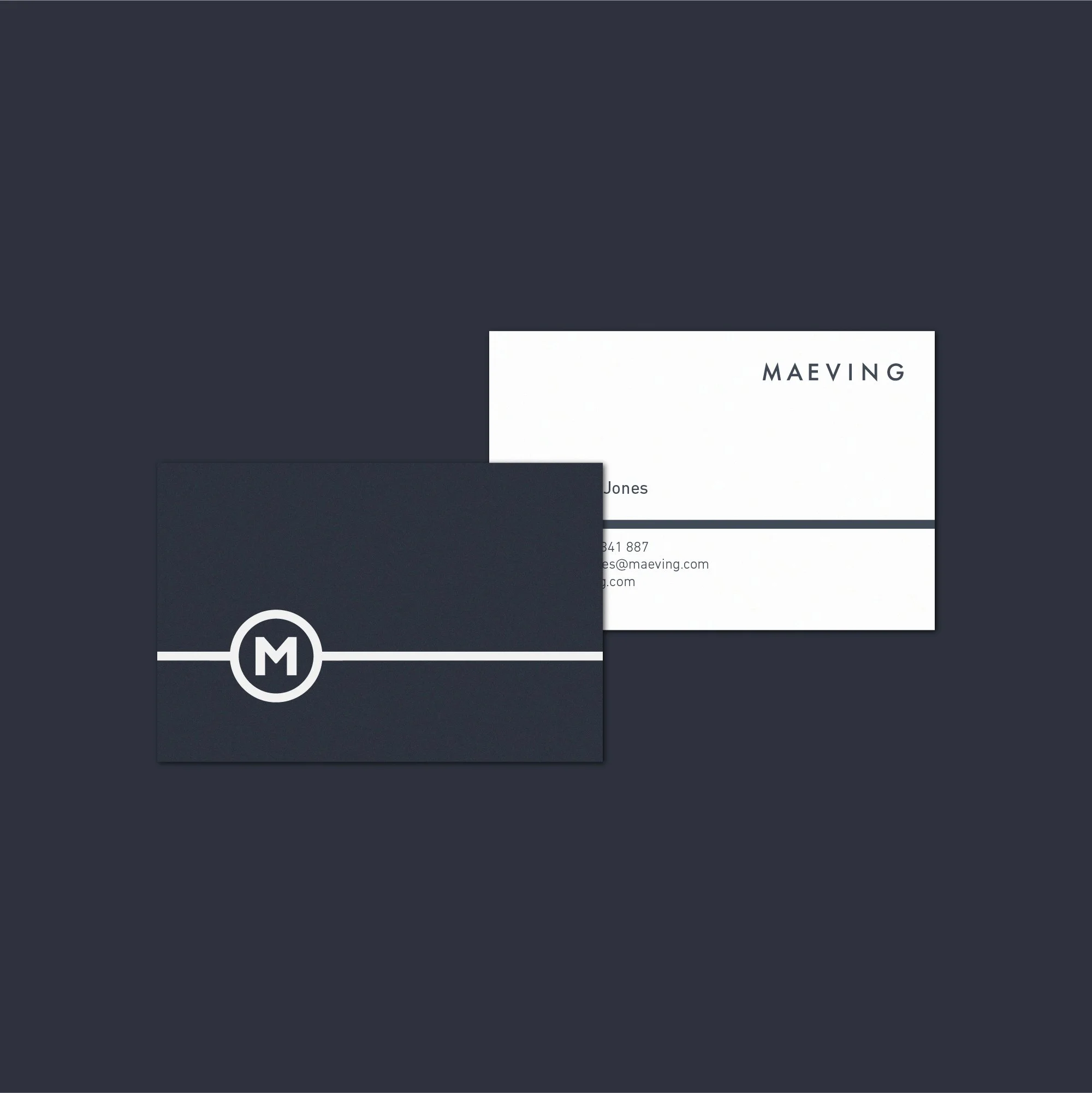
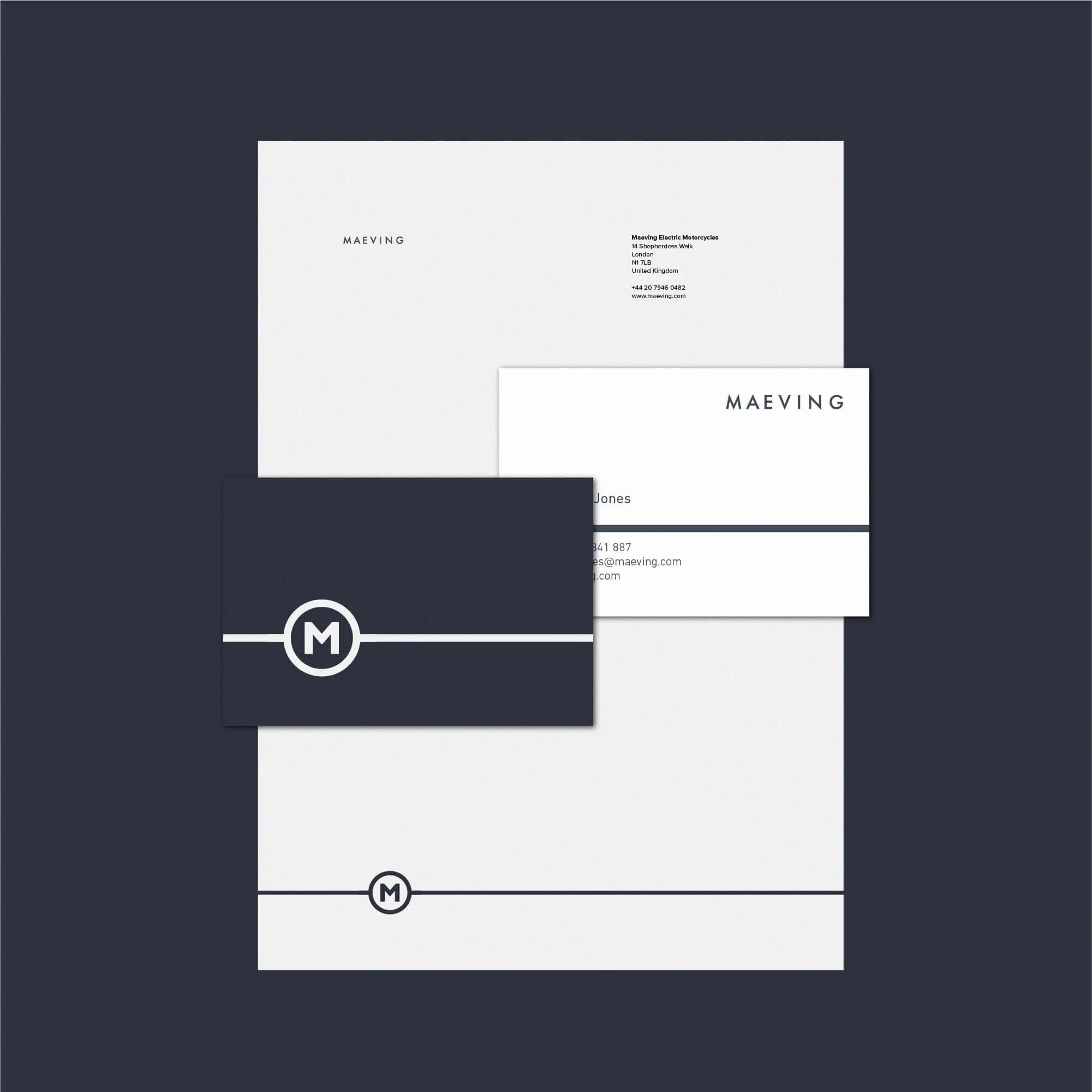
Identity & Logomark: A clean typographic mark and emblem crafted to reflect industrial precision, timeless proportion, and modern electric mobility.
Color & Typographic System: A restrained palette inspired by classic automotive finishes paired with sharp editorial typography to convey craftsmanship and speed.
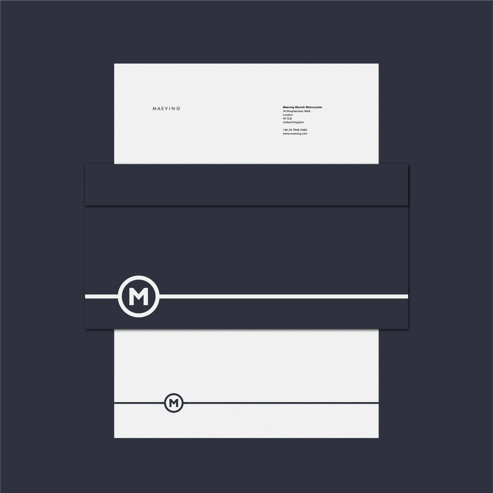
Product & Retail Touchpoints: A suite of high-touch brand assets, including digital configurator UI elements, owner documentation, premium packaging, and physical vehicle branding.
Key Deliverables
Brand Strategy & Positioning
Custom Logo & Mark System
Comprehensive Brand Identity Guidelines
Typography & Color Hierarchy
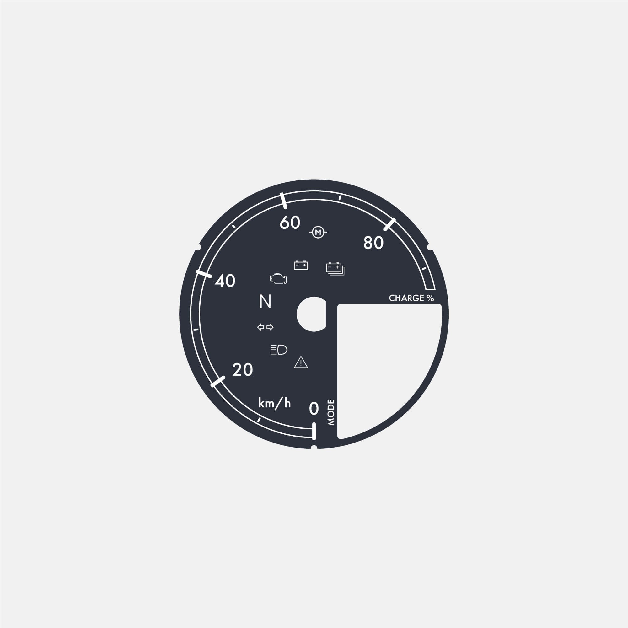
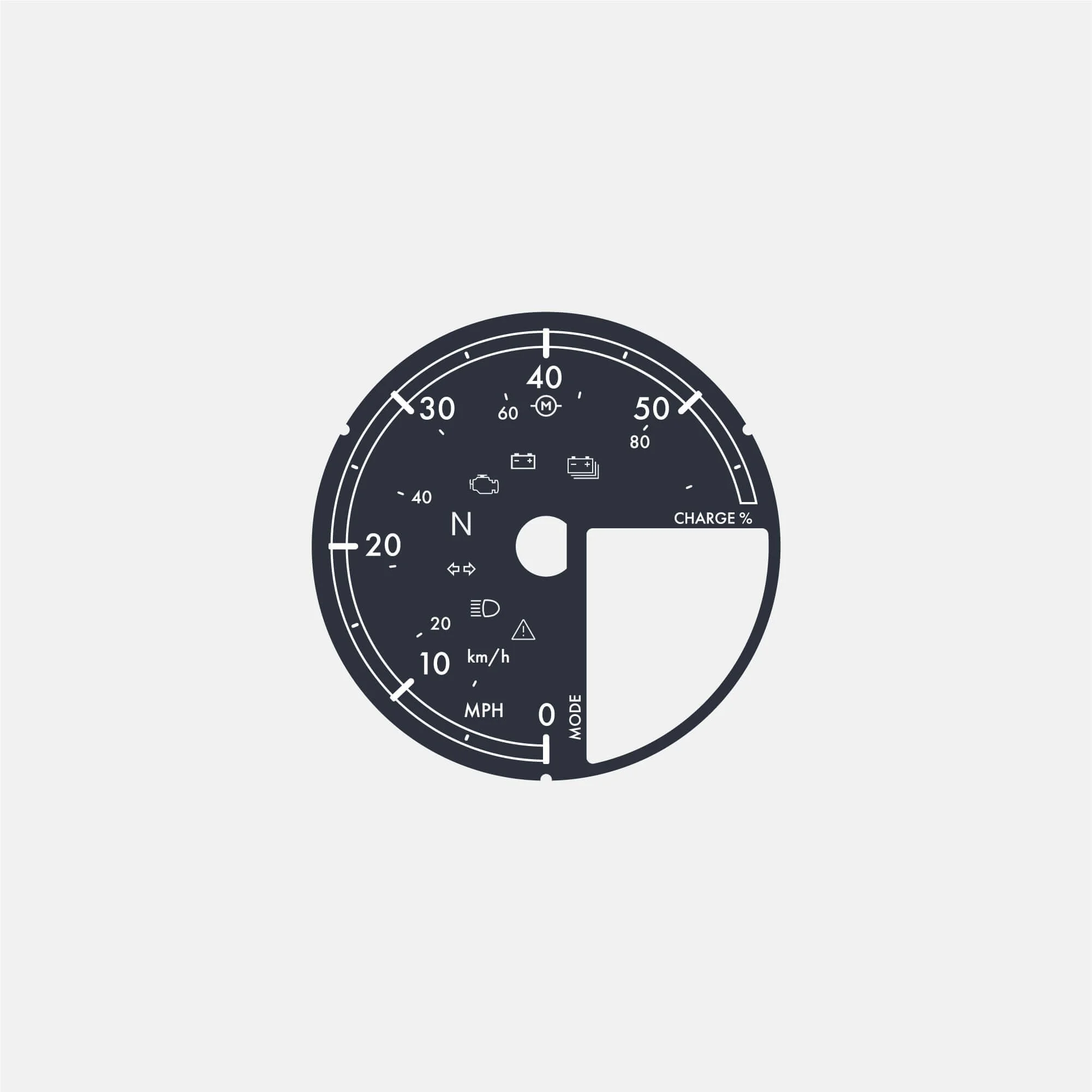
Speedometer UI Design