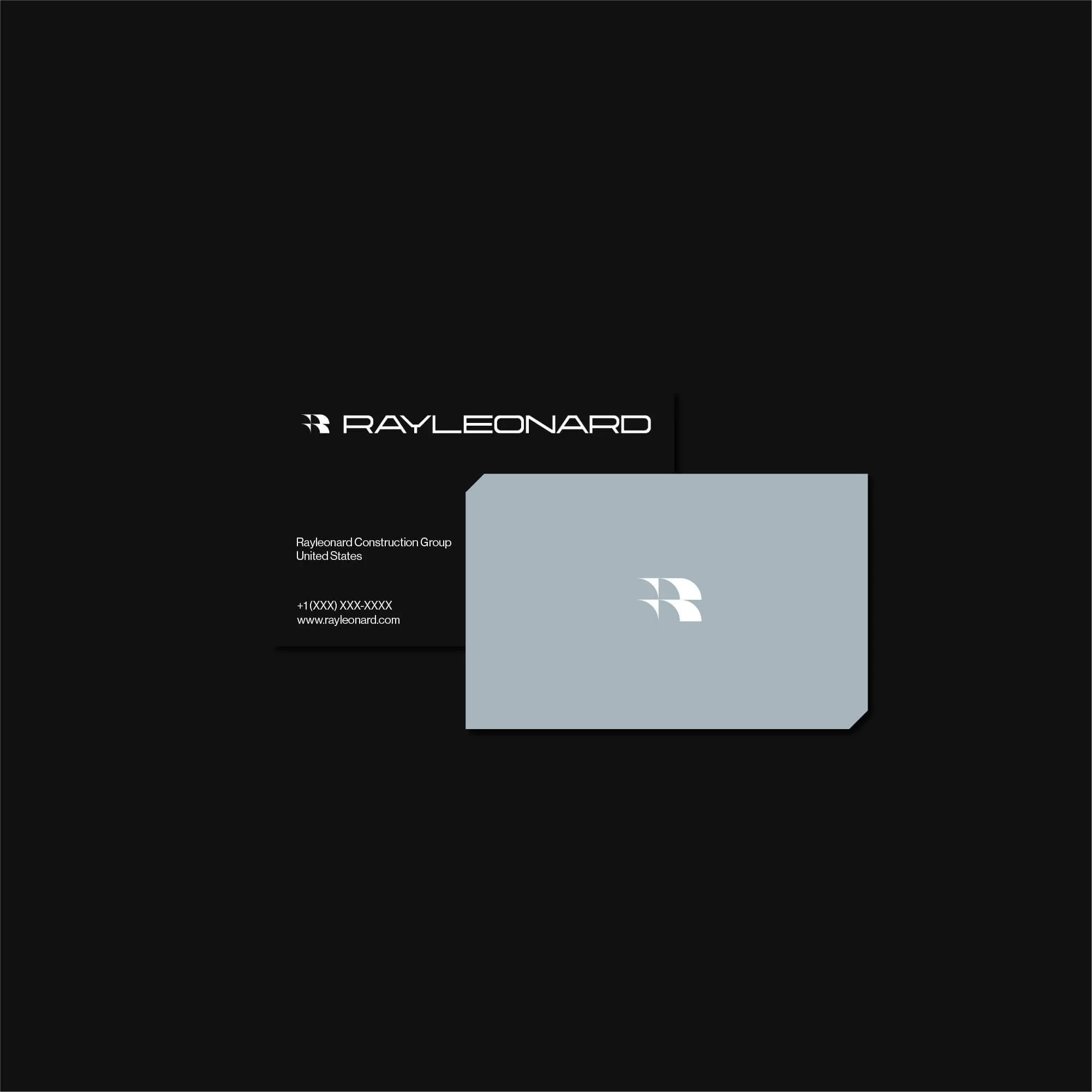
Rayleonard
-
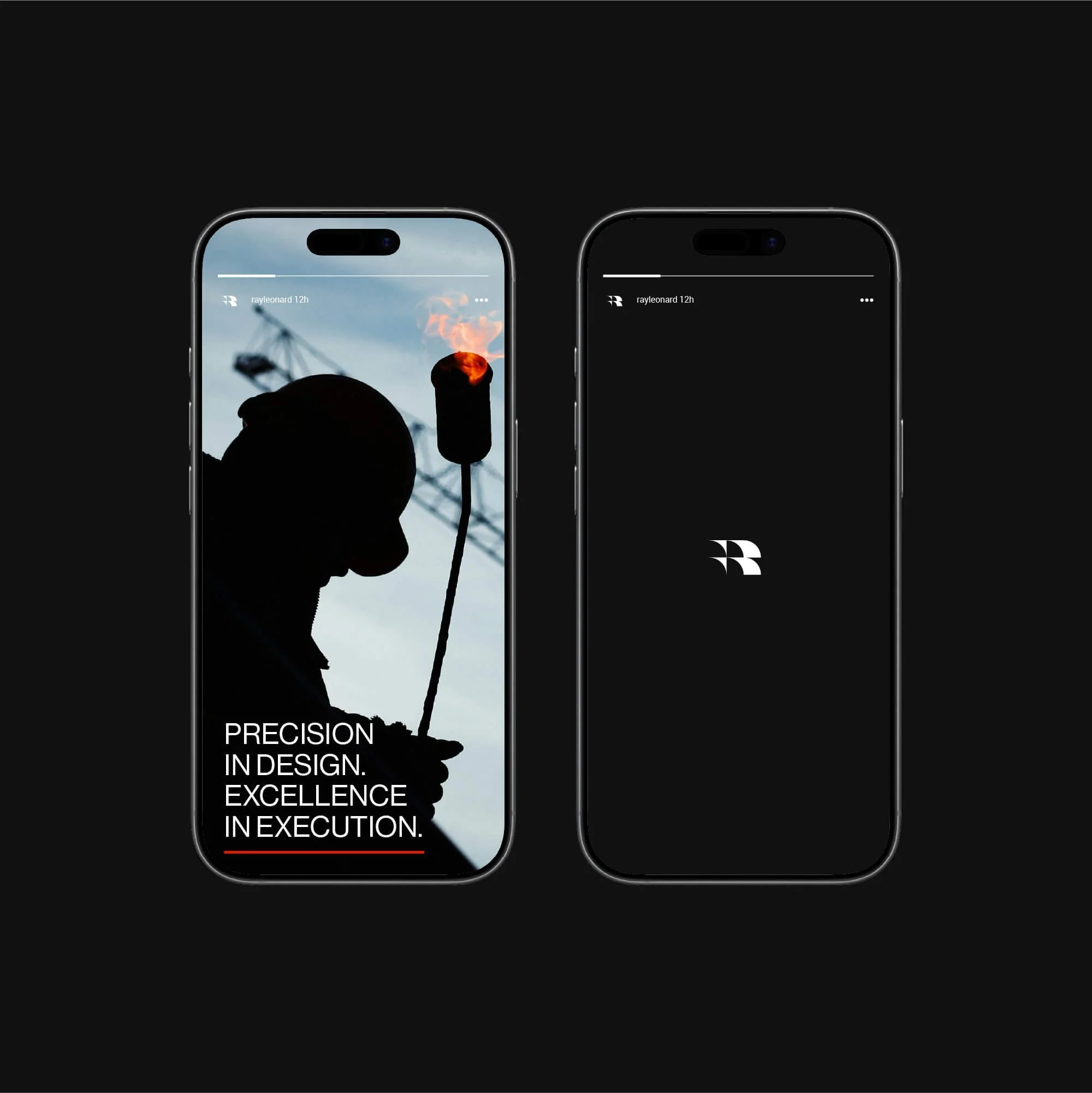
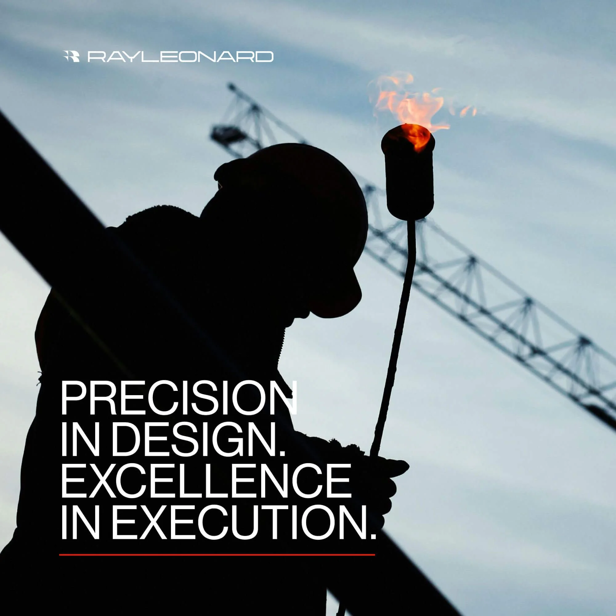
Ray Leonard Construction is a general contracting firm specializing in commercial builds, high-end renovations, and structural engineering projects. To support their growth, compete for larger commercial tenders, and establish trust with project architects, I developed an authoritative visual identity engineered to project structural integrity, site safety, and operational precision.
The Objective
Commercial Tender Authority: Elevate the firm’s visual presence to win high-ticket commercial, institutional, and municipal construction bids.
Professional Differentiation: Separate the business from informal local trades through an enterprise-grade visual identity system.
Site & Asset Utility: Build a high-durability brand system optimized for real-world application, including heavy equipment livery, site safety signage, crew workwear, and sub-contractor tender decks.
Visual Strategy & Execution
The strategy focused on converting engineering principles and structural steel frameworks into a bold, high-visibility visual identity. The system is built on three core pillars:
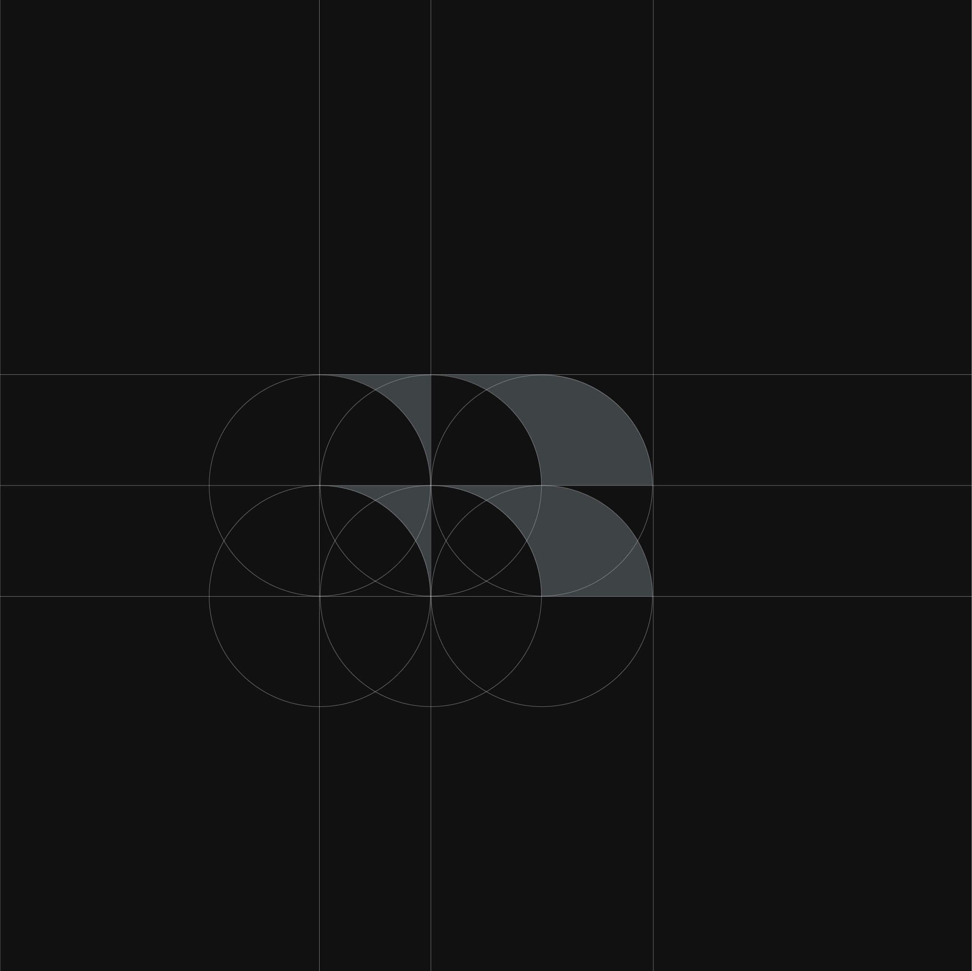
Identity & Logomark: A bold, geometric mark engineered to signify balance, structural strength, and modern industrial execution.
Color & Typographic System: A high-contrast safety and corporate palette paired with strong, legible typography designed for clear reading across digital screens and job-site banners.
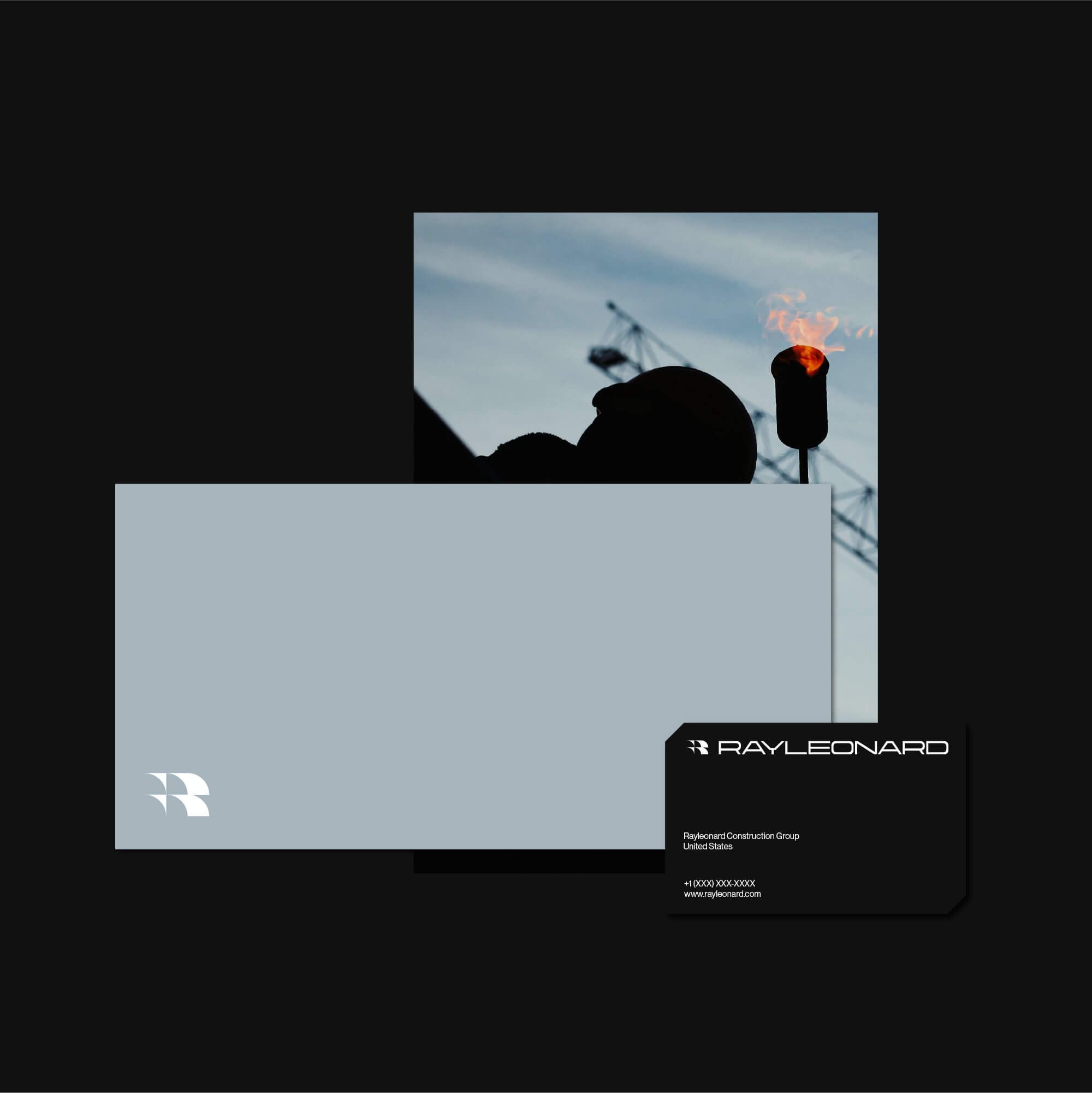
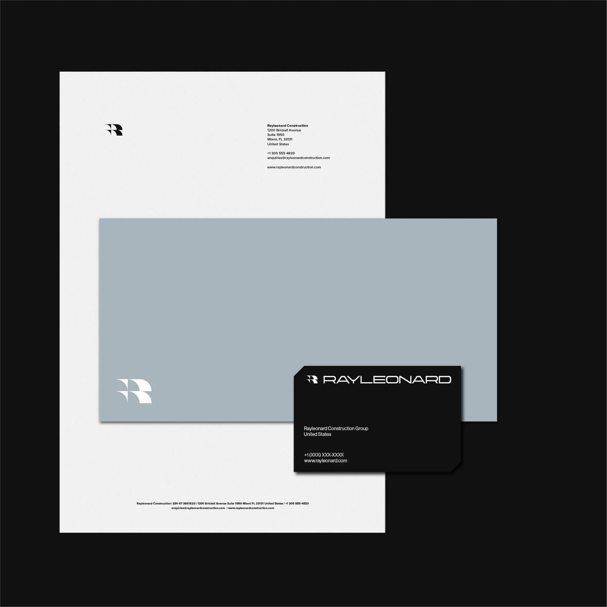
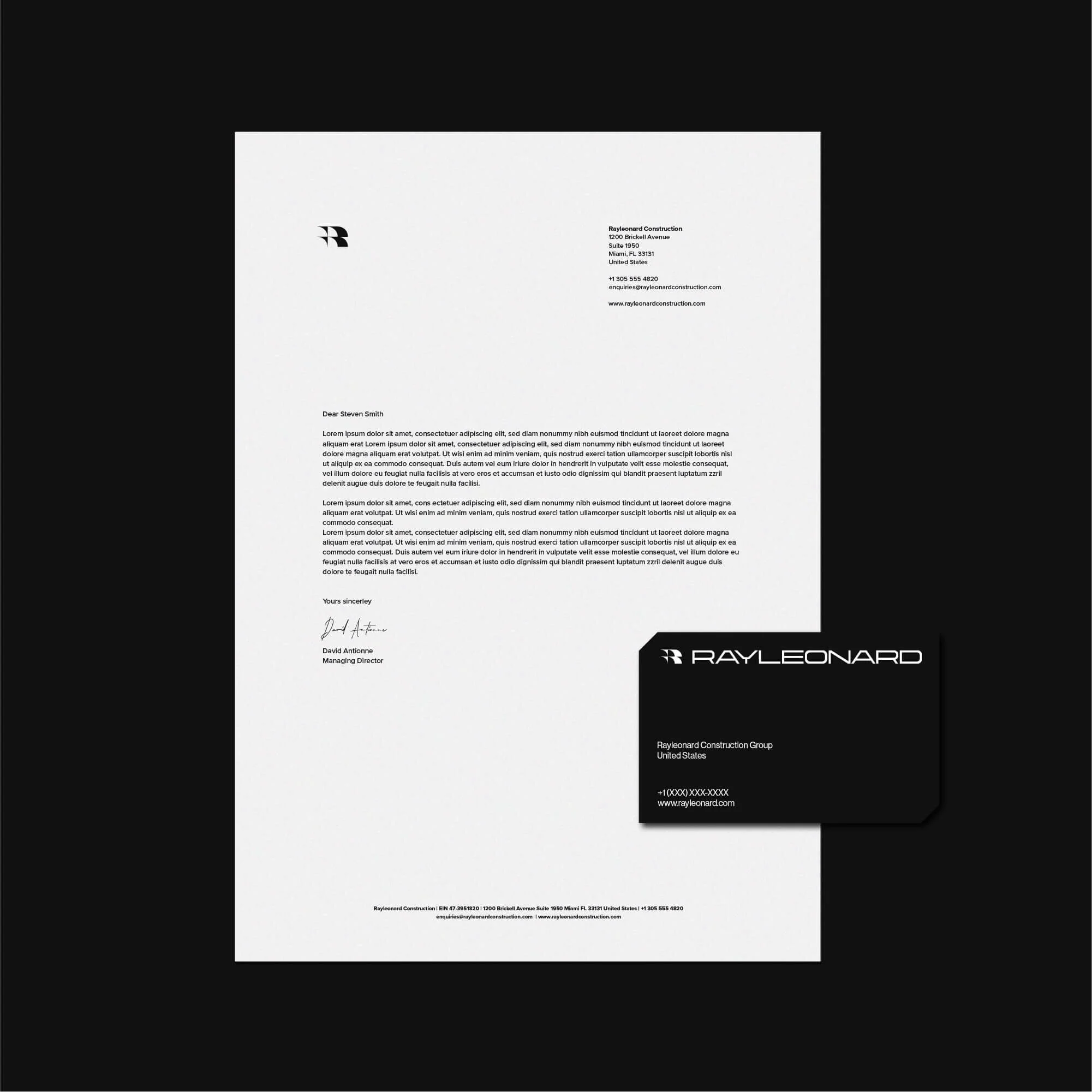
Fleet & On-Site Touchpoints: A suite of durable visual assets, including vehicle livery, site hoarding graphics, safety signage, bid proposal templates, and client handoff packages.
Key Deliverables
Brand Strategy & Market Positioning
Custom Logo & Symbol System
Construction Identity Guidelines
Typography & Industrial Color Hierarchy
Fleet Livery & Site Safety Signage Design
Commercial Bid & Tender Proposal Templates