
Property Developer Logo Design & Brand Identity
Continental Developments required a refined visual identity that could communicate sophistication, stability and long-term value within the premium property development market.
The identity was developed around a custom “C” monogram, structured typography and a restrained visual system inspired by architectural form and precision.
The result is a distinctive property developer brand identity designed to feel established, premium and flexible across investment materials, presentations, stationery and wider development communications.


Project Overview
Continental Developments is a premium property developer focused on residential and architecture-led real estate projects.
The brief was to create a visual identity that could communicate sophistication, stability and long-term value while giving the business a more distinctive and recognisable market presence.
The brand needed to feel controlled, professional and high-end, aligning with the expectations of premium property development, investment-led real estate and architectural project presentation.
The final direction combines a custom monogram with structured typography and a restrained visual language designed for long-term use.
The Challenge
Property development brands need to communicate credibility at several different levels.
The identity may need to appeal to buyers, investors, partners, consultants and other stakeholders while also reflecting the quality and positioning of the developments themselves.
Many property brands rely on predictable visual conventions such as buildings, rooflines or literal architectural imagery, which can make them difficult to distinguish from one another.
The challenge for Continental Developments was to create an identity that felt clearly connected to the built environment without becoming overly literal or generic.
The visual system also needed enough flexibility to work across formal investment documents, presentations, stationery, digital communication and wider property marketing.
The Solution
The final identity was built around a refined “C” monogram supported by a structured typographic wordmark.
The monogram uses clean geometric lines inspired by architectural frameworks, giving the brand a clear sense of structure, precision and permanence.
A restrained visual language was maintained throughout the identity, with careful attention to proportion, spacing and visual hierarchy.
The result is a premium system that feels considered and architectural without becoming overly decorative.
The final identity included:
Custom “C” monogram
Primary wordmark
Secondary logo configurations
Colour palette
Typography direction
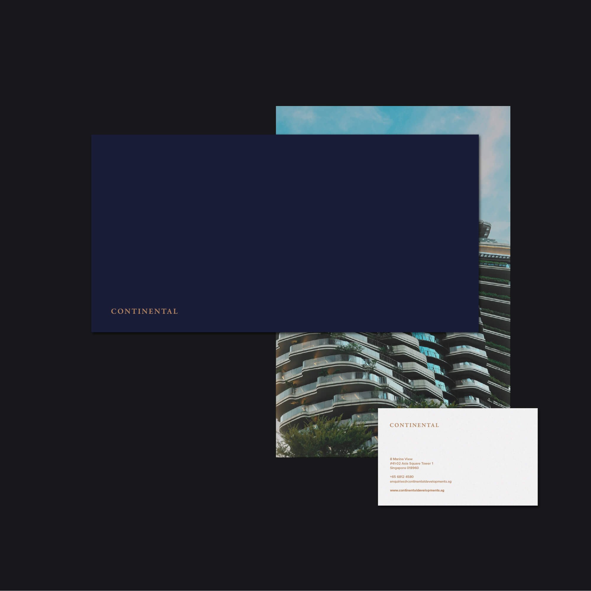
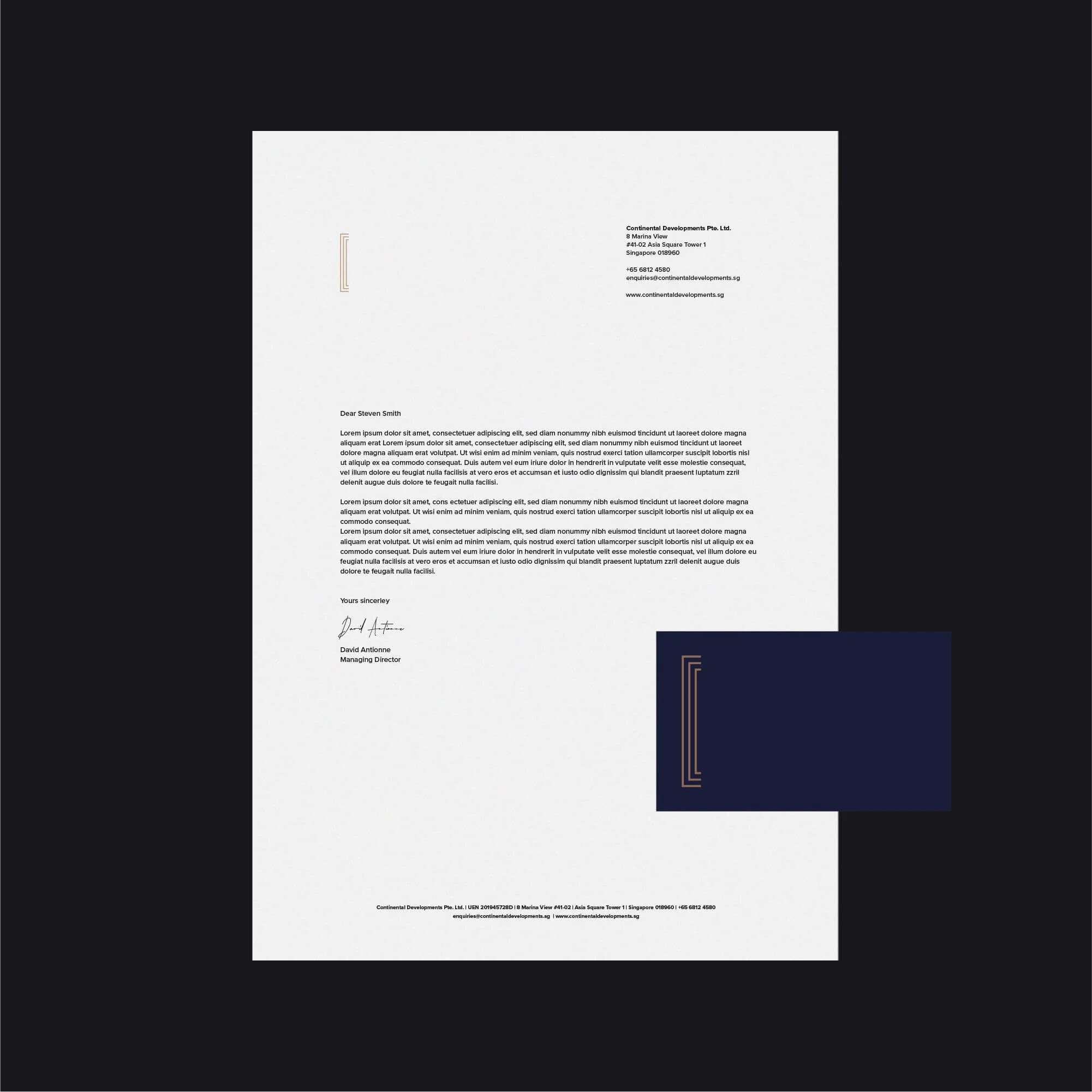
Stationery design
Printed materials
Development presentations
Investment documents
Digital brand applications
Property Developer Logo Design Approach
The logo was designed around structure and proportion.
The custom “C” monogram creates a distinctive visual asset while drawing subtly on the geometry and organisation associated with architecture and the built environment.
Rather than using a literal building or property symbol, the identity communicates the sector through its construction, spacing and overall visual character.
This gives Continental Developments a more ownable identity while allowing the mark to remain appropriate for premium real estate.
The logo was also designed to remain clear across different scales, from smaller digital applications to larger presentation and property-development materials.
This reflects the same principles I use across my professional logo design services, where clarity, recognisability and long-term practical use are considered throughout the design process.
Brand Identity Development
The wider identity was designed to reinforce the sense of precision established by the logo.
Typography, colour and layout were kept controlled and understated, allowing the monogram and wordmark to remain the primary points of recognition.
For a property developer, visual consistency is especially important because the brand may appear across investor communication, project presentations, stationery, marketing materials and development-related documentation.
The supporting visual system therefore needed enough flexibility to adapt to those different uses without losing its premium and architectural character.
This broader approach to brand identity design ensures the logo functions as part of a coherent visual system rather than as an isolated graphic.
Brand Applications
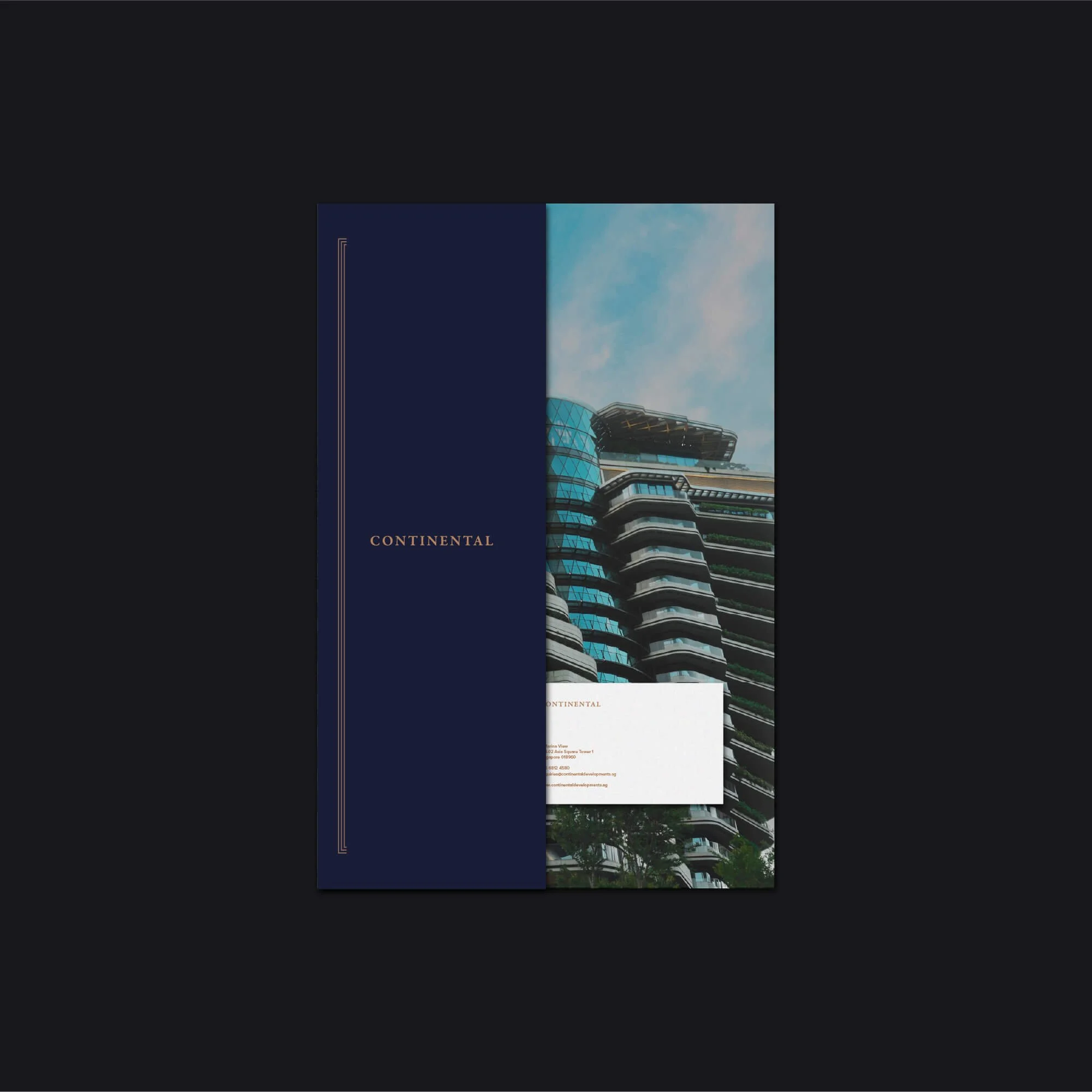
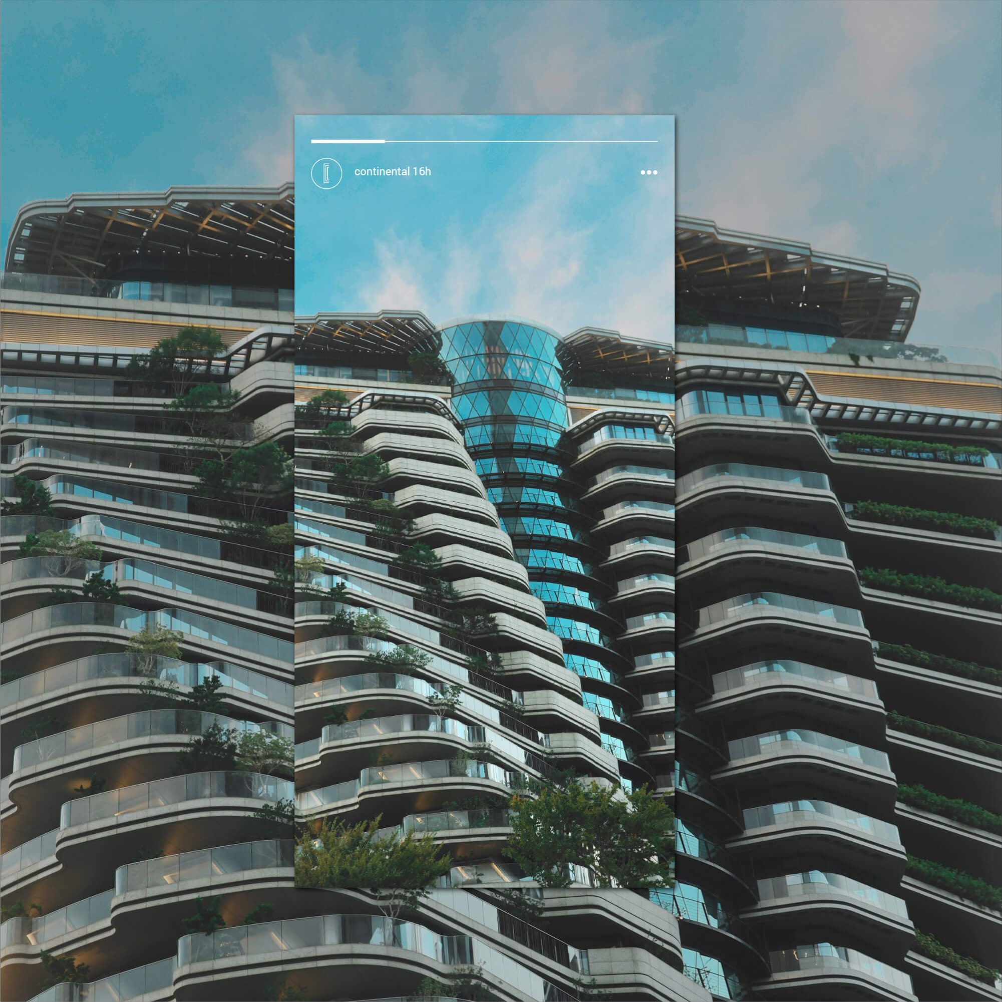
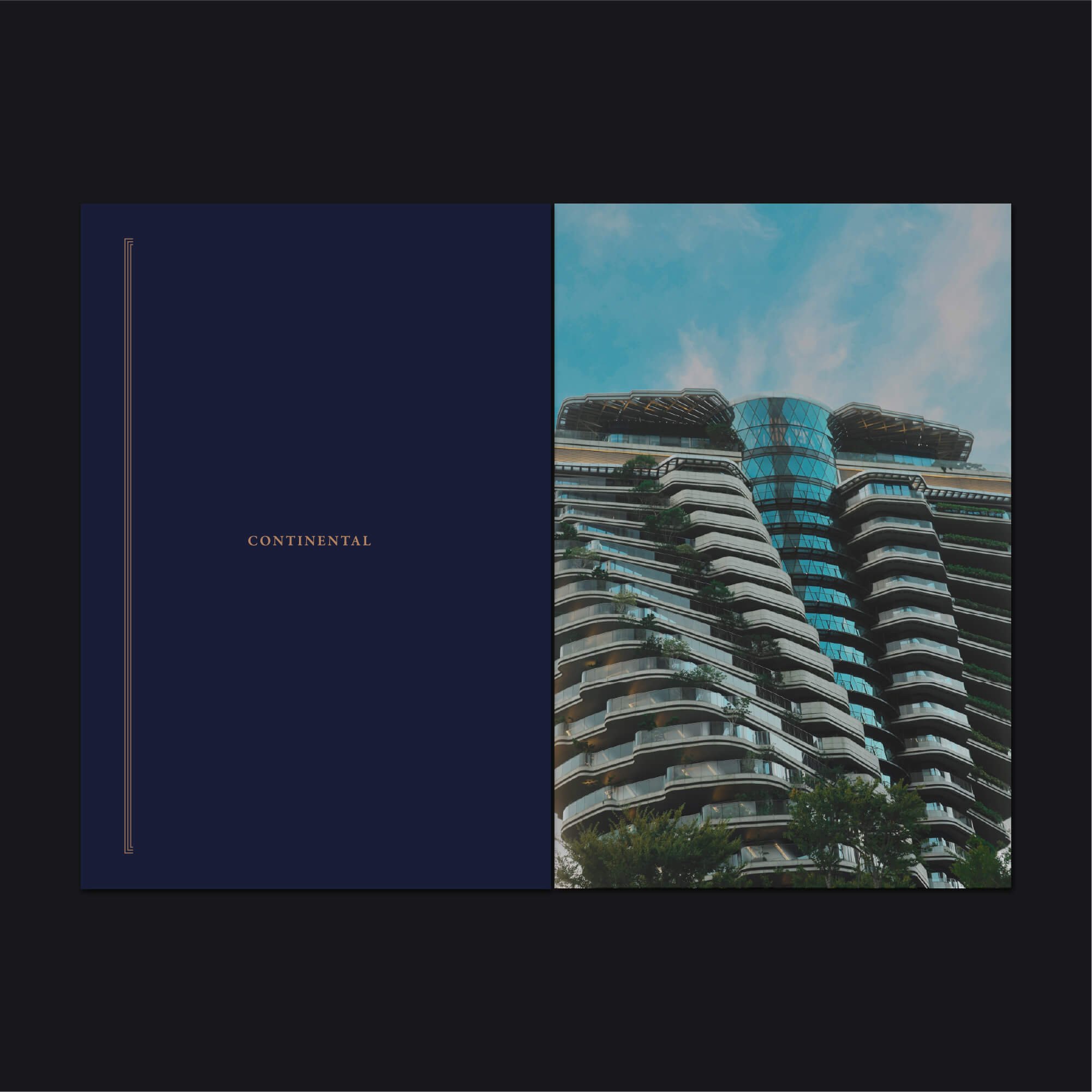
The identity was applied across selected property development touchpoints, including stationery, printed materials, digital communication, investment documents and development presentations.
Each application uses the same structured typography, spacing and visual hierarchy to maintain consistency across both physical and digital formats.
This allows Continental Developments to present itself with the same level of polish whether the brand appears in formal investment communication or wider property marketing.
The Outcome
The completed identity gives Continental Developments a stronger and more distinctive presence within the premium property development sector.
The custom monogram creates a recognisable central brand asset, while the structured typography and supporting visual system communicate precision, stability and professionalism.
The result is an identity that feels architectural and high-end without relying on predictable real estate imagery.
It also provides the business with a flexible visual foundation capable of supporting future developments, investment communication and wider brand growth.
Logo Design for Property Developers & Real Estate Brands
For property developers and real estate businesses, visual identity plays an important role in communicating quality, financial credibility and long-term value.
A strong property brand needs to feel appropriate to the developments it represents while still being distinctive enough to stand apart within a competitive market.
That does not require relying on literal property symbols.
Typography, geometry, proportion and a carefully developed brand mark can communicate architecture, structure and confidence in a more ownable way.
My work with property developers and real estate businesses focuses on creating identities that feel established, premium and flexible enough to work across investor communication, project marketing, presentations and wider development applications.
Start a Property Development Branding Project
If your property development or real estate business needs a new logo, refined identity or complete brand refresh, use the enquiry form below to share your requirements, budget and timeframe.