
Australian Real Estate Agency Logo Design & Brand Identity
Alluvial Property Group required a refined visual identity that could communicate trust, local knowledge and professionalism within the Australian property market. The identity was developed around a distinctive wordmark and an abstract alluvial symbol inspired by branching waterways, deposited land and the surrounding landscape. This created a meaningful connection to the company’s name and property focus without relying on predictable houses, rooftops or building imagery. The result is an elegant and flexible identity designed to work consistently across stationery, property marketing, digital platforms and wider brand communications.
Project Overview
Alluvial Property Group is an independent real estate agency specialising in residential property sales in Clunes, Victoria. Established by two local agents, the business is positioned around detailed local knowledge, straightforward advice and an informed understanding of the Clunes property market.
The project called for an identity that could establish the agency as a confident local presence while distinguishing it from larger, more conventional real estate businesses. It needed to feel considered and established, but also approachable enough to reflect the direct relationship Alluvial Property Group maintains with local sellers and buyers.
The name offered a strong conceptual foundation for the identity. Rather than treating it simply as a company name, the visual direction used the meaning of “alluvial” to connect the brand with land, movement and the natural processes that shape a landscape.
The Challenge
Real estate agency branding often relies on an established collection of visual shortcuts. Rooflines, houses, location pins and key symbols communicate the industry quickly, but their widespread use can make one agency difficult to distinguish from another.
For Alluvial Property Group, the identity needed to communicate its connection to property and place without adopting those familiar conventions. It also needed to balance two different qualities: the professionalism expected from an agency handling significant property transactions and the personal, locally informed character of an independent Clunes business.
The company name presented an additional typographic consideration. “Alluvial” needed to remain the dominant and memorable element, while “Property Group” had to establish the nature of the business without competing with the main wordmark.
The complete identity also needed to remain recognisable across a wide range of sizes and formats, including property advertising, printed stationery, digital profiles and other customer-facing communications.
The Solution
The final direction combines an abstract alluvial-inspired symbol with a carefully structured typographic lockup.
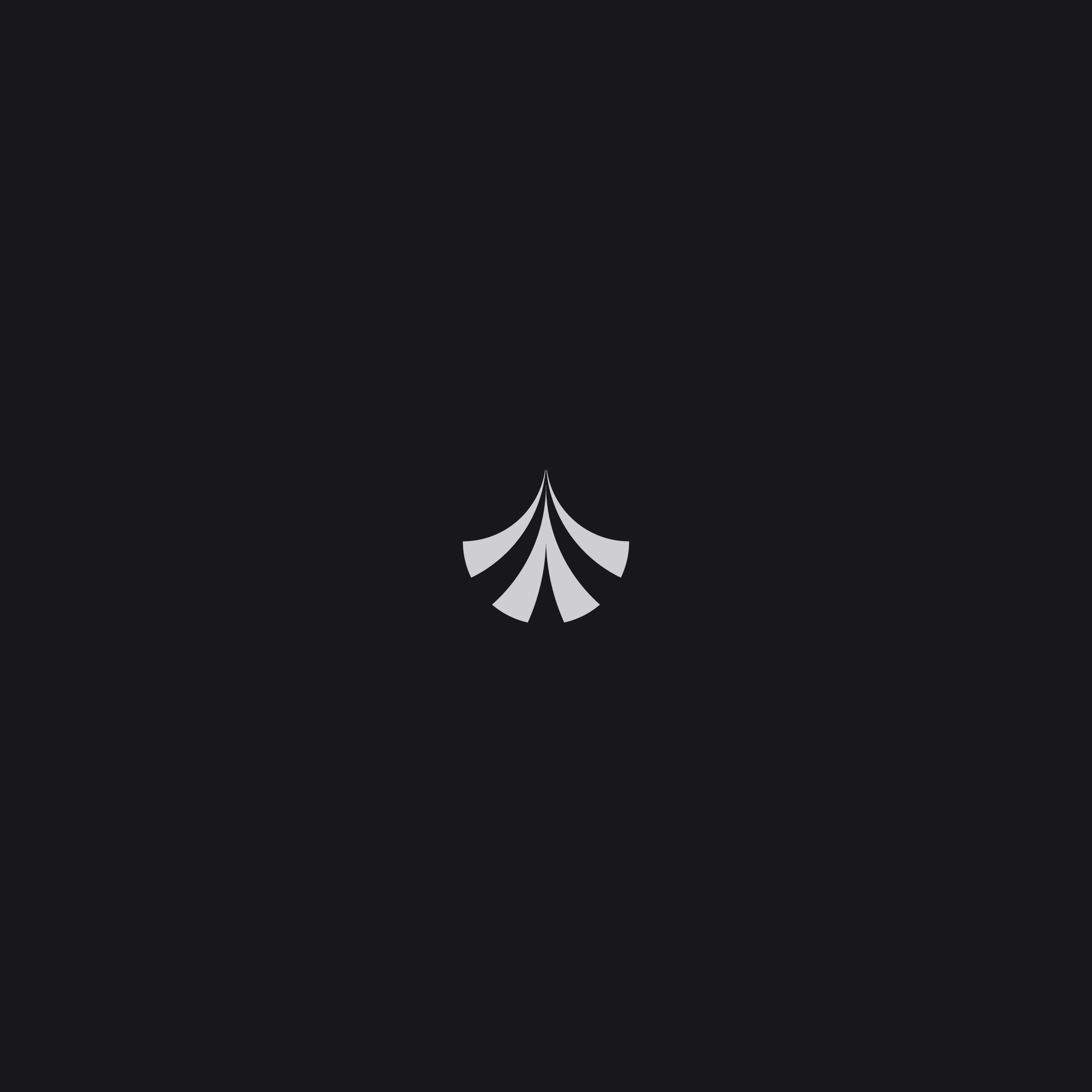
The standalone mark is formed from a series of shapes that spread outward from a central point. Its construction references the branching channels and fan-like deposits created as water moves across land. This provides a meaningful connection to the Alluvial name while remaining abstract enough to function as a distinctive property brand mark.
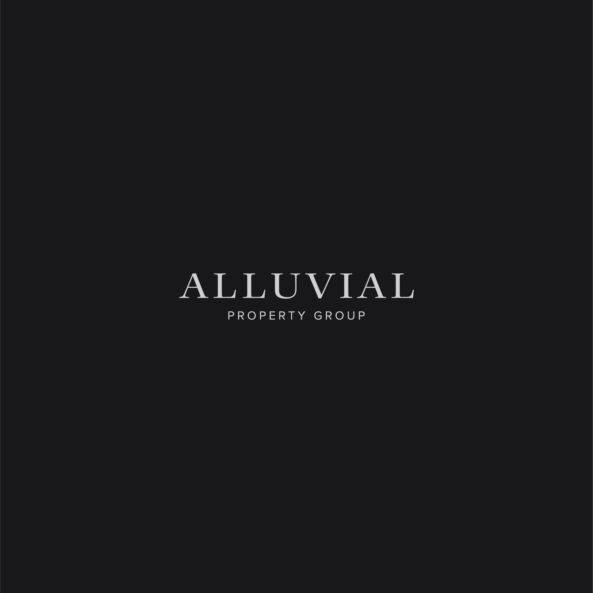
A serif wordmark gives the identity an established and composed character, while the widely spaced uppercase lettering creates clarity and presence. The smaller “Property Group” descriptor sits beneath it in a restrained sans-serif style, introducing a clear contrast while preserving the hierarchy of the company name.
The identity system included:
Abstract alluvial brand symbol
Primary Alluvial wordmark
Property Group descriptor
Combined horizontal logo lockup
Standalone brand-mark configuration
Monochrome logo variations
Typographic hierarchy
Business-card application
Print and digital logo formats
Logo Design Approach
The symbol was designed to communicate through association rather than literal illustration. Its repeated forms suggest the movement of water, the spreading shape of an alluvial fan and the layers of material through which land is gradually formed.
This relationship between name, landscape and property gives the mark relevance without limiting it to a single interpretation. At first glance, it works as a balanced geometric emblem. With greater familiarity, its connection to the meaning of Alluvial becomes more apparent, giving the identity an underlying idea that can support recognition over time.
The symmetry creates a sense of stability, while the outward movement of the individual elements introduces energy and progression. Careful control of the negative space allows the mark to remain clear when reproduced at smaller sizes or used independently from the wordmark.
The result avoids the visual conventions normally associated with real estate logo design while still feeling appropriate for a business built around land, location and property.
Wordmark and Typography
The Alluvial wordmark uses an elegant serif style to establish confidence and permanence. Its proportions and letter spacing were considered to give the name a strong horizontal presence without making the identity feel excessively decorative or traditional.
The difference in scale between “Alluvial” and “Property Group” creates an immediate hierarchy. The main name remains the memorable brand element, while the descriptor provides the necessary industry context in a quieter supporting role.
Pairing the serif wordmark with a compact sans-serif descriptor also gives the identity greater versatility. It creates enough contrast to separate the two levels of information while allowing them to operate as one cohesive logo.
This measured typographic treatment supports the agency’s positioning: knowledgeable and professional, but independent from the generic corporate appearance used by many larger real estate brands.
Visual Identity Development
The wider visual direction was kept restrained so the symbol and wordmark could remain the primary points of recognition.
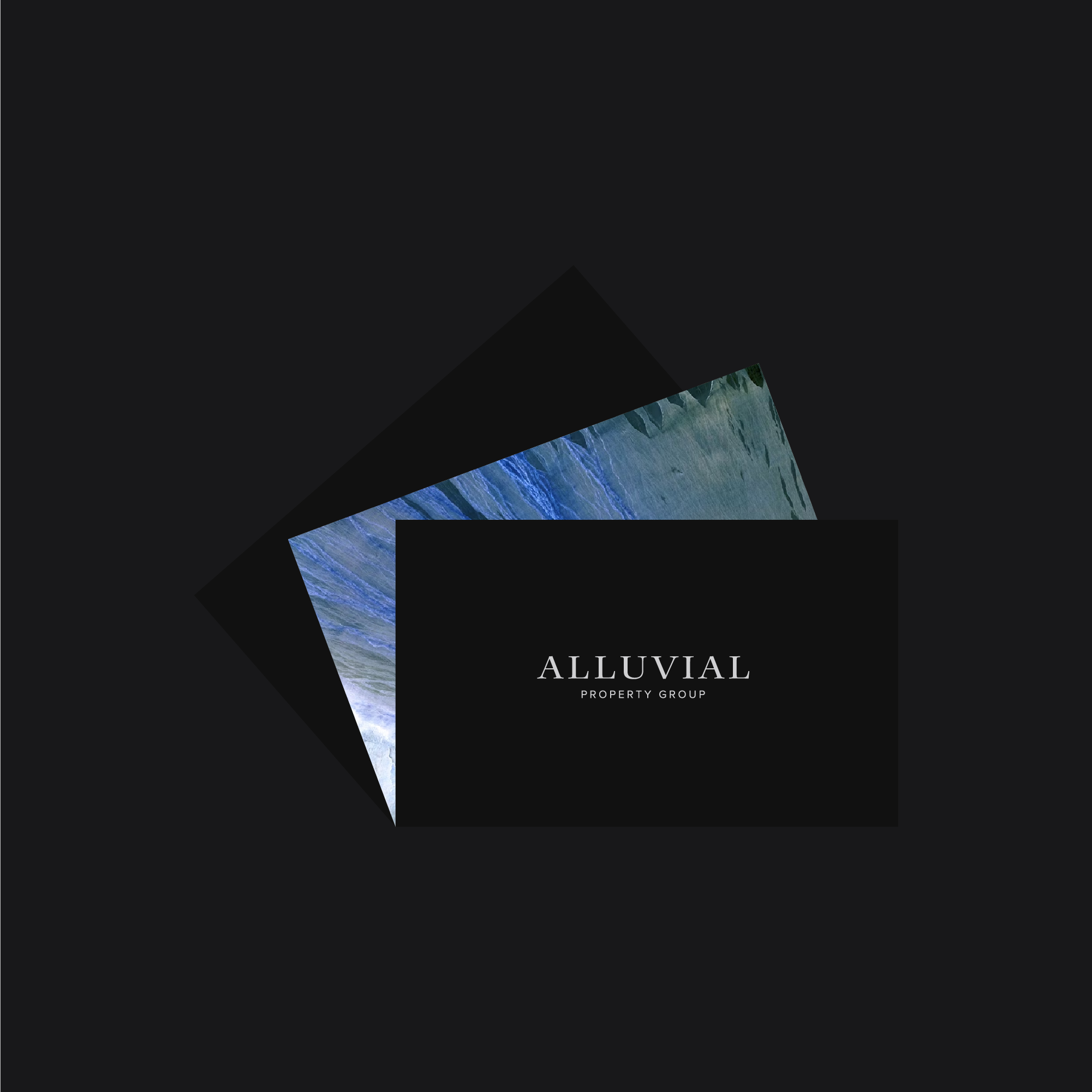
Dark backgrounds give the identity a confident, established appearance, while the light logo artwork provides strong contrast and reliable legibility. Textural imagery and cooler natural tones can introduce a connection to land and landscape without overwhelming the simplicity of the core identity.
The standalone symbol provides a compact asset for situations where the complete company name would be too detailed. The full lockup can then be used for formal introductions, property communications and larger branded applications where the business name and descriptor need to appear together.
This flexible relationship between the symbol and wordmark allows the identity to remain consistent without forcing the same logo configuration into every format.
Brand Applications
The identity was designed to translate clearly between printed and digital applications.On business cards, the full wordmark creates a refined client-facing presentation, while the standalone symbol can be used as a secondary graphic element. The compact mark is also suitable for social profiles, digital icons and other restricted spaces where the complete lockup would lose impact.For property marketing, the strong contrast and uncomplicated construction allow the logo to remain recognisable across listing materials, printed documents, signage and online communications. Each configuration retains the same visual character while adapting to the practical requirements of the format.The application system demonstrates how a relatively minimal collection of elements can create a cohesive and professional presence without depending on excessive decoration.
The Outcome
The completed identity gives Alluvial Property Group a distinctive visual foundation rooted in the meaning of its name and its connection to land.The abstract symbol provides a recognisable alternative to conventional real estate imagery, while the wordmark establishes the composed, credible character required within the property sector. Together, they create an identity that can represent the agency consistently across customer communications, property marketing and future applications.By drawing on the natural idea behind “alluvial,” the final design feels specific to the business rather than interchangeable with another real estate agency. It provides Alluvial Property Group with a clear and ownable brand asset capable of supporting its position within the Clunes property market.
Logo Design for Australian Real Estate Agencies
A professionally developed identity can help an independent real estate agency establish recognition and communicate its positioning before a prospective client makes contact.The most effective property identities do more than identify the industry. They reflect the agency’s location, character, audience and approach while remaining practical across property listings, boards, stationery, presentations, social media and digital advertising.My professional logo design services include custom wordmarks, brand symbols, monograms and wider visual identity systems for real estate agencies, property professionals and related businesses. Each identity is developed around the individual company, creating a more distinctive and credible alternative to generic property branding.
Explore More Logo Design Projects
Discover more custom logos, visual identities and brand systems created for businesses across a wide range of industries and international markets.
Start a Real Estate Agency Branding Project
If your real estate or property business needs a new logo, refined identity or complete brand refresh, use the enquiry form below to share your requirements, budget and timeframe.