Realtor Logo Design & Luxury Real Estate Brand Identity

Benge Redding required a refined visual identity that could communicate trust, sophistication and professionalism within the competitive luxury property market.

The identity was developed around a custom monogram, elegant typography and a restrained visual system designed to feel premium without relying on the predictable visual clichés commonly associated with real estate branding.

The result is a distinctive and flexible identity created to work consistently across stationery, digital platforms, property marketing and wider brand communications.

circle monogram logo design
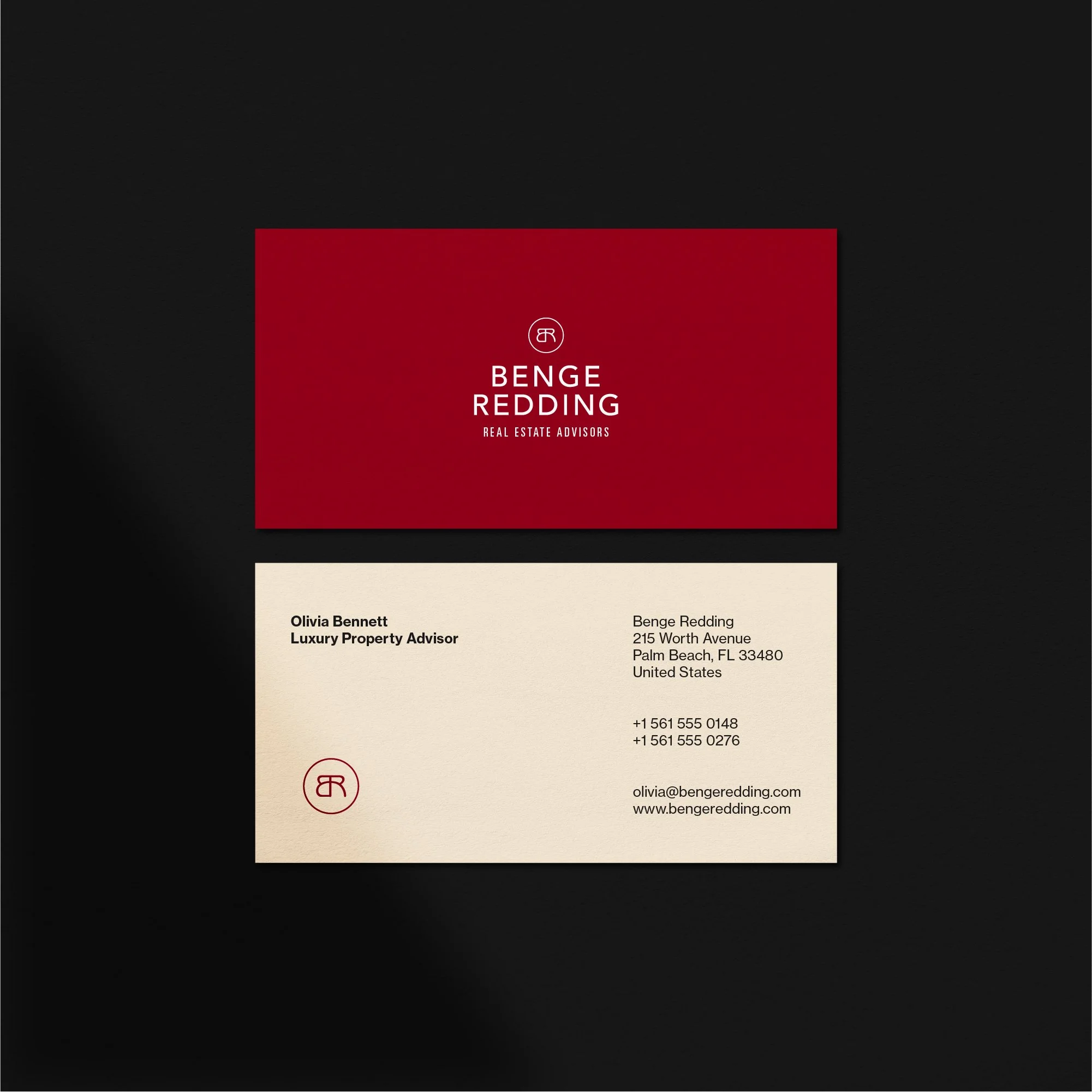
luxury stationery design
wordmark logo design
Benge Redding Sarasota realtor business card design
business cards design
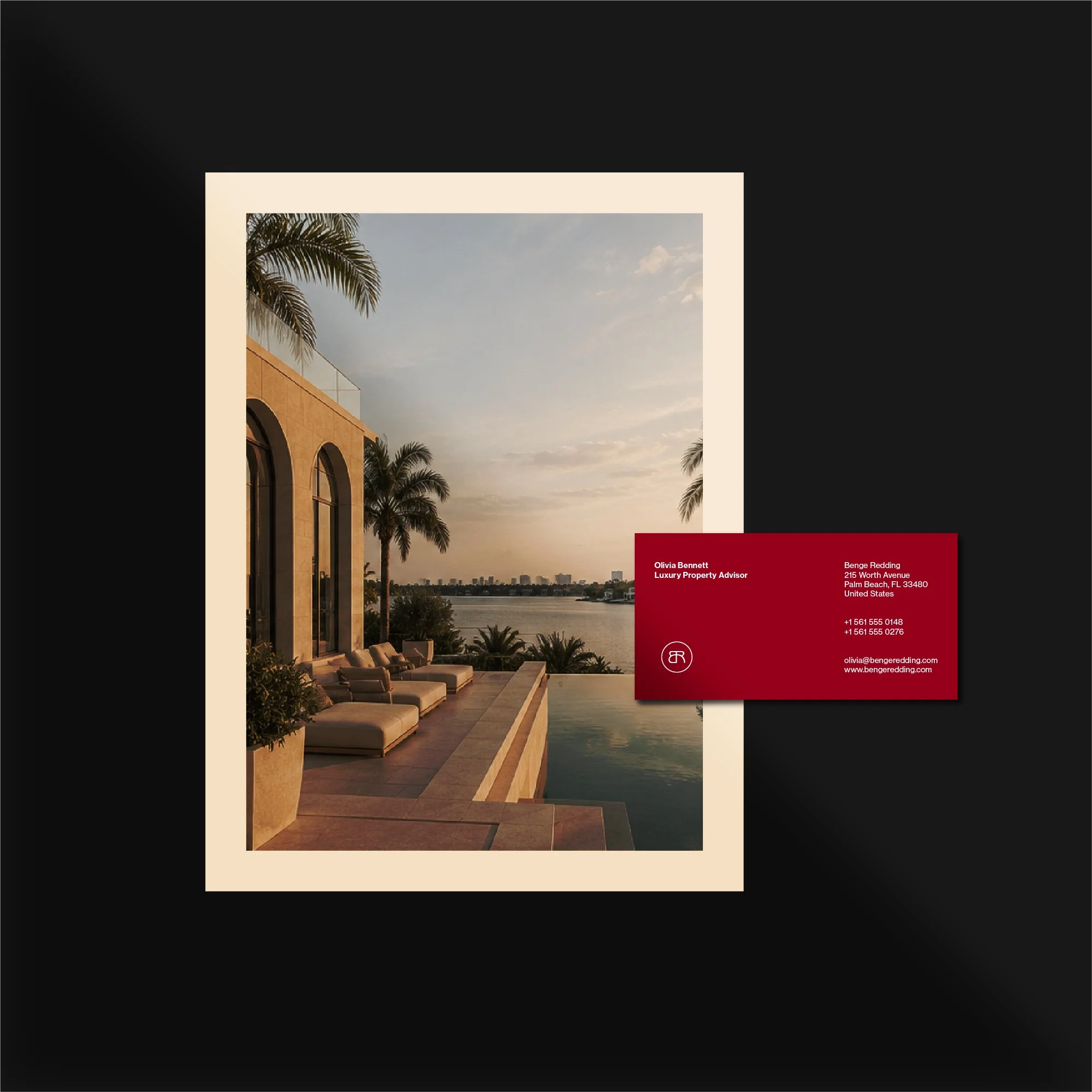
stationery design
real estate graphic design
Benge Redding Sarasota realtor graphic design
real estate graphic design

Project Overview

Benge Redding is a luxury real estate business operating in a market where credibility, presentation and first impressions are especially important.

The brief was to create a visual identity that felt established, confident and premium while remaining simple enough to work across a wide range of applications.

Rather than relying on generic property symbols or familiar real estate clichés, the direction focused on a more distinctive identity built around typography, proportion and a custom brand mark.

The aim was to give the business a visual presence that felt refined and professional while remaining flexible enough for property marketing, stationery, digital platforms and future brand applications.

The Challenge

Luxury real estate branding needs to communicate professionalism and trust immediately, but many businesses within the sector rely on similar visual conventions.

House icons, rooflines, keys, columns and overly decorative typography are common, which can make individual brands difficult to distinguish from one another.

The challenge was to create an identity that felt appropriate for the luxury property market while avoiding those predictable visual cues.

The logo also needed to remain clear and recognisable across very different applications, from small digital formats and social profiles to printed collateral, property marketing and signage.

The Solution

The final identity was built around a custom BR monogram supported by refined typography and a restrained visual system.

The monogram provides a compact and recognisable brand mark that can work independently from the full wordmark, while the primary logo creates a more formal presentation for larger applications.

A controlled colour palette and supporting layout system were used to reinforce the premium positioning without allowing the identity to become overly decorative.

The final brand system included:

  • Custom BR monogram

  • Primary wordmark

  • Secondary logo configurations

  • Colour palette

  • Typography direction

  • Stationery applications

  • Marketing collateral

  • Digital brand assets

Logo Design Approach

The logo was designed to balance clarity with character.

The custom BR monogram uses the initials as a central visual device, creating a recognisable symbol that remains simple enough to reproduce clearly at small sizes.

Proportion, spacing and typography were refined carefully so the identity feels confident and established rather than overly stylised.

The aim was to create a logo system that could remain effective over time, rather than depending on short-lived luxury branding trends.

This approach reflects the same principles I use across my professional logo design services, where recognisability, flexibility and long-term use are considered from the beginning of the project.

Brand Identity Development

The wider identity was designed to support the logo rather than compete with it.

Typography, colour and layout were kept controlled so the brand could maintain a consistent premium appearance across different applications.

The identity needed enough flexibility to work across client-facing materials, property marketing and digital channels while still feeling like part of the same visual system.

This broader approach is an important part of brand identity design, where the logo becomes one element within a more complete and consistent visual language.

Brand Applications

The final identity was applied across a range of physical and digital touchpoints to show how the system could work consistently in real-world use.

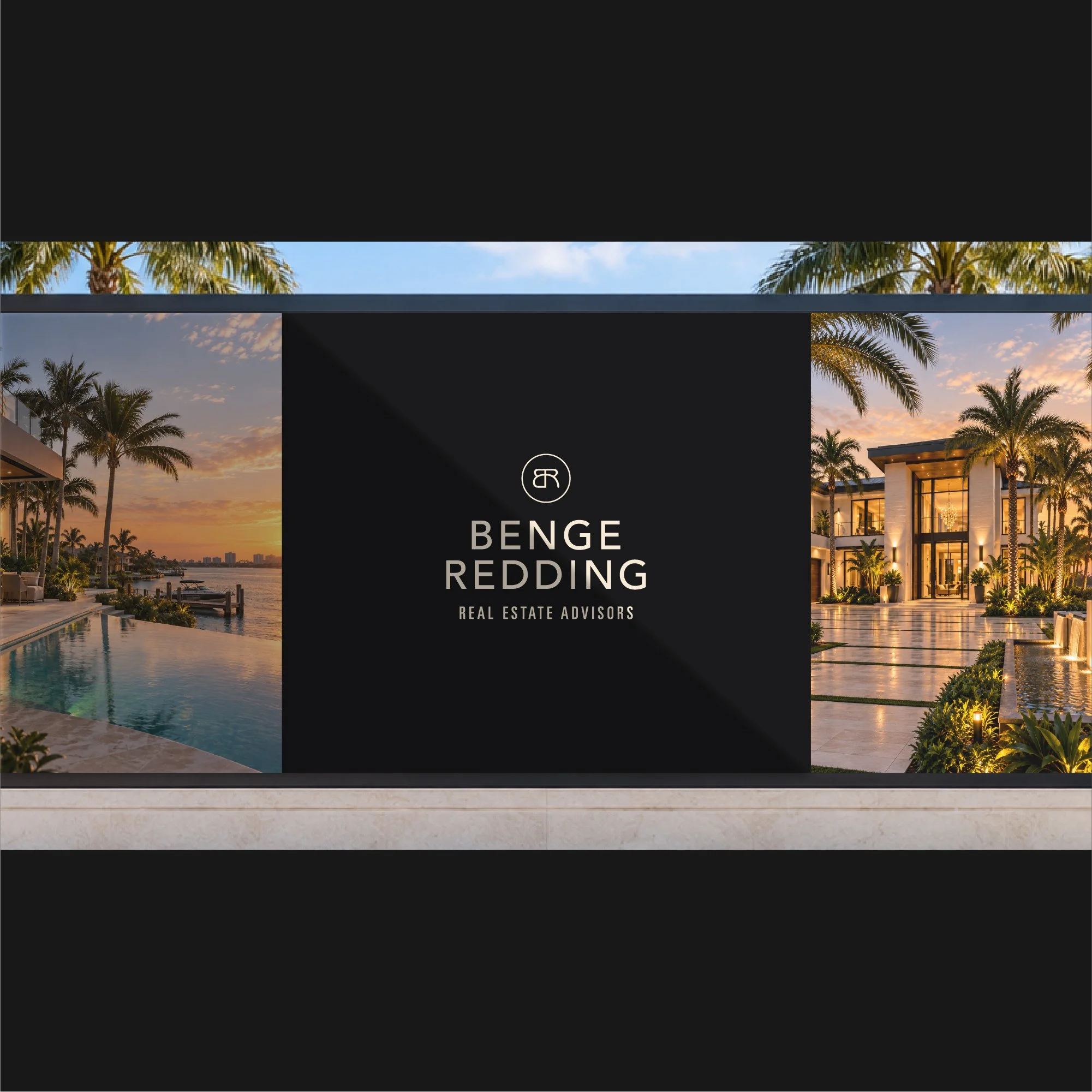
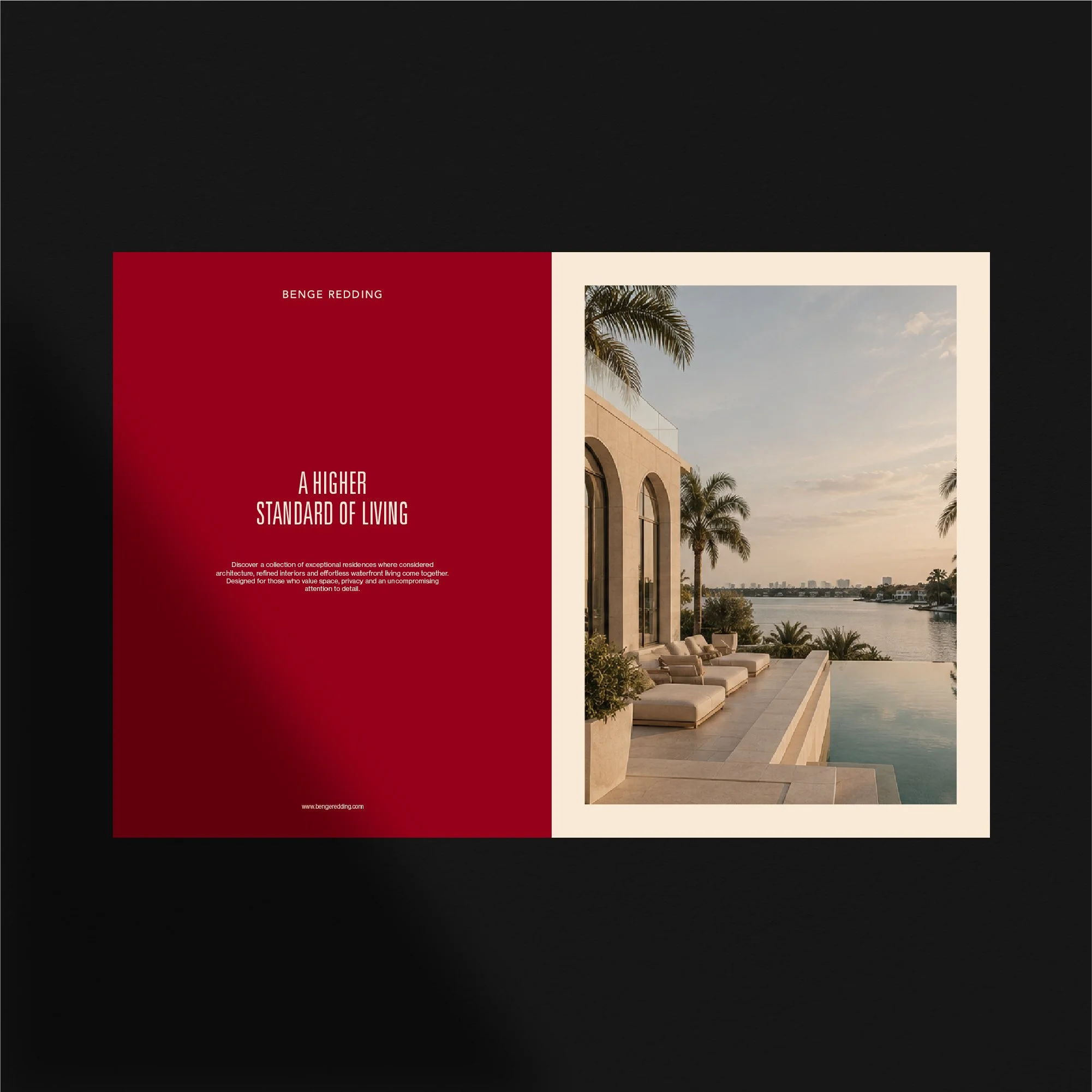
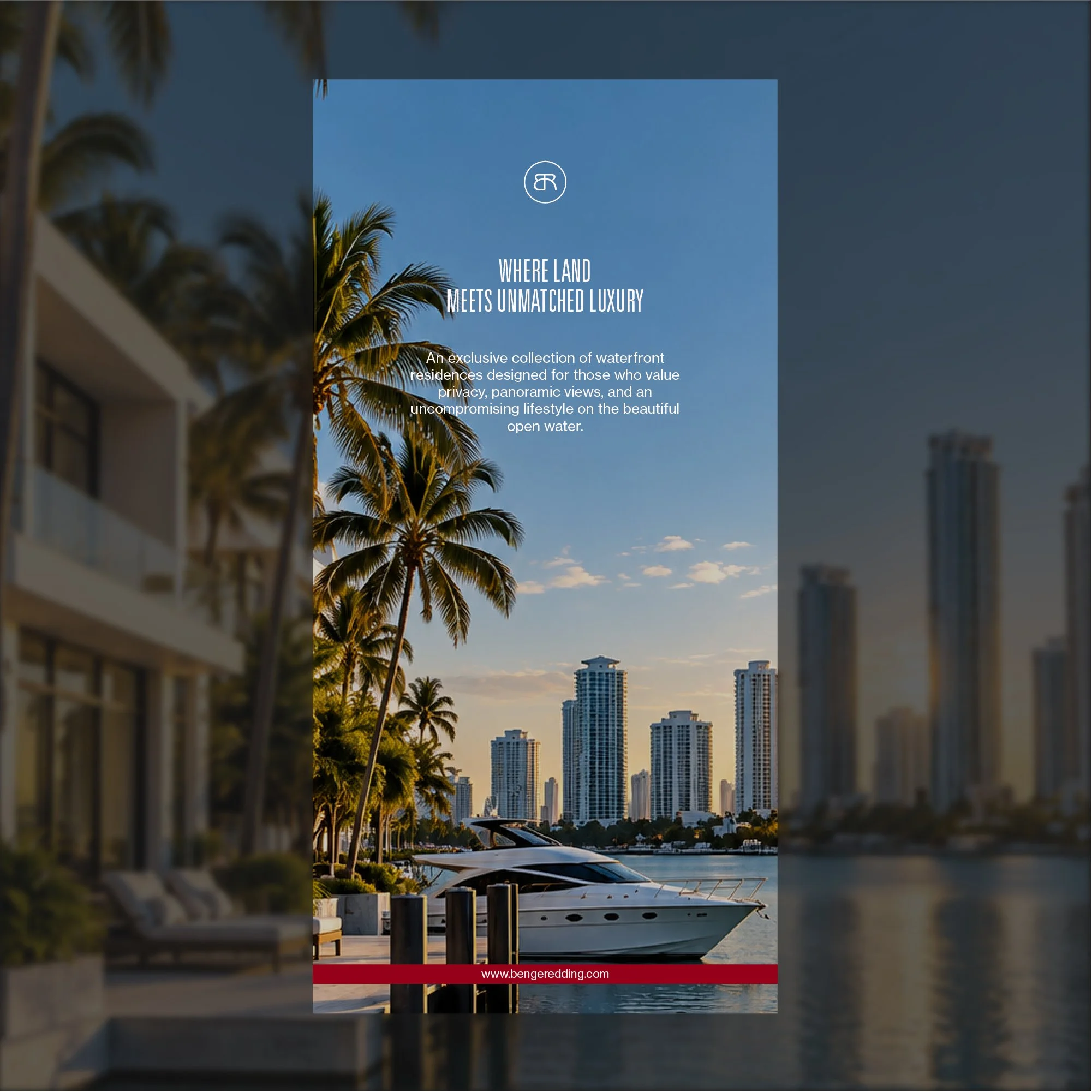
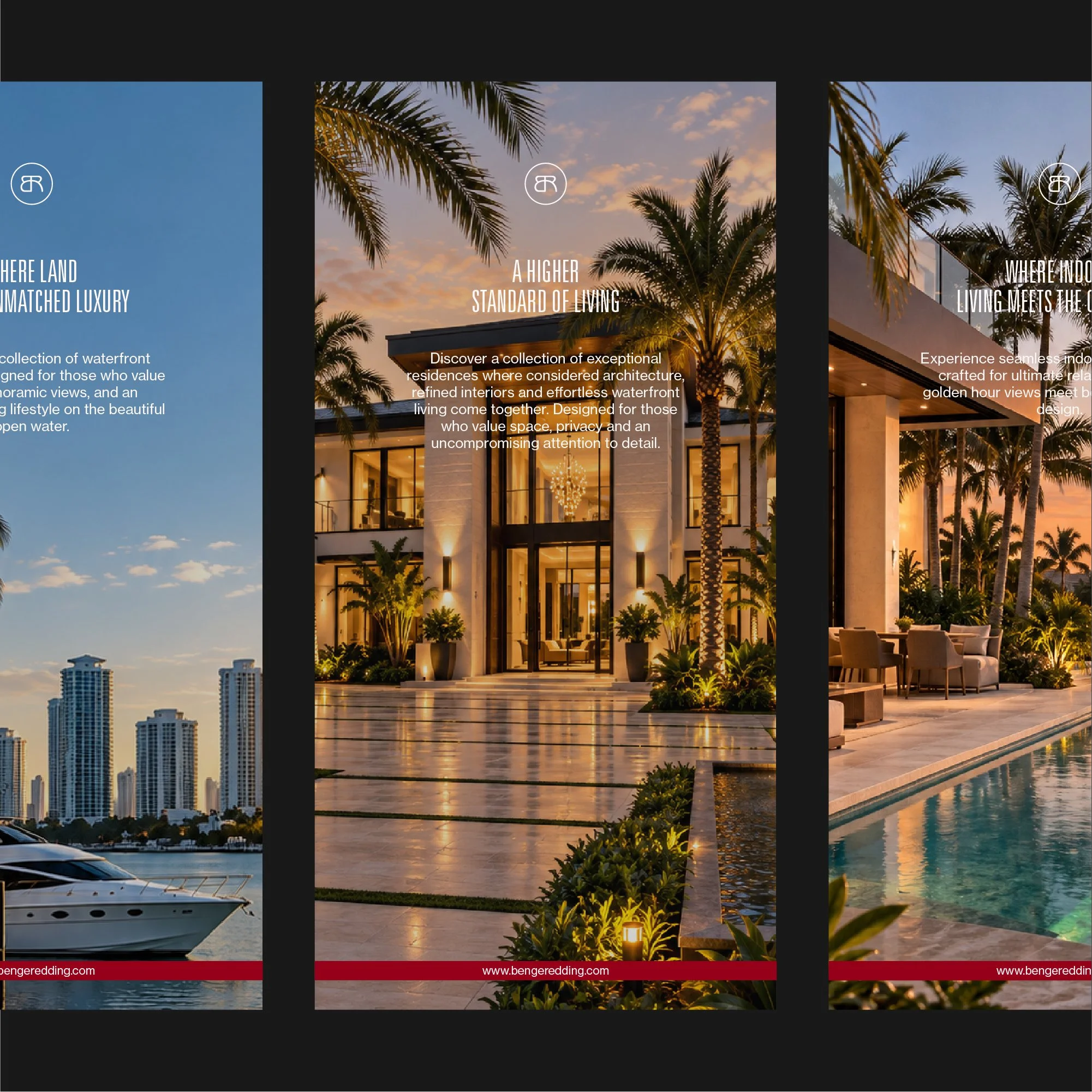
Applications included stationery, printed collateral, property marketing materials and digital brand assets, with each format designed to maintain the same sense of refinement and professionalism.

These applications helped demonstrate the flexibility of the logo system, typography and colour palette while keeping the overall identity cohesive across different environments.

The Outcome

The completed identity gave Benge Redding a more distinctive and cohesive visual presence within the luxury real estate market.

The custom monogram created a recognisable brand asset, while the wider logo system provided the flexibility needed for both formal and compact applications.

The result is a visual identity that feels professional, established and appropriate for a premium property business without relying on the generic visual conventions commonly seen within the sector.

The final system also provides a stronger foundation for future marketing, allowing the brand to remain consistent as it is applied across new digital and physical touchpoints.

Luxury Real Estate Branding

For real estate professionals and property businesses, visual identity plays an important role in establishing credibility before a client ever makes contact.

A strong identity can help communicate experience, positioning and the level of service being offered, while creating greater consistency across property listings, presentations, signage, social media and printed materials.

My work with property and real estate businesses focuses on creating identities that feel credible and distinctive without becoming predictable or relying on the same visual clichés used throughout the sector.

For premium and luxury businesses in particular, the identity needs to feel considered at every touchpoint. Typography, proportion, colour and application all contribute to how the brand is perceived and whether it feels genuinely established.

Start a Luxury Real Estate Branding Project

If your real estate or property business needs a new logo, refined identity or complete brand refresh, use the enquiry form below to share your requirements, budget and timeframe.