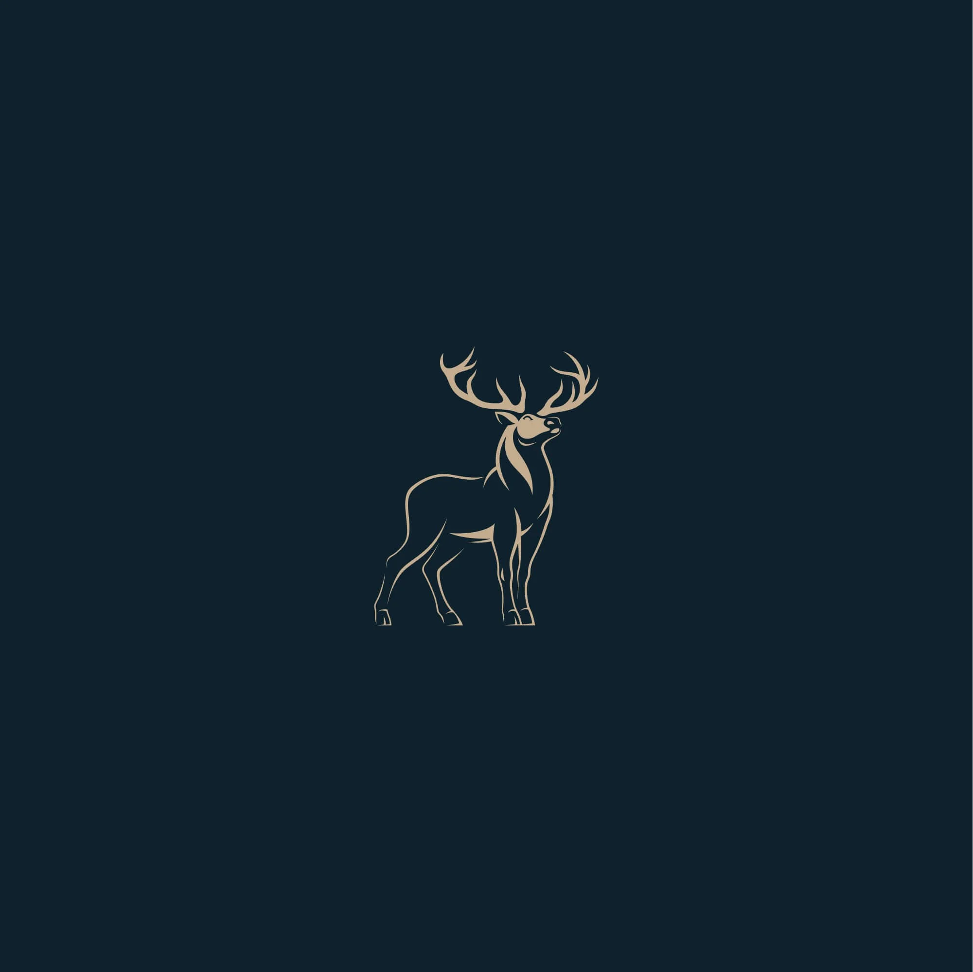
Accounting Firm Logo Design
AGN Highlands is a Scottish accountancy firm serving individuals and businesses across the Highlands and wider UK. The logo design and brand identity were created to reflect trust, responsibility, and measured financial guidance, translating the firm’s professional values into a disciplined visual system built around clarity, confidence, and long-term client relationships.
Accounting Firm Brand Identity
Project Overview
AGN Highlands required an accounting firm brand identity built around clarity, trust, and professionalism. The aim was to create a visual system that communicates reliability and structure while maintaining a refined, contemporary feel suited to a modern financial services business.
The identity was developed to support long-term client relationships, helping the firm present itself with confidence, consistency, and credibility across every brand touchpoint.
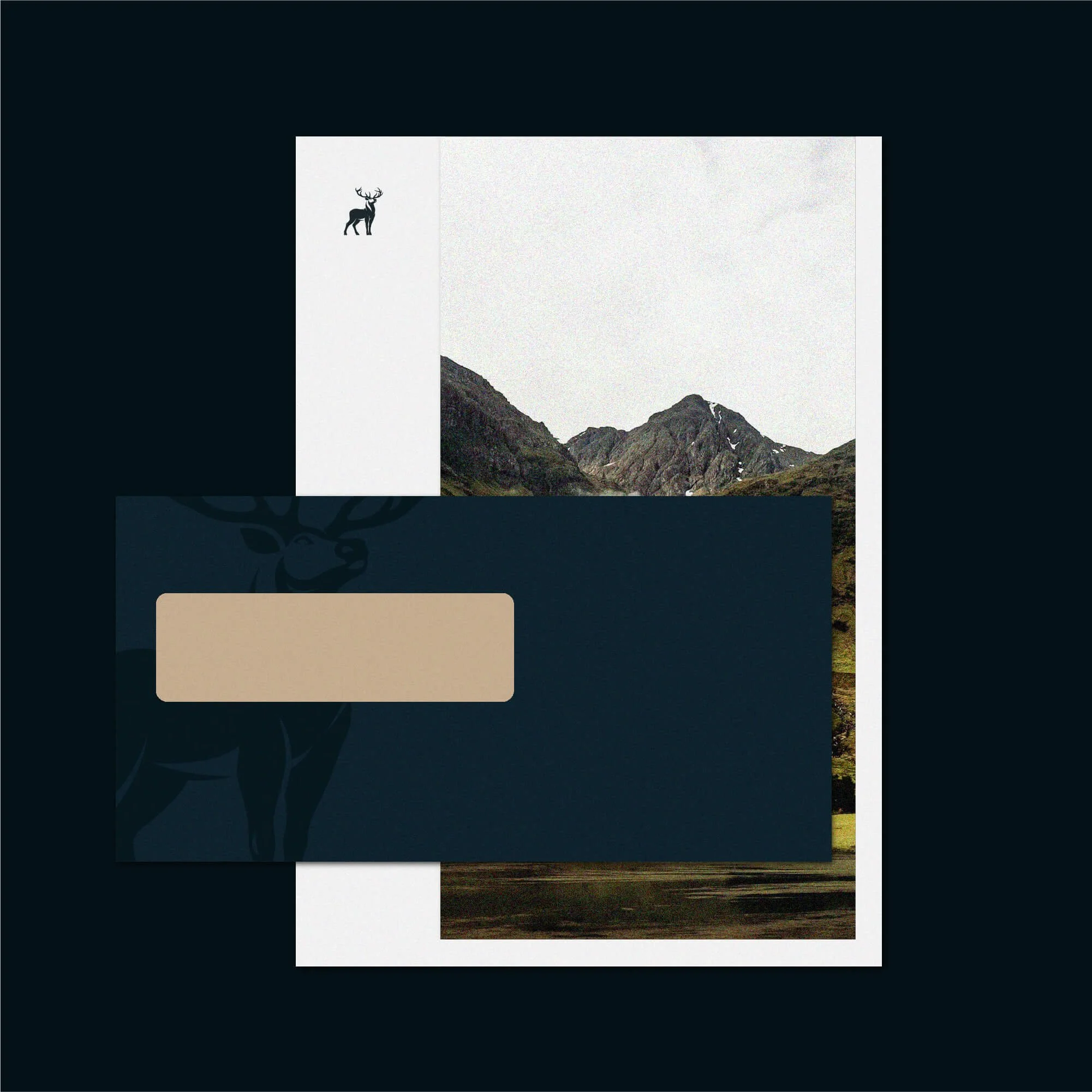
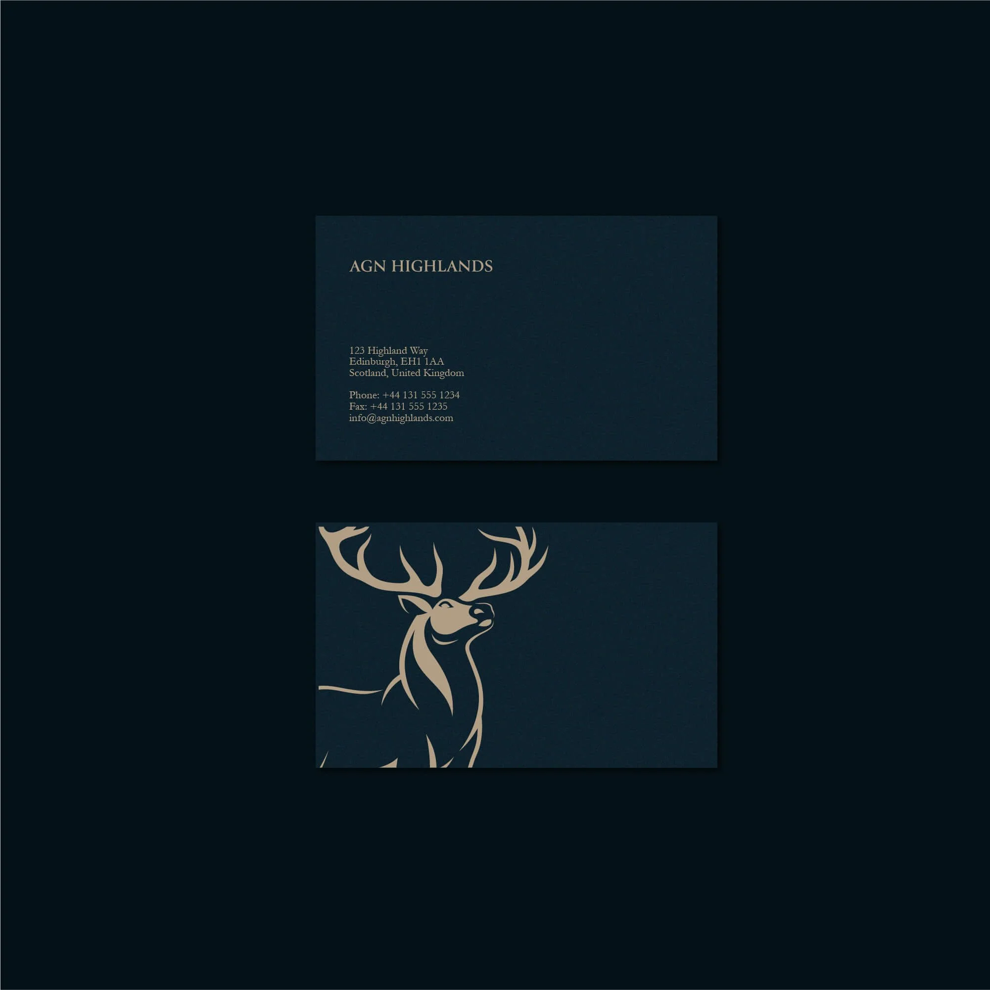
Accounting Logo Design Approach
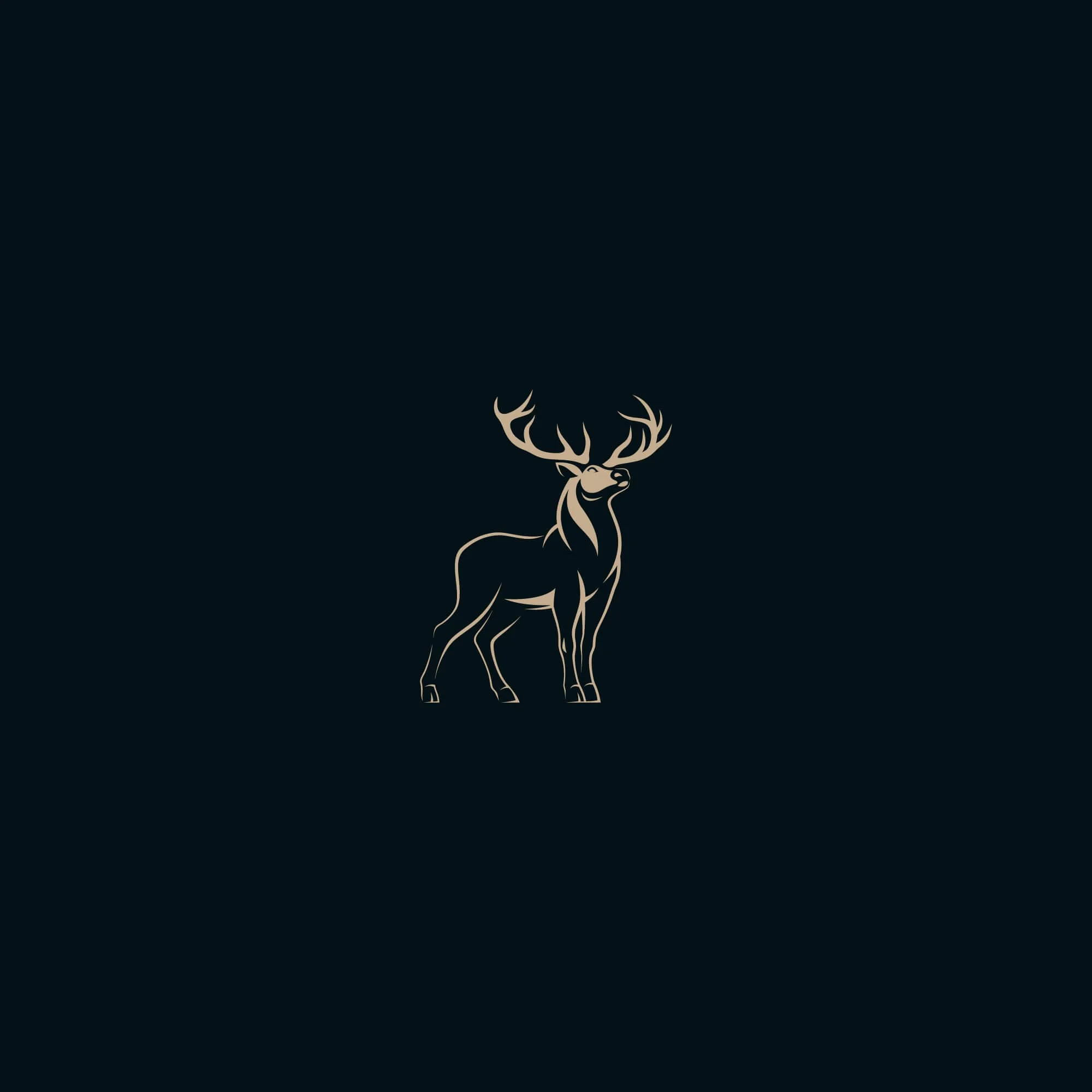
The logo design combines a distinctive emblem with a structured typographic system, creating a mark that feels balanced, dependable, and professional.
A clean and disciplined visual language was used throughout the identity, with careful attention to proportion, spacing, and typography. This helps reinforce a sense of precision and measured decision-making, qualities that are essential within accounting and financial services.
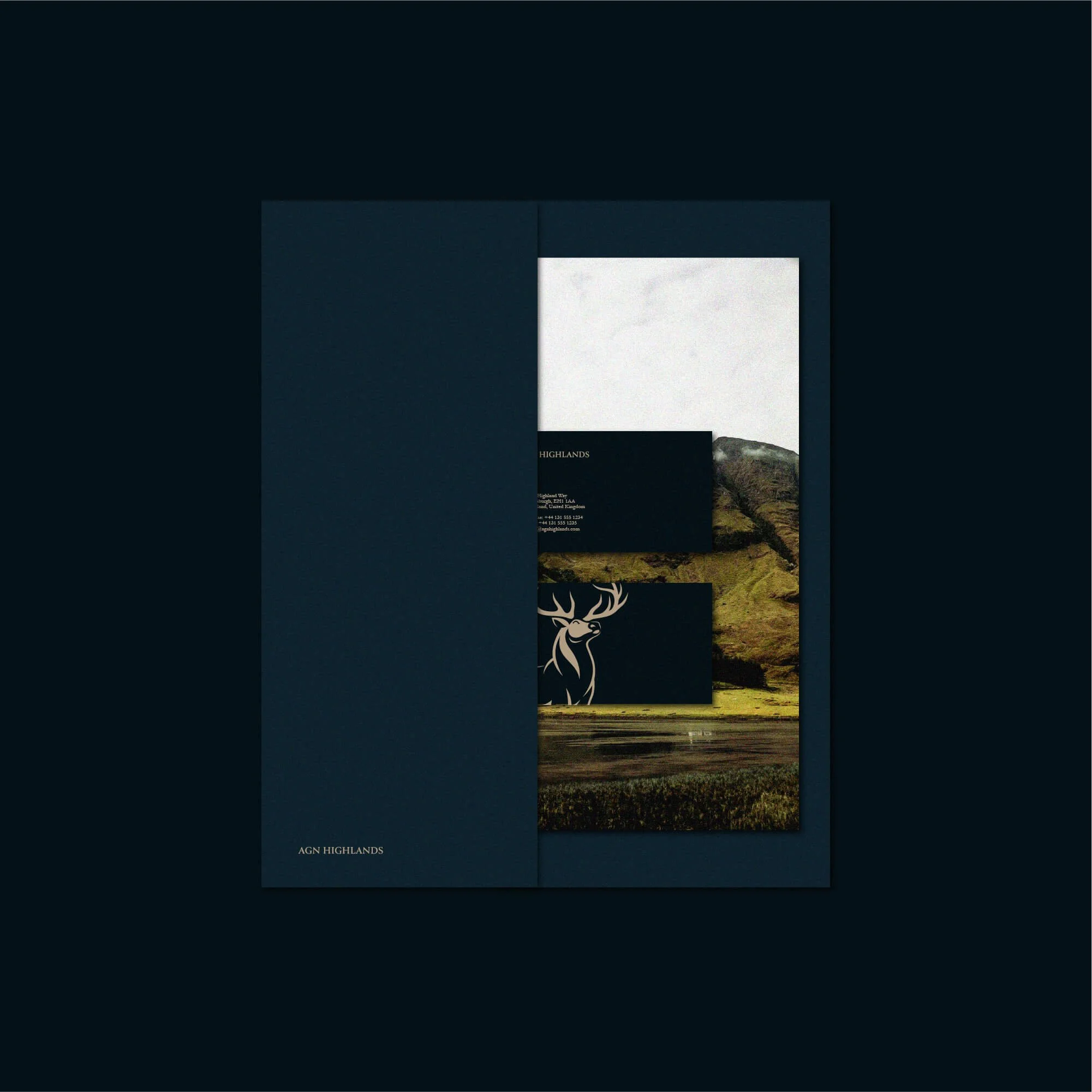
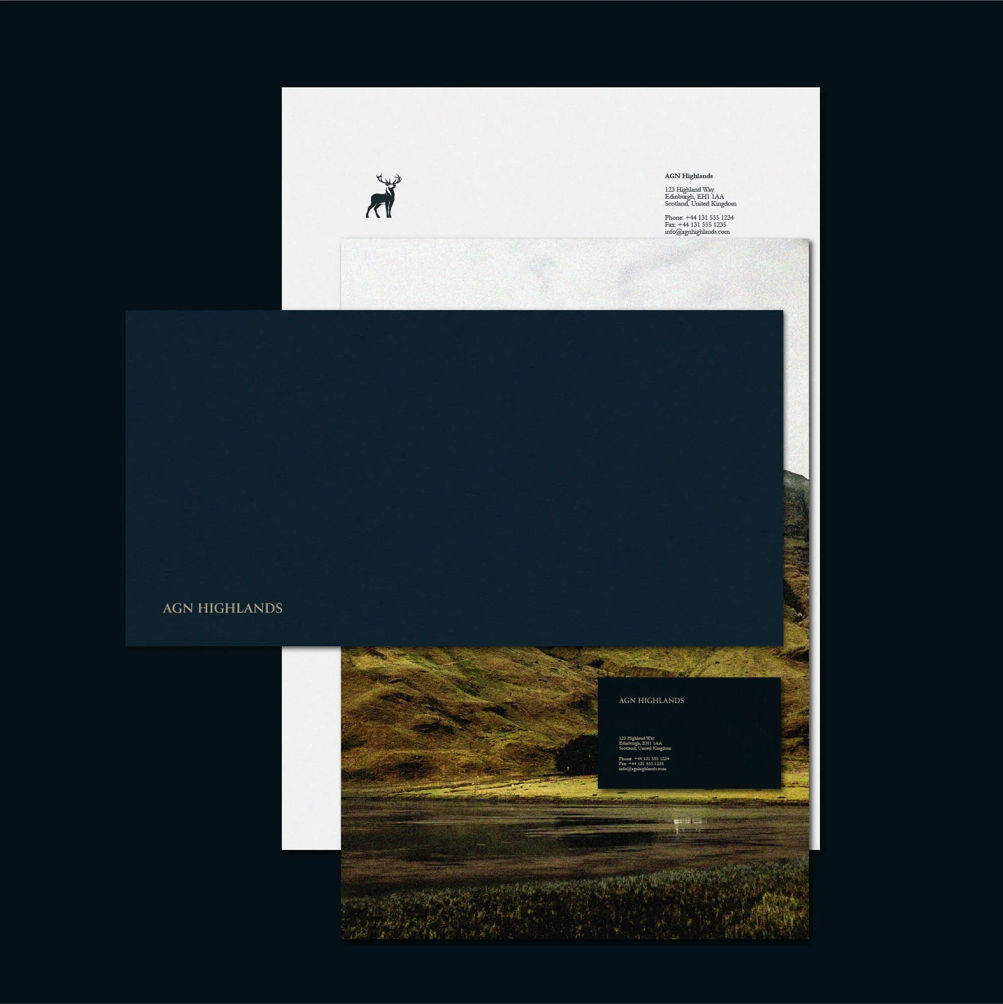
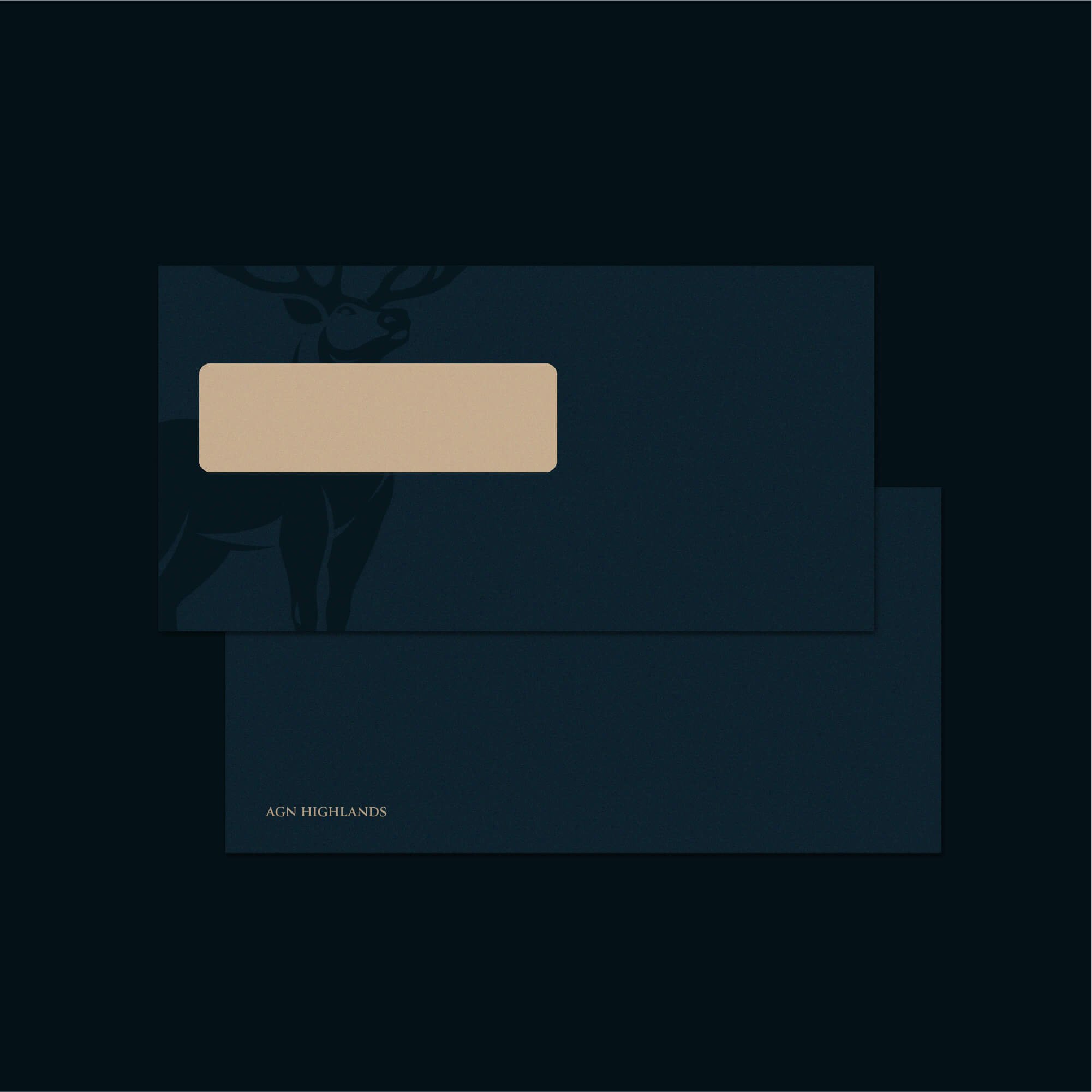
Brand Applications for Financial Services
The visual identity was applied across selected brand touchpoints, including stationery, digital materials, client-facing documents, and wider business communications.
Each application supports a cohesive and recognisable brand presence, helping AGN Highlands maintain clarity across both print and digital environments. The system was designed to feel consistent, practical, and professional in everyday use.
Logo Design for Accounting and Financial Brands
Logo design for accounting firms needs to communicate trust, clarity, and structure from the first impression. The identity has to feel credible and professional while remaining simple enough to work across documents, websites, reports, and client communications.
For AGN Highlands, the final brand identity creates a disciplined and dependable visual system built around professionalism, long-term trust, and clear financial guidance.
Explore more logo design and brand identity projects to see how each identity is applied across different industries and brand contexts.
Have a Project in Mind?
For logo design, brand identity, or visual identity projects, get in touch to discuss your brief.