Firearms Restoration Logo Design
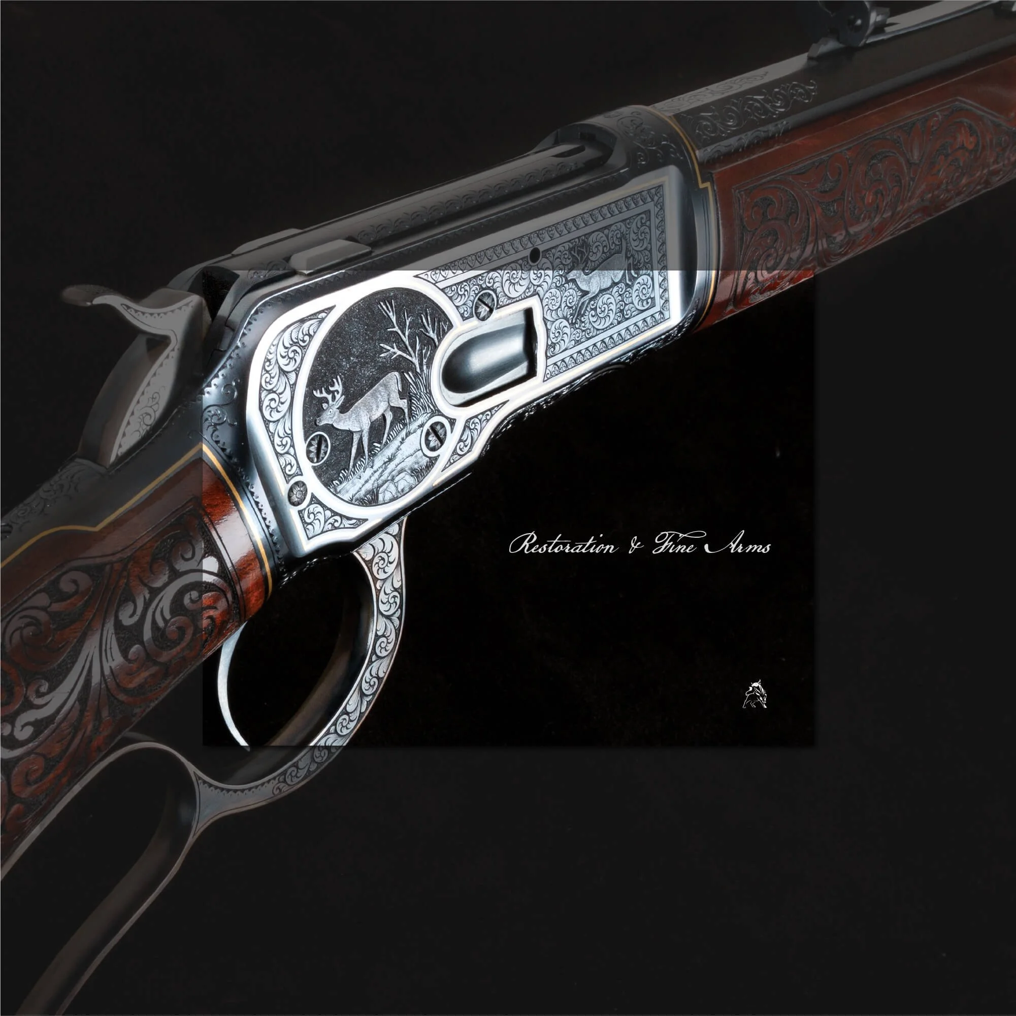
Turnbull Restoration is known for the restoration and preservation of historic American firearms. This brand identity concept explores a refined firearms restoration logo design created to reflect craftsmanship, precision, heritage, and traditional gunsmithing. The identity combines a distinctive logo mark with restrained typography and selected brand applications, creating a visual system that feels strong, authentic, and built around specialist restoration work.


Firearms Restoration Brand Identity
Project Overview
Turnbull Restoration is known for the preservation and restoration of historic American firearms, requiring a brand identity that reflects precision, heritage, and craftsmanship. The aim was to create a visual system that communicates trust, expertise, and authenticity while aligning with the traditional values of specialist restoration work.
The identity needed to feel refined and authoritative, balancing historical influence with a clean and controlled presentation suitable for modern brand applications.
Firearms Restoration Logo Design Approach
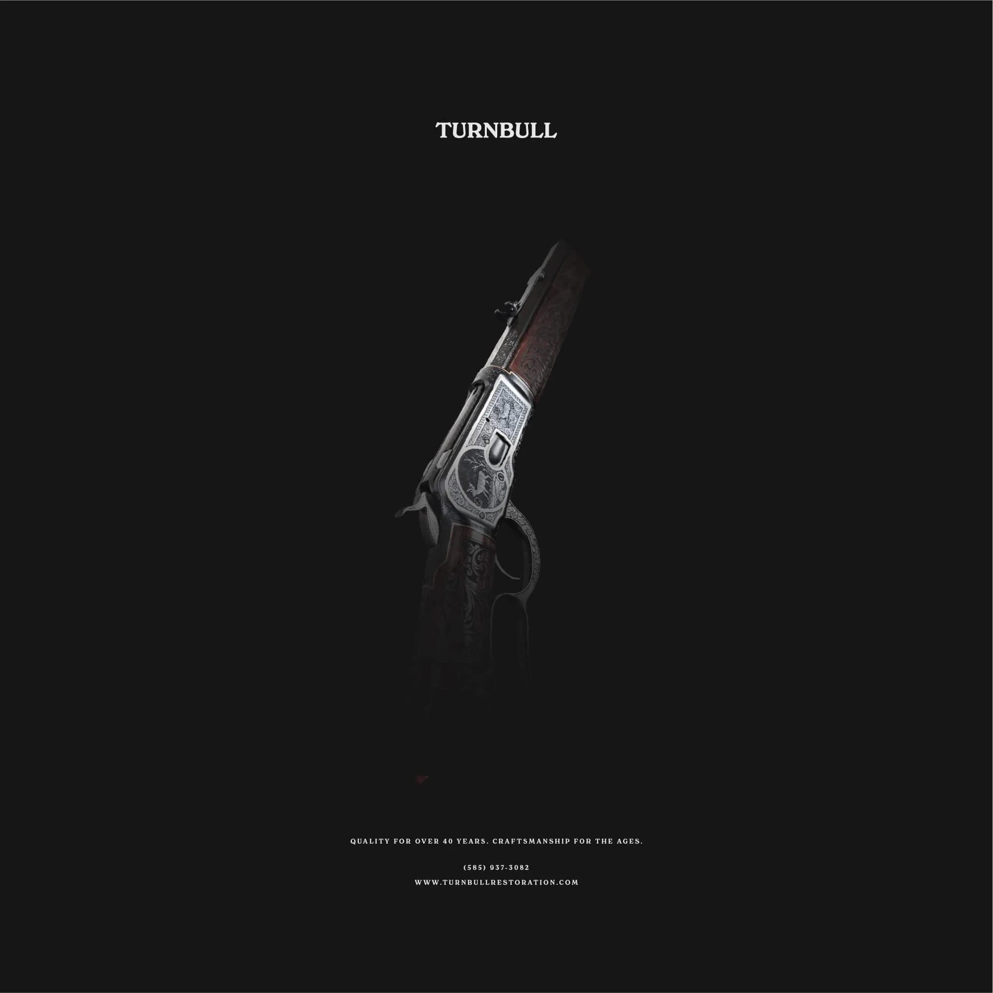
The logo design combines a distinctive emblem with a structured typographic system, creating a mark that feels established, recognisable, and built around craftsmanship.
The visual language draws from traditional gunsmithing and heritage restoration while maintaining clarity and modern legibility. Careful attention was given to proportion, detail, and balance, helping the identity communicate strength, precision, and longevity.
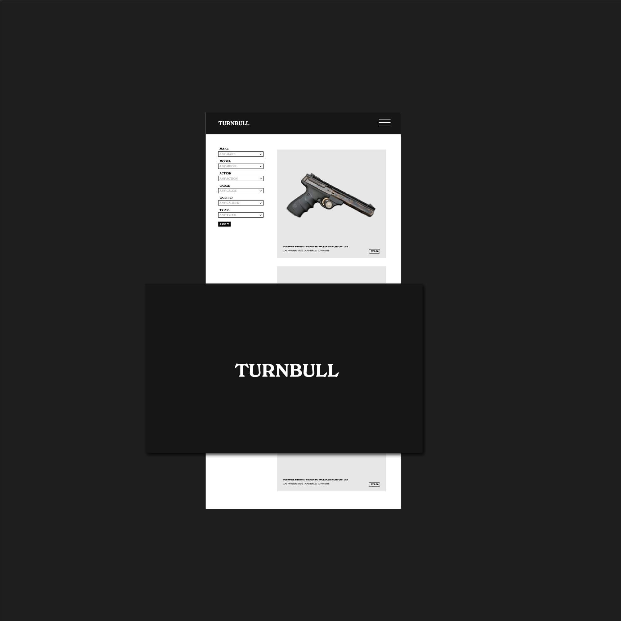
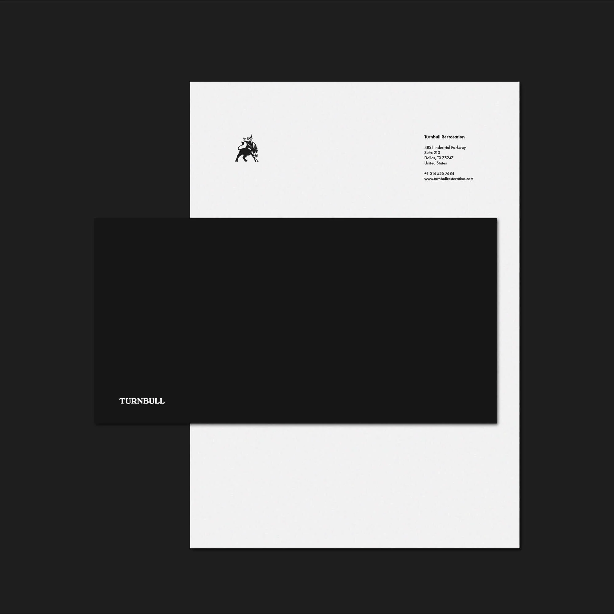
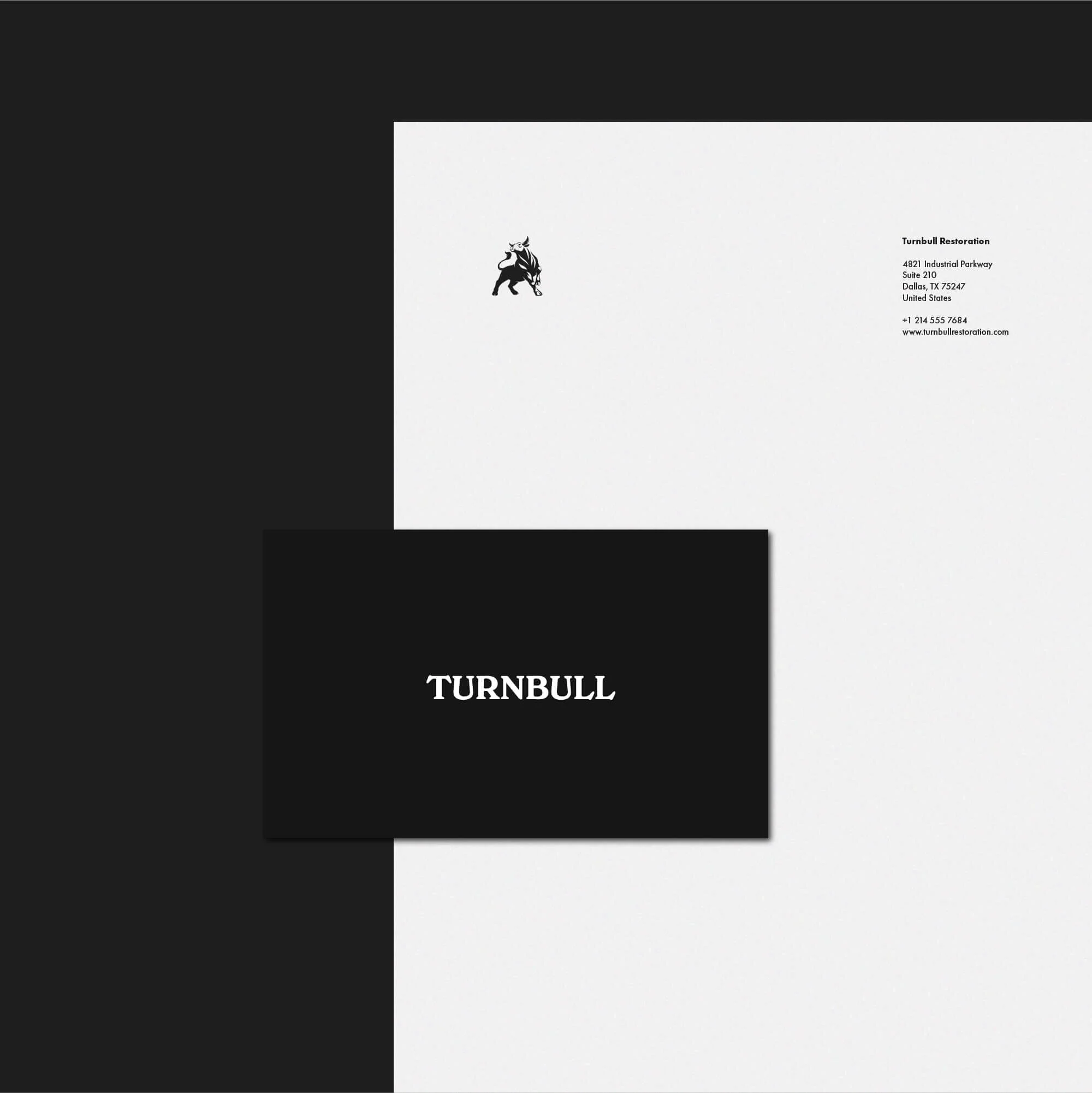
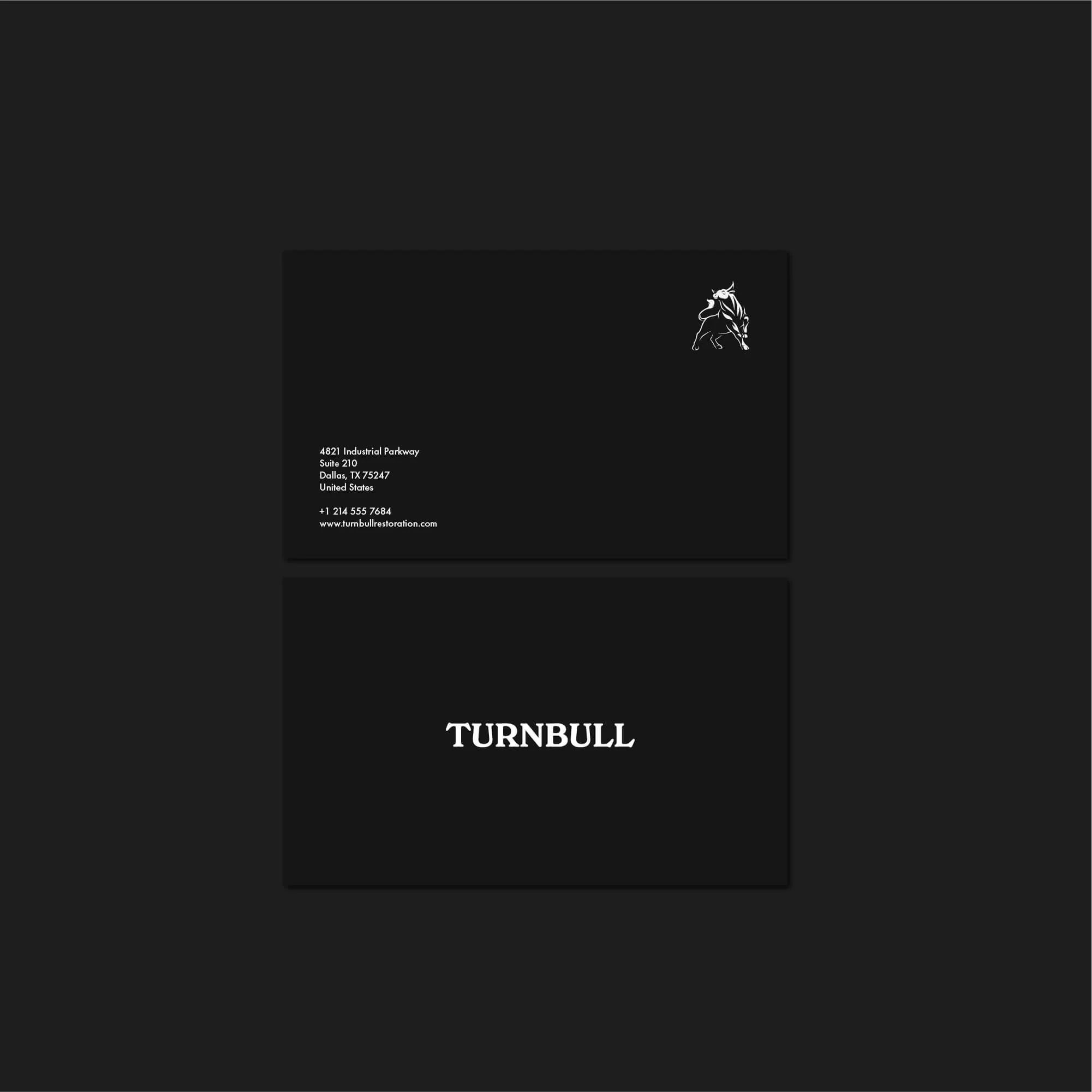
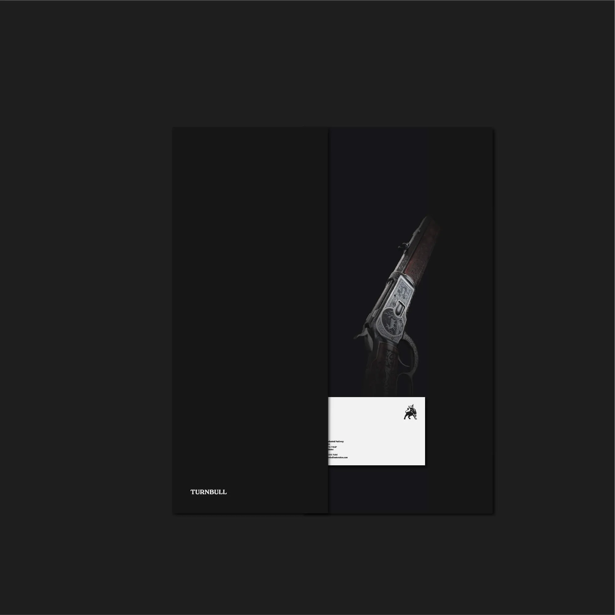
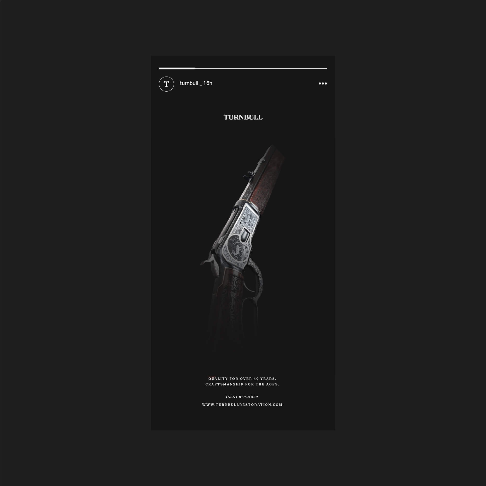
Brand Applications and Heritage Presentation
The identity was applied across selected brand touchpoints, including business cards, stationery, digital layouts, and social media compositions. Each application reinforces a consistent and cohesive brand presence across both physical and digital environments.
The system was designed to maintain a refined and controlled aesthetic, giving Turnbull Restoration a visual identity that feels professional, authentic, and appropriate for a specialist heritage brand.
Logo Design for Restoration and Heritage Brands
Brand identity design for restoration and heritage-focused businesses requires a balance of tradition, precision, and clarity. The identity needs to communicate craftsmanship and trust while remaining functional across modern applications.
For Turnbull Restoration, the final direction creates a strong and recognisable brand identity built around heritage, specialist expertise, and long-term credibility within a highly specialised industry.
Explore more logo design and brand identity projects to see how each identity is applied across different industries and brand contexts.
Have a Project in Mind?
For logo design, brand identity, or visual identity projects, get in touch to discuss your brief.