Law Firm Logo Design
A law firm logo design project for Wendy Owens, created to give the brand a refined, trustworthy and professional visual identity. The design direction focuses on clarity, authority and credibility, helping the legal brand present itself with confidence across digital, print and client-facing materials.


Law Firm Brand Identity
Project Overview
The identity for Wendy A. Owens PC was developed to reflect professionalism, clarity, and trust, core qualities expected from a legal brand. The aim was to create a visual identity that feels established and credible while maintaining a refined, modern presence.
The brand needed to support traditional legal expectations while still feeling distinctive enough to stand apart from generic law firm branding.
Law Firm Logo Design Approach
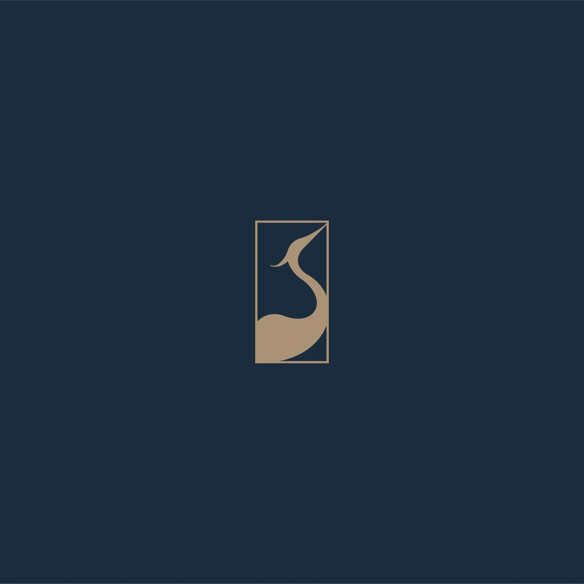
The logo design is built around a structured typographic system supported by a refined “WO” monogram and a distinctive heron symbol derived from the letterforms themselves.
Clean letterforms, balanced spacing, and restrained detailing help create a law firm logo that feels authoritative, legible, and professional. The result is an identity that feels timeless without becoming overly traditional.
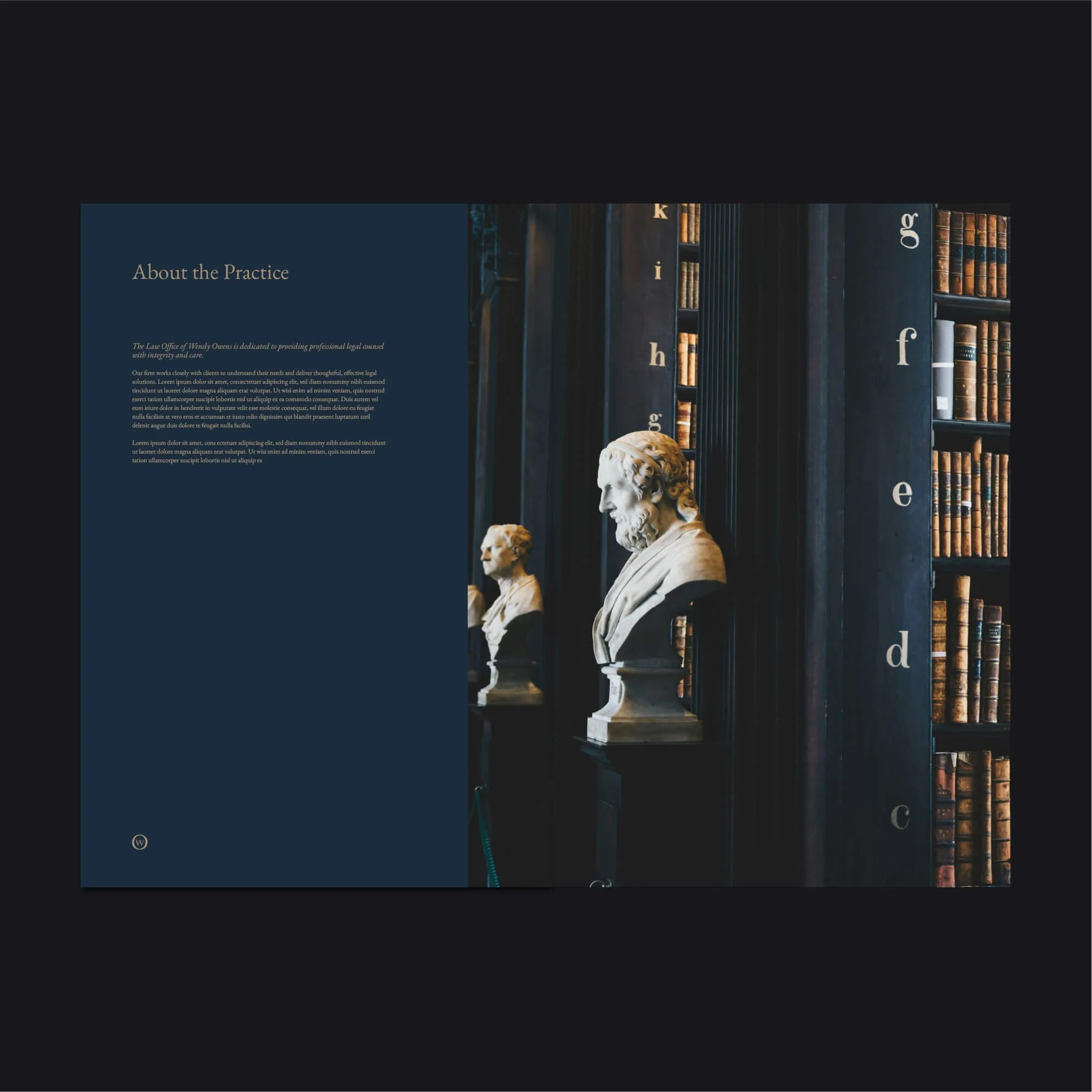
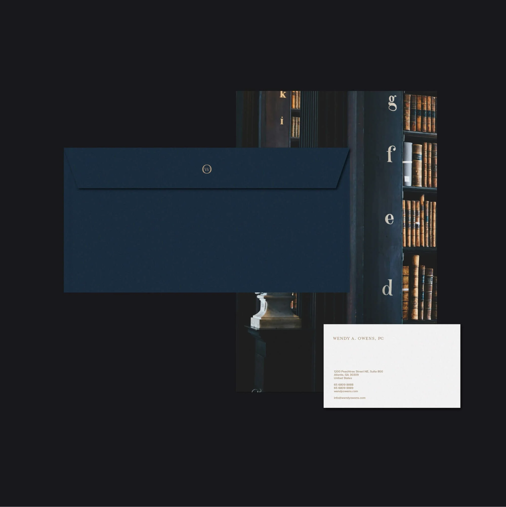
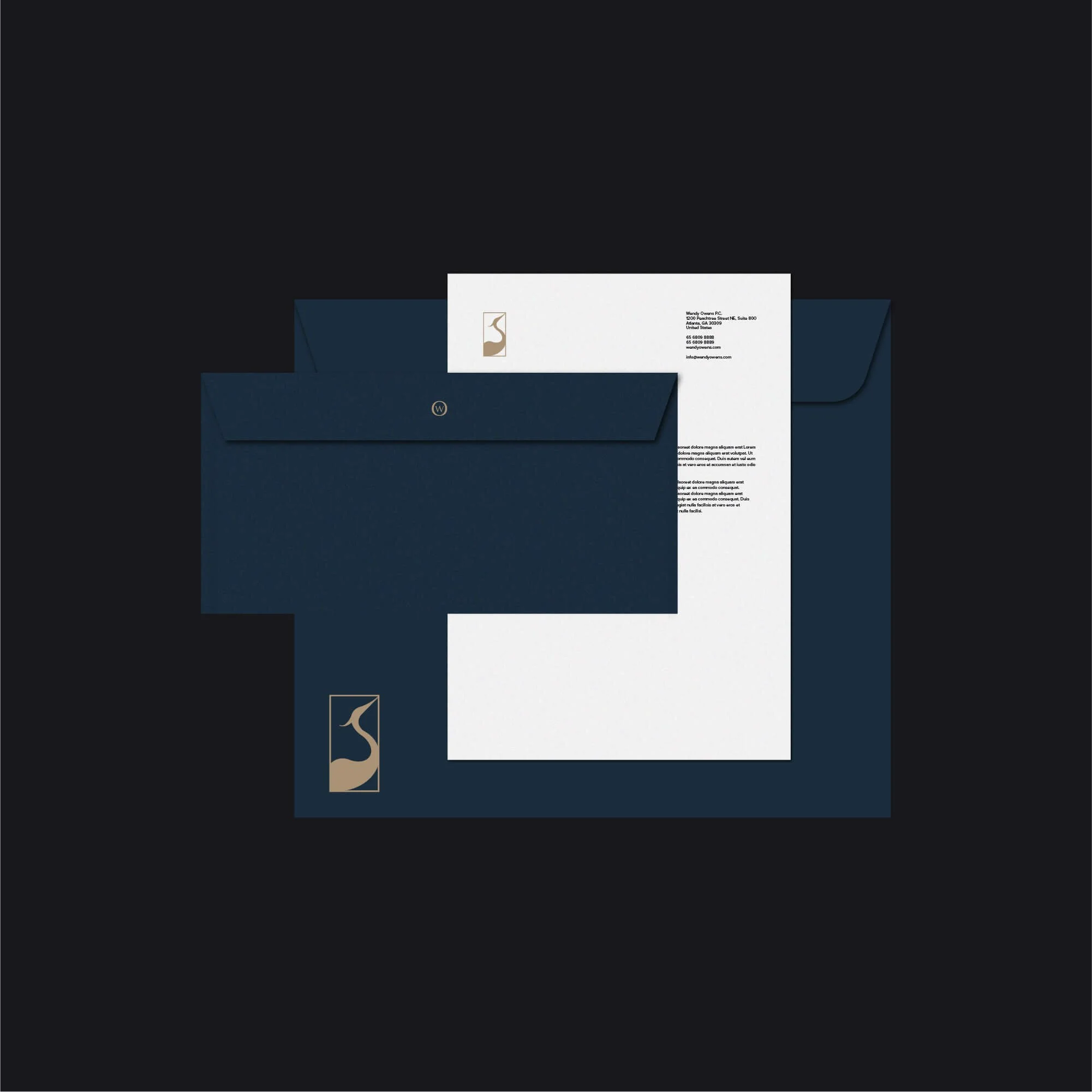
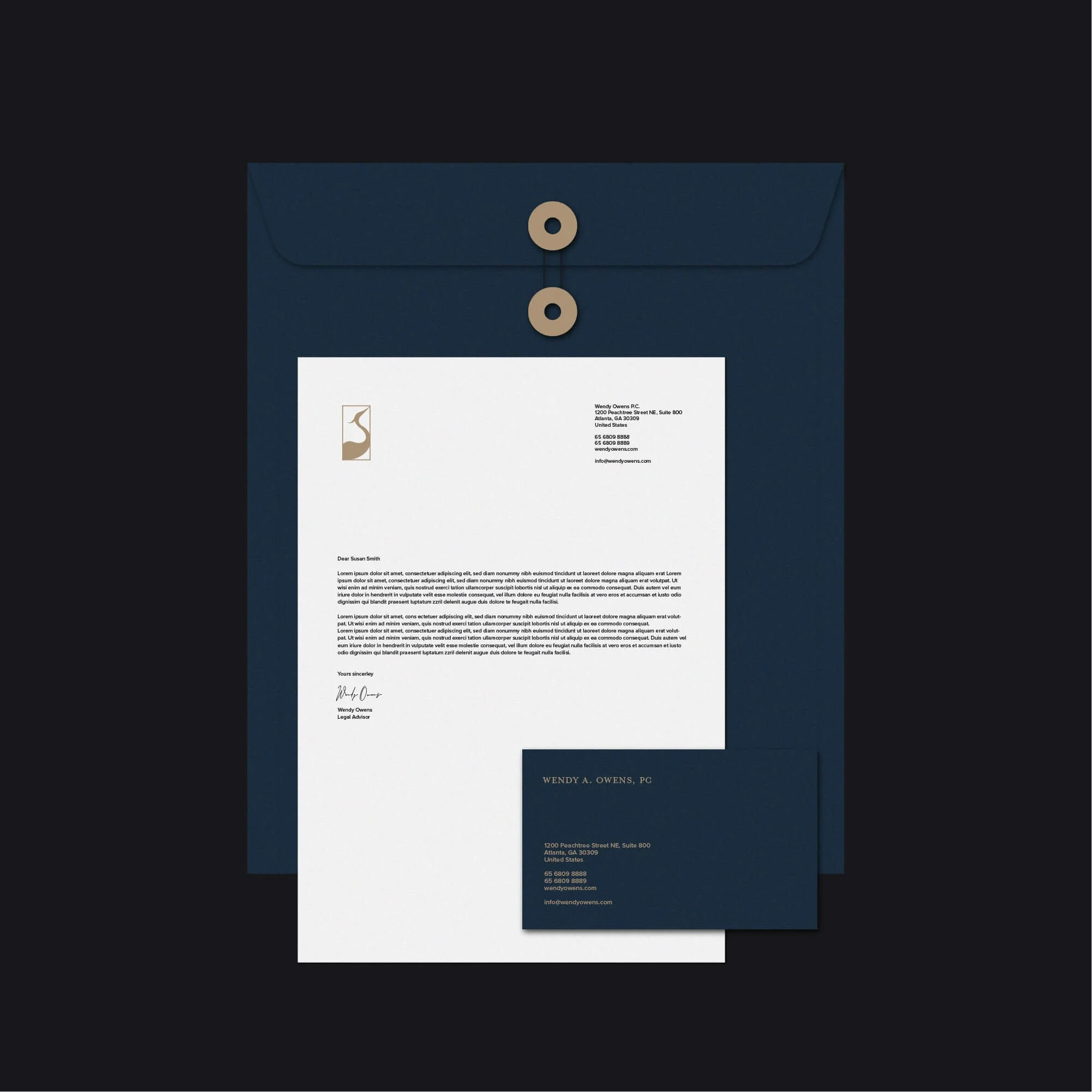
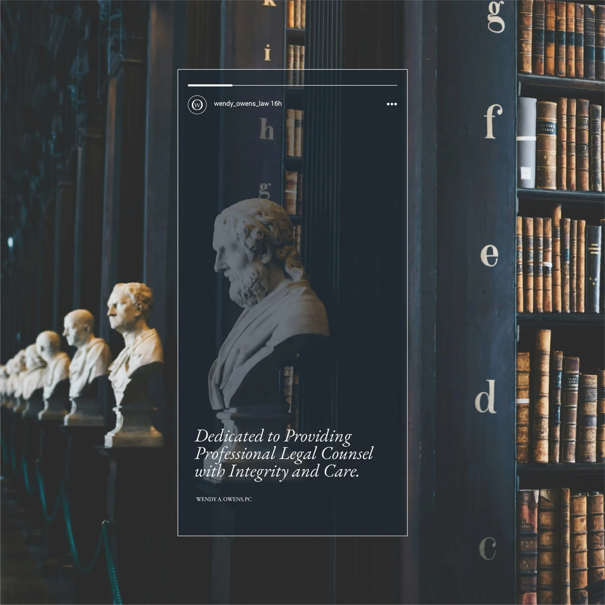
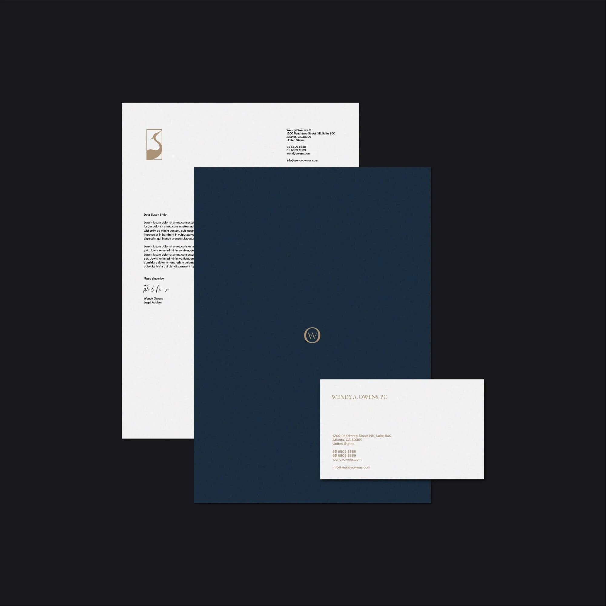
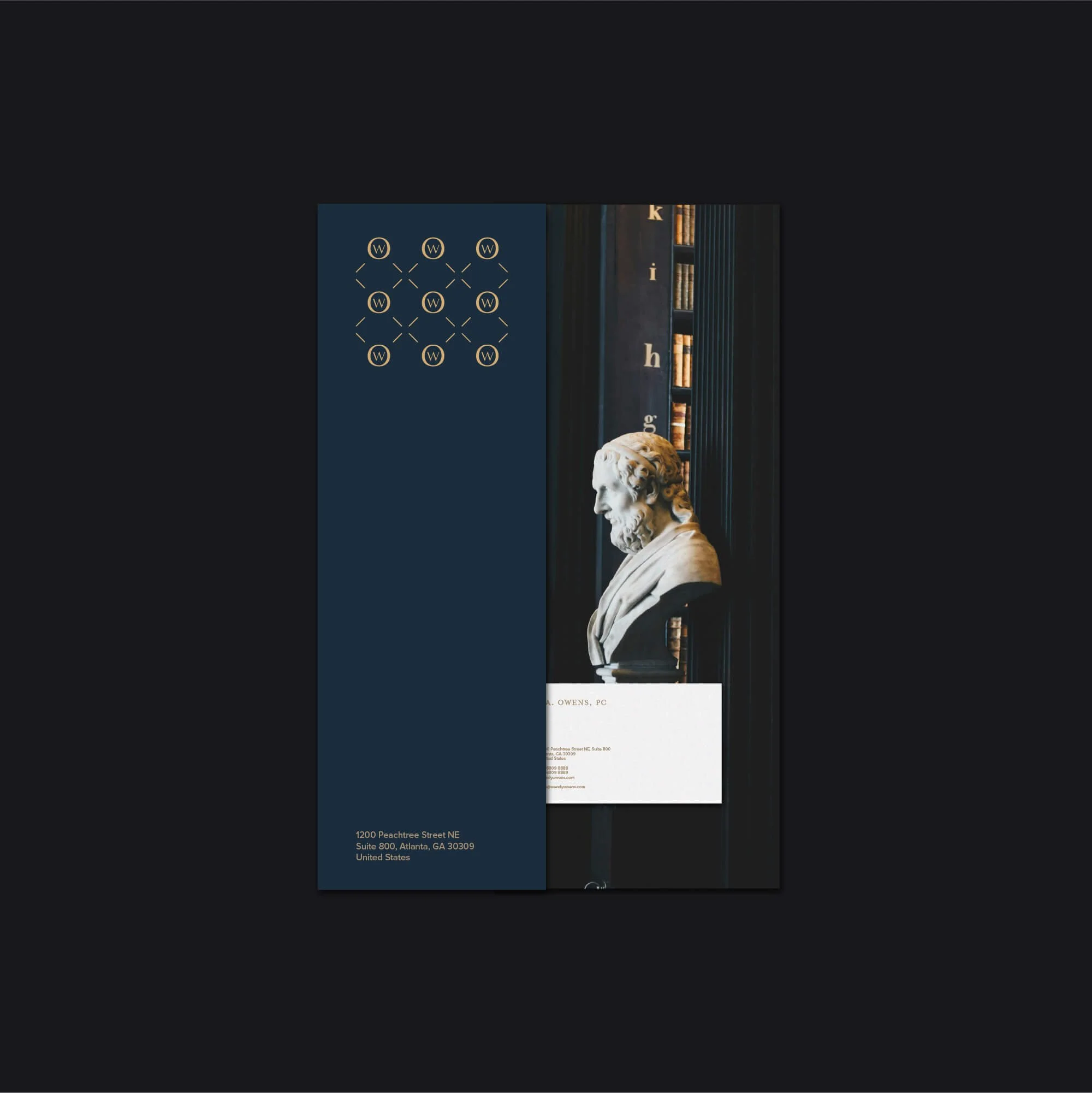
Brand Applications for Legal Practice
The visual identity was applied across selected legal brand touchpoints, including stationery, digital assets, editorial layouts, and client-facing materials.
Each application maintains a consistent and cohesive visual language, helping reinforce trust, recognition, and professionalism across both print and digital environments commonly used within legal practice.
Logo Design for Law Firms and Legal Brands
Logo design for law firms requires a careful balance of clarity, credibility, and visual distinction. The identity needs to communicate authority and trust while remaining simple, refined, and practical to use across formal business applications.
For Wendy A. Owens PC, the final brand identity creates a polished and recognisable legal visual system built around professionalism, restraint, and long-term credibility.
Explore more logo design and brand identity projects to see how each identity is applied across different industries and brand contexts.
Have a Project in Mind?
For logo design, brand identity, or visual identity projects, get in touch to discuss your brief.