Realtor Logo Design
Benge Reddingare luxury realtors based in Sarasota, Florida. The project focused on creating a refined logo design and brand identity for a high-end property brand, built around a minimalist BR monogram, restrained wordmark, and a sophisticated black, crimson, and white colour palette.
Luxury Real Estate Brand Identity
Project Overview
Benge Redding was created as a refined realtor brand identity for the Sarasota luxury property market. The aim was to develop a visual identity that feels polished, confident, and highly considered, reflecting the quality of the properties represented and the premium nature of the service.
The brand needed to communicate trust, discretion, and professionalism while standing apart in a competitive real estate market. The direction focused on restraint, clarity, and a more elevated visual presence.
Luxury Realtor Logo Design Approach
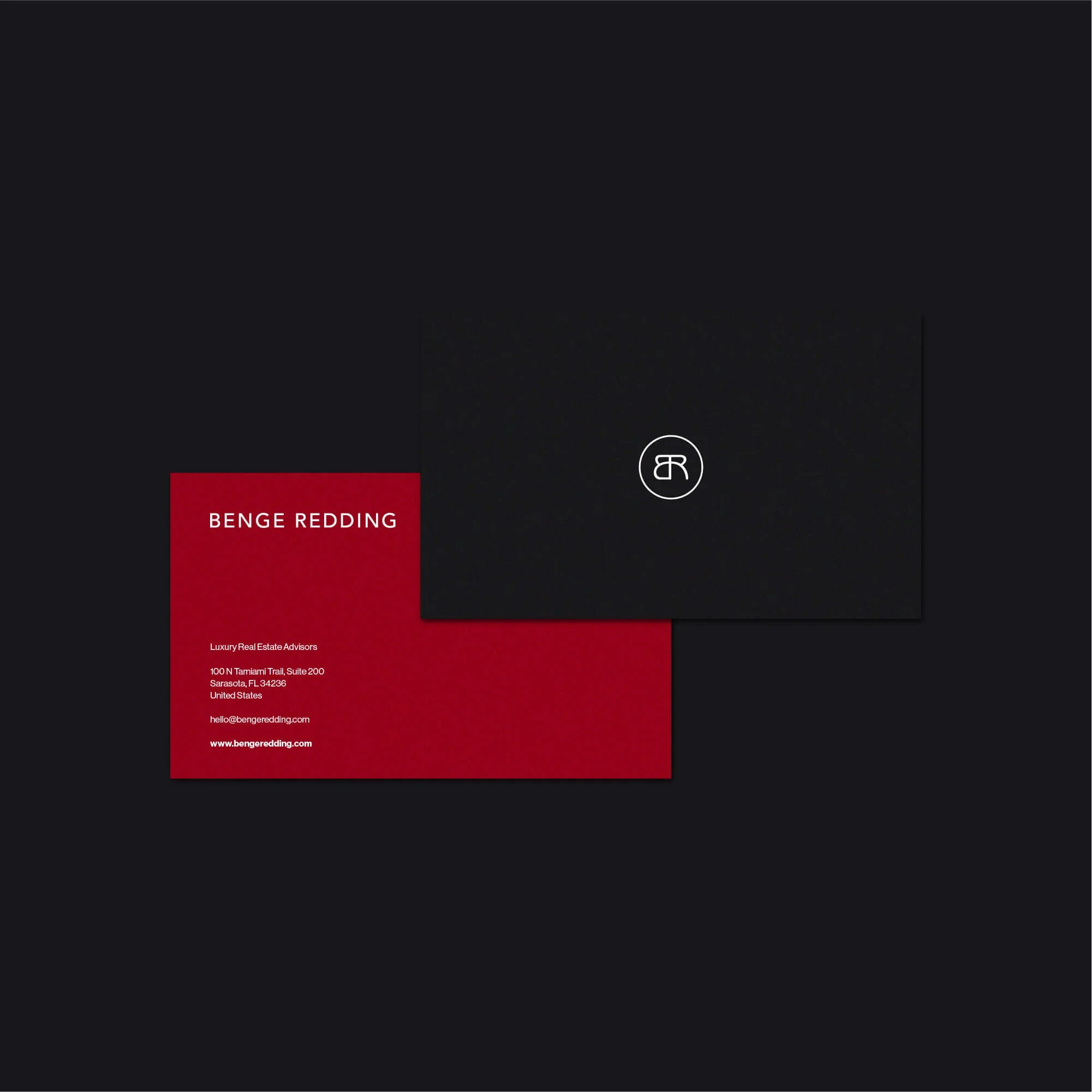
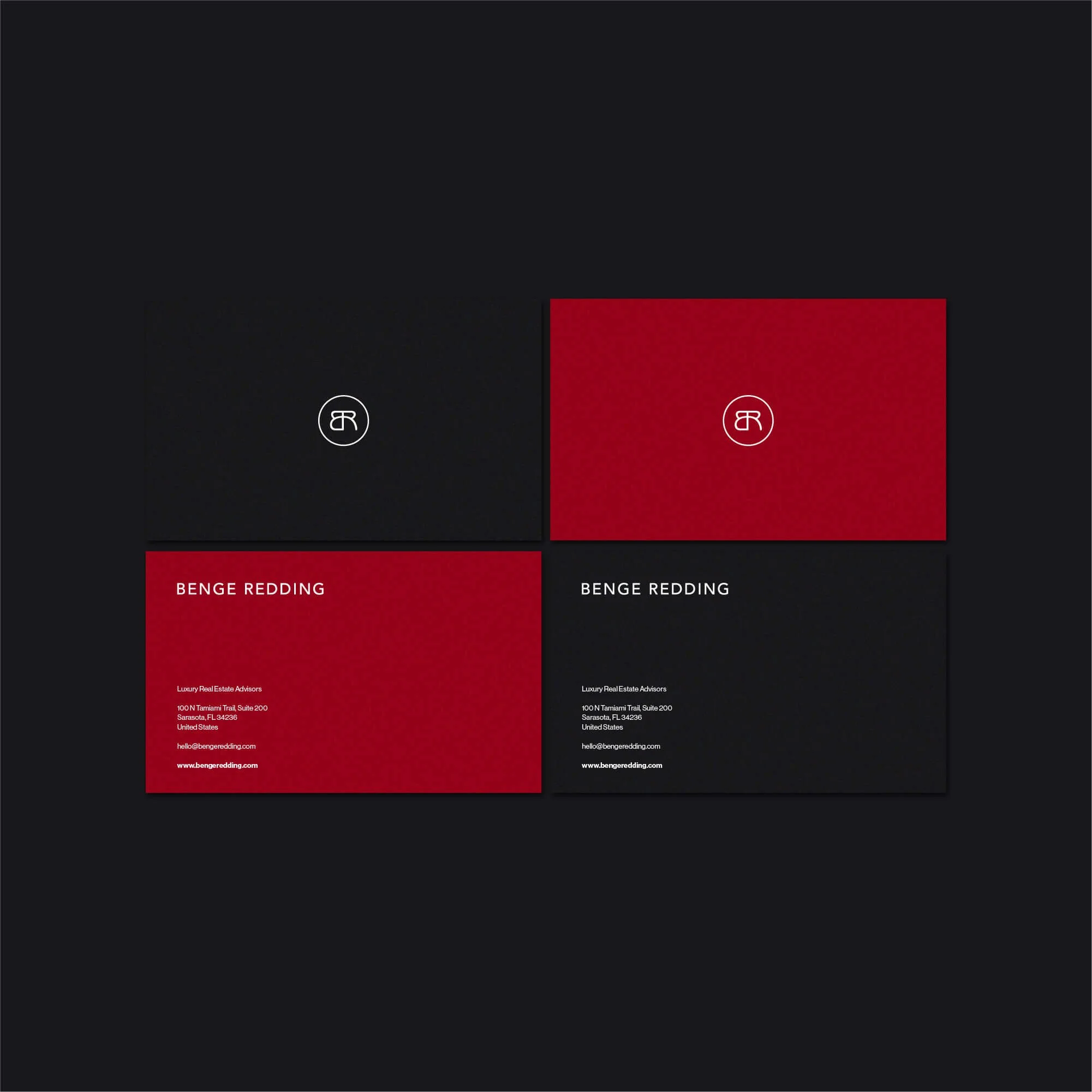
The logo design centres on a minimalist BR monogram paired with elegant typography. This creates a visual identity that feels modern, established, and easy to recognise across different brand applications.
A restrained design language was used throughout the system, with careful attention to spacing, proportion, and typography. The result is a logo identity that feels premium without becoming overly decorative or complicated.
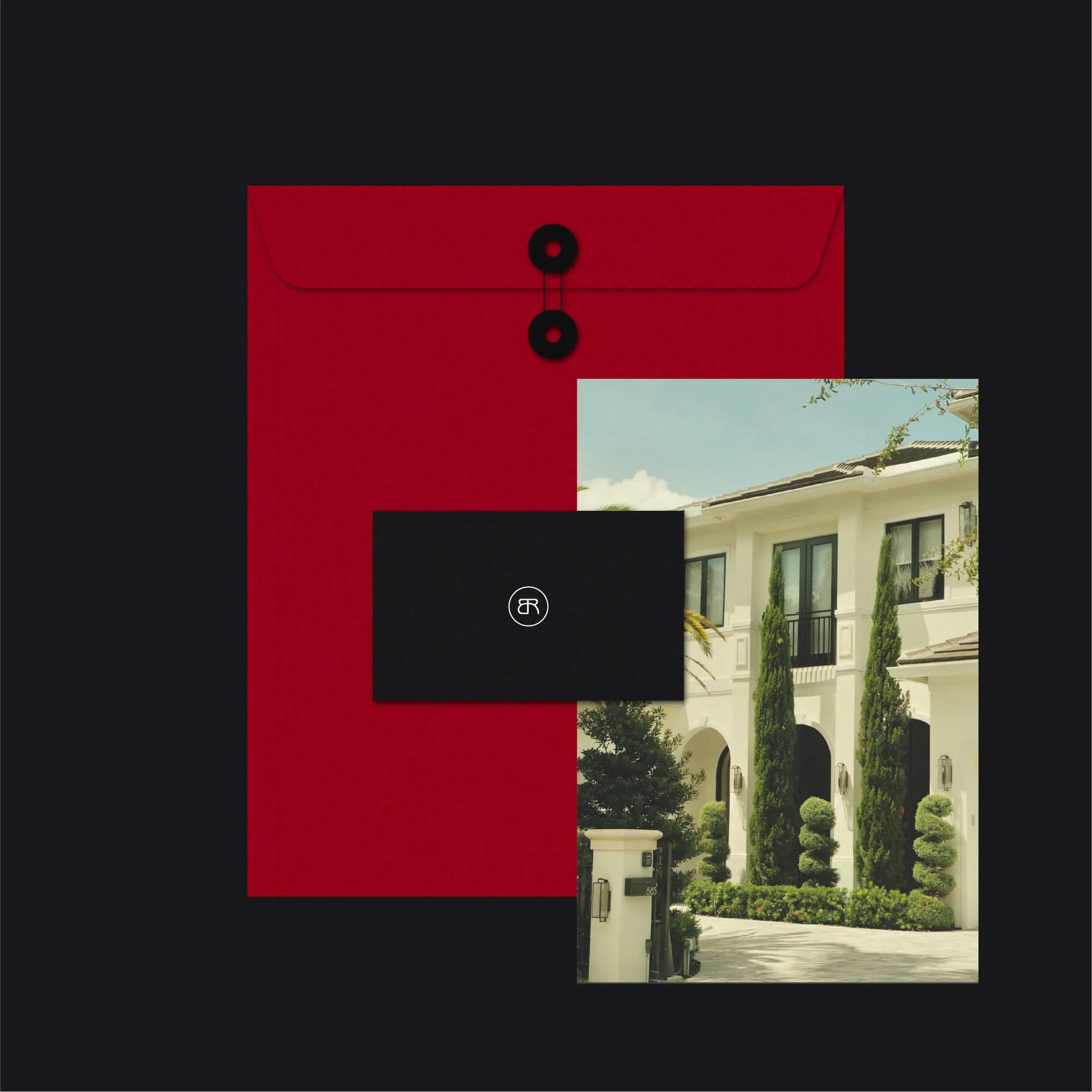
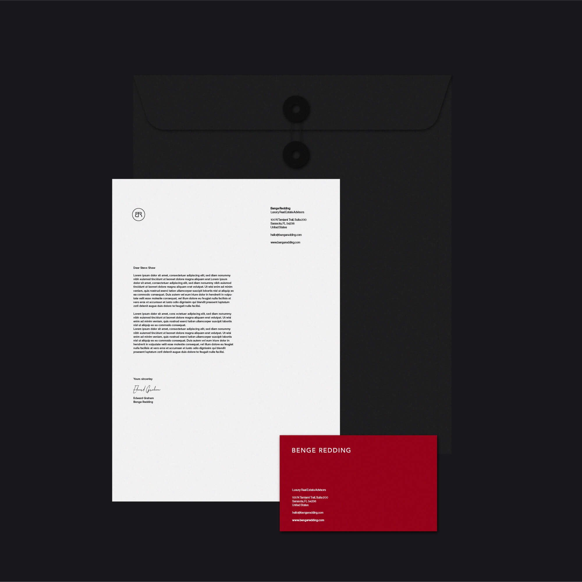
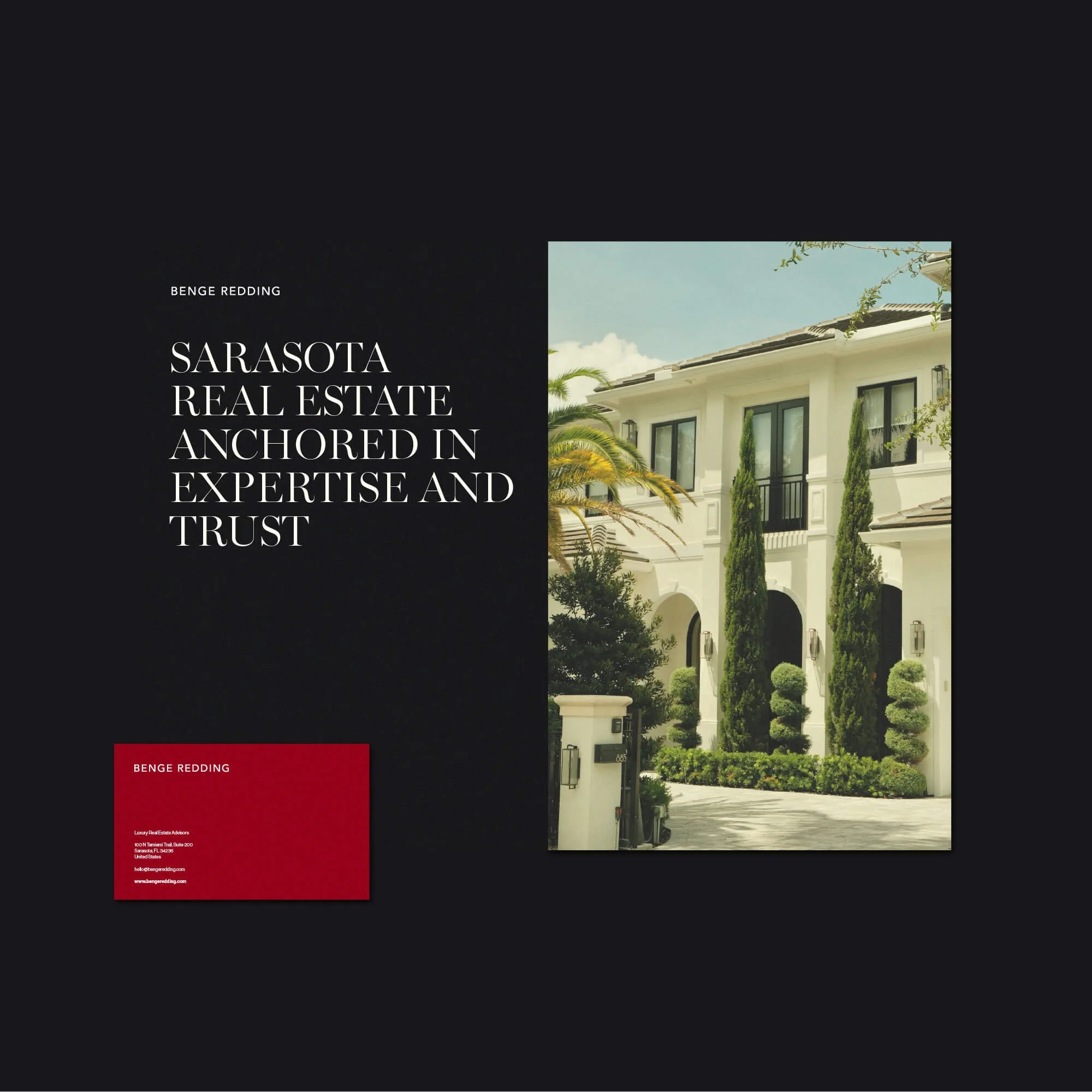
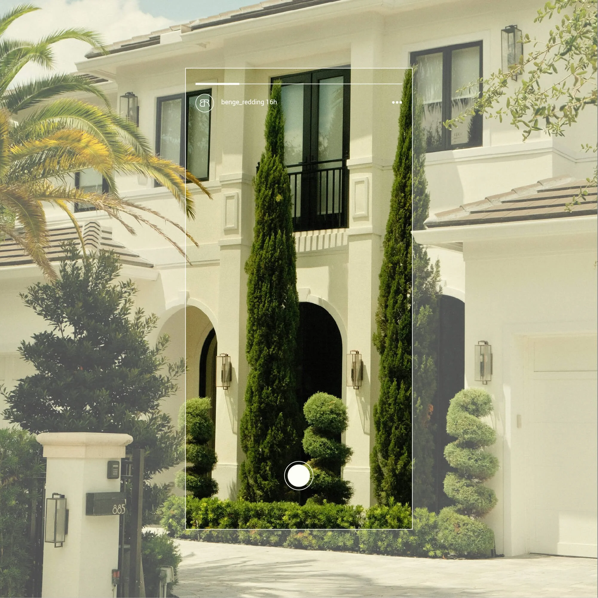
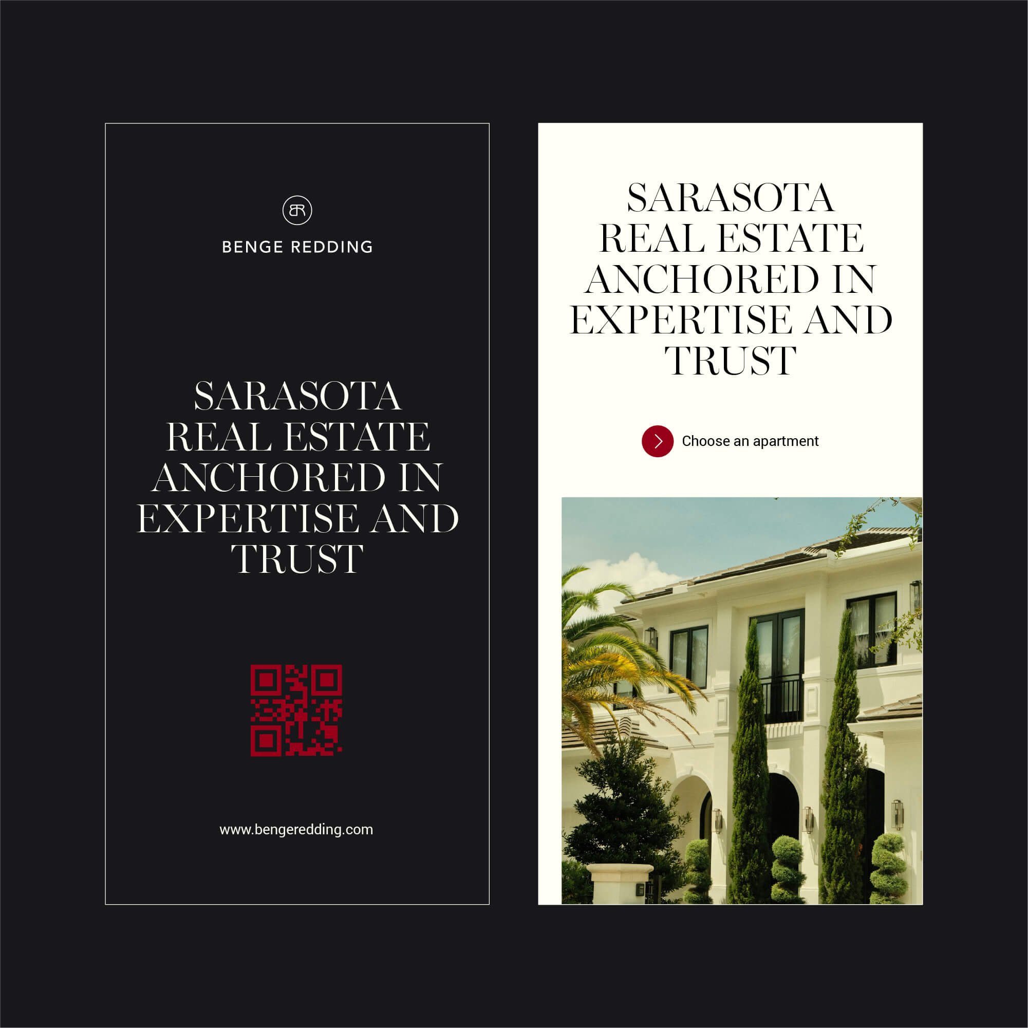
Brand Applications Across Real Estate Marketing
The identity was designed to work across stationery, marketing materials, listing presentations, digital assets, and wider brand communications. Each application supports a consistent and elevated brand presence across both print and digital touchpoints.
From first impressions online to printed collateral and client-facing presentation material, the system helps Benge Redding maintain a cohesive, professional, and recognisable identity.
Realtor Branding for High-End Property Brands
Branding for luxury real estate requires more than a polished logo. The identity needs to communicate trust, refinement, and strong market positioning while still feeling clear and practical to use.
For Benge Redding, the final direction supports a premium real estate presence built around discretion, credibility, and long-term recognition within the Sarasota property market.
Explore more logo design and brand identity projects to see how each identity is developed across different industries and brand contexts.
Have a Project in Mind?
For logo design, brand identity, or visual identity projects, get in touch to discuss your brief.