Construction Company Logo Design
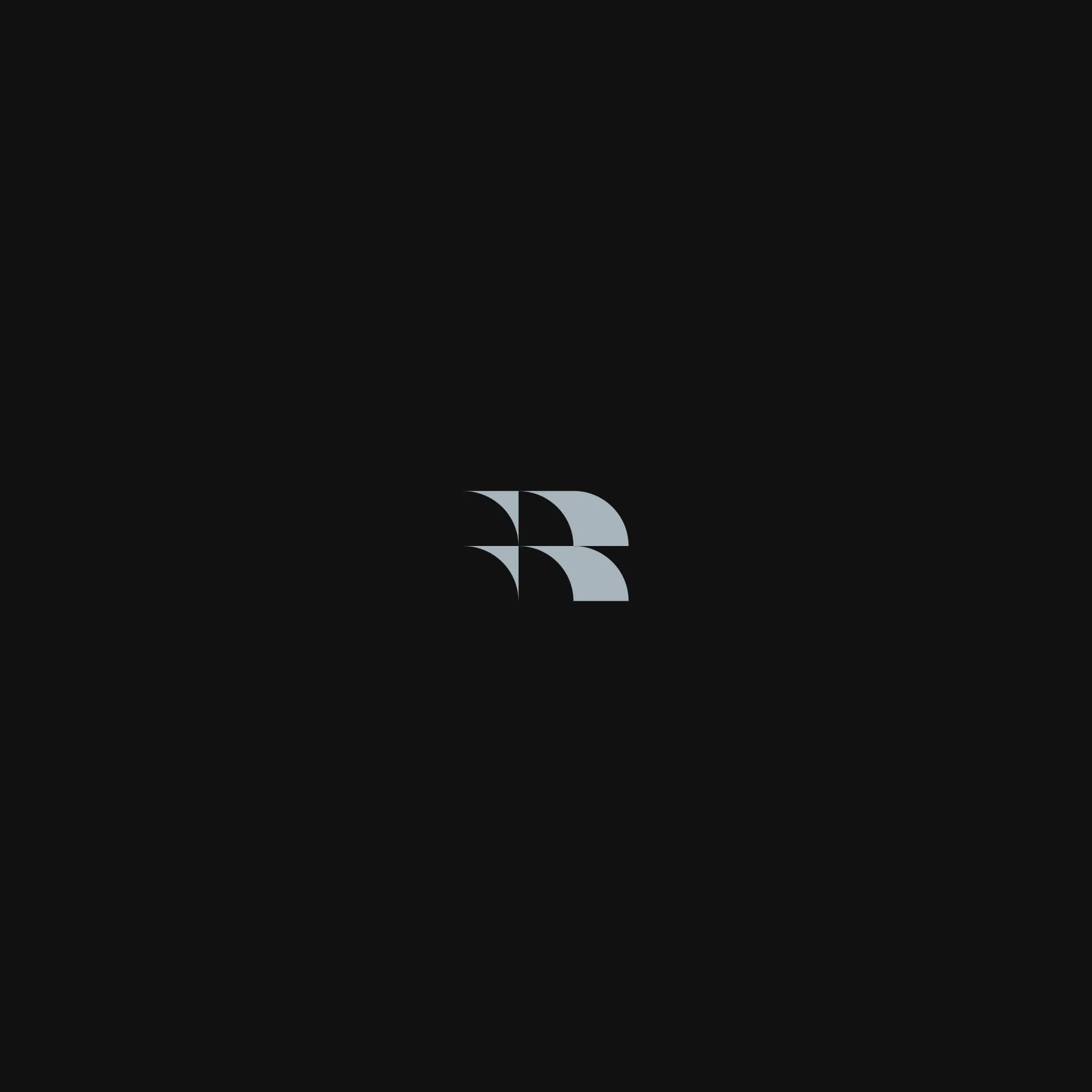
Ray Leonard is a construction company specialising in roofing, with a visual identity designed to feel structured, reliable, and built for growth. The logo centres on a geometric “R” symbol formed from overlapping roof tile shapes, creating a distinctive construction logo mark that reflects the company’s core trade while supporting a broader move into wider construction services.

Construction Company Logo Design Overview
Project Overview
Ray Leonard required a construction company brand identity that communicates strength, reliability, and precision. The aim was to create a visual system that feels professional, structured, and easy to recognise, giving the business a stronger presence within a competitive construction market.
The identity was developed to support both current roofing services and future growth into broader construction work, creating a brand that feels focused without becoming too limited.
Construction Logo Design Approach
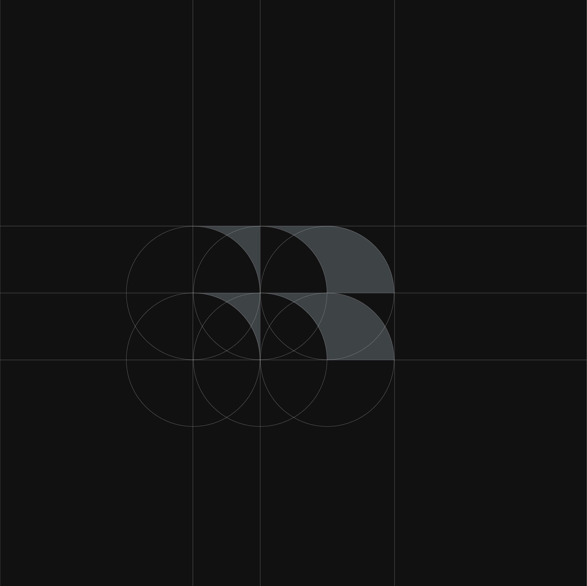
The logo design centres on a geometric “R” symbol constructed from overlapping roof tile forms. This creates a distinctive construction logo mark that connects directly to the company’s roofing background while still feeling suitable for wider construction services.
A clean and controlled visual language was used throughout the identity, with balanced proportions, structured shapes, and clear typography helping to reinforce a sense of durability, craftsmanship, and professionalism.
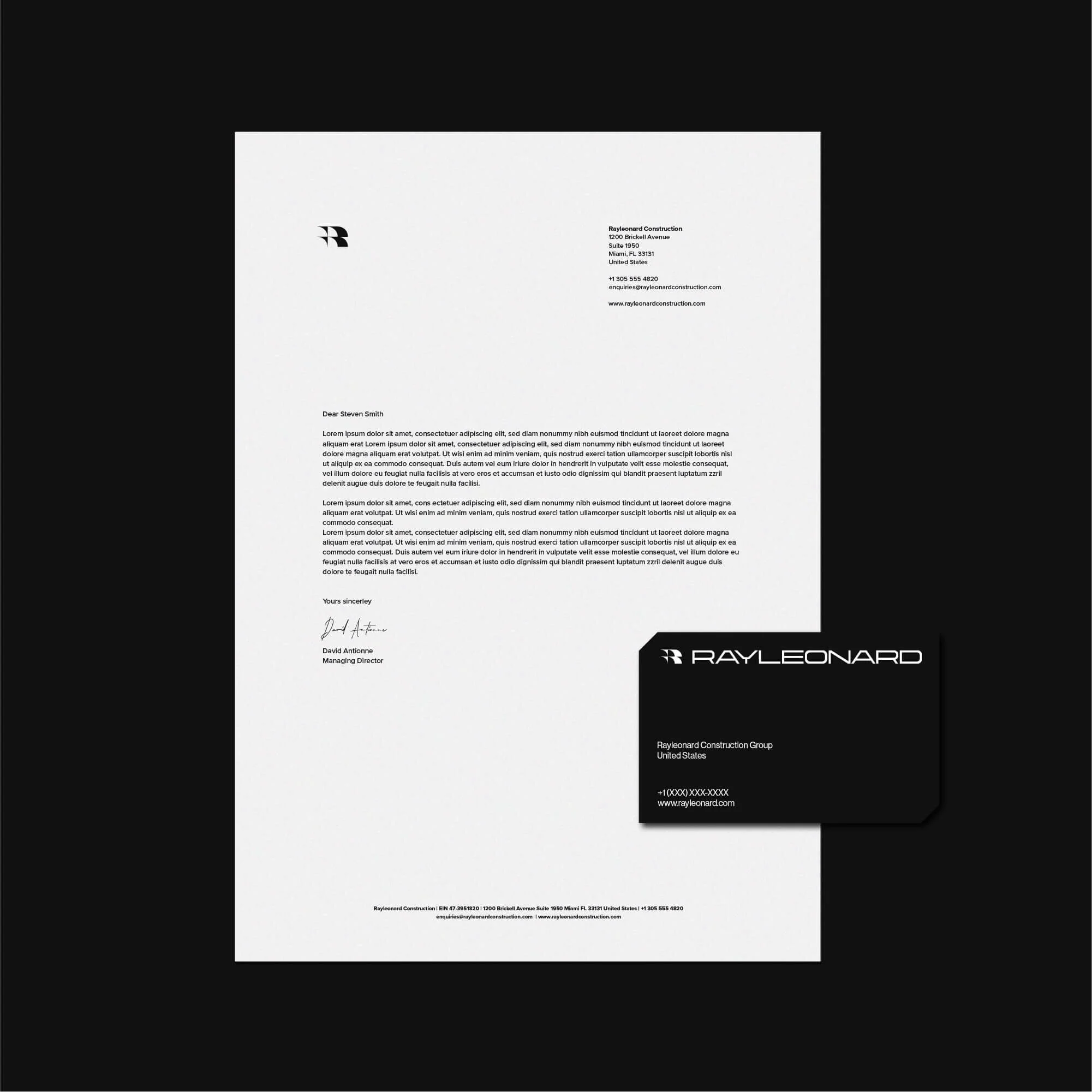
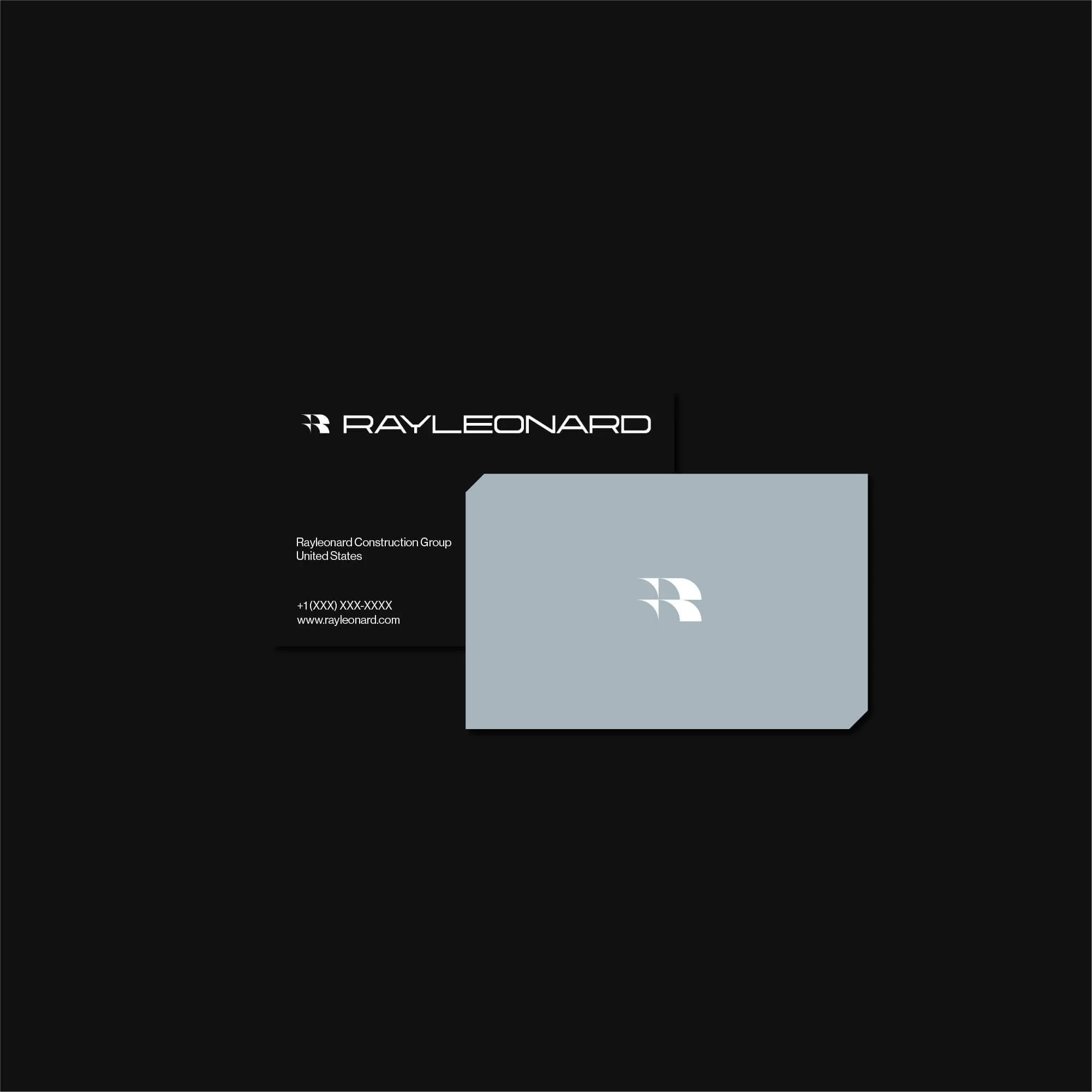
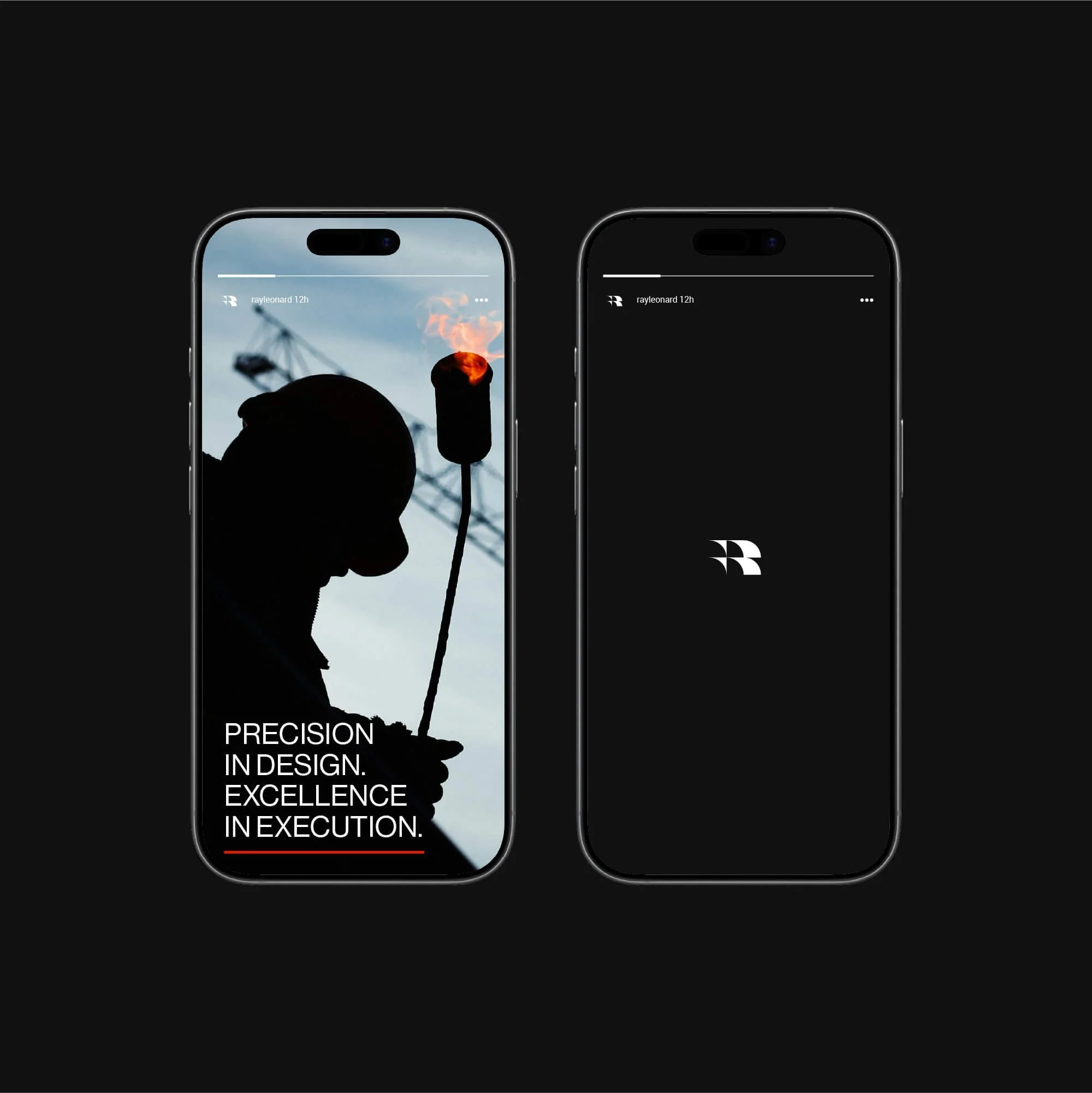
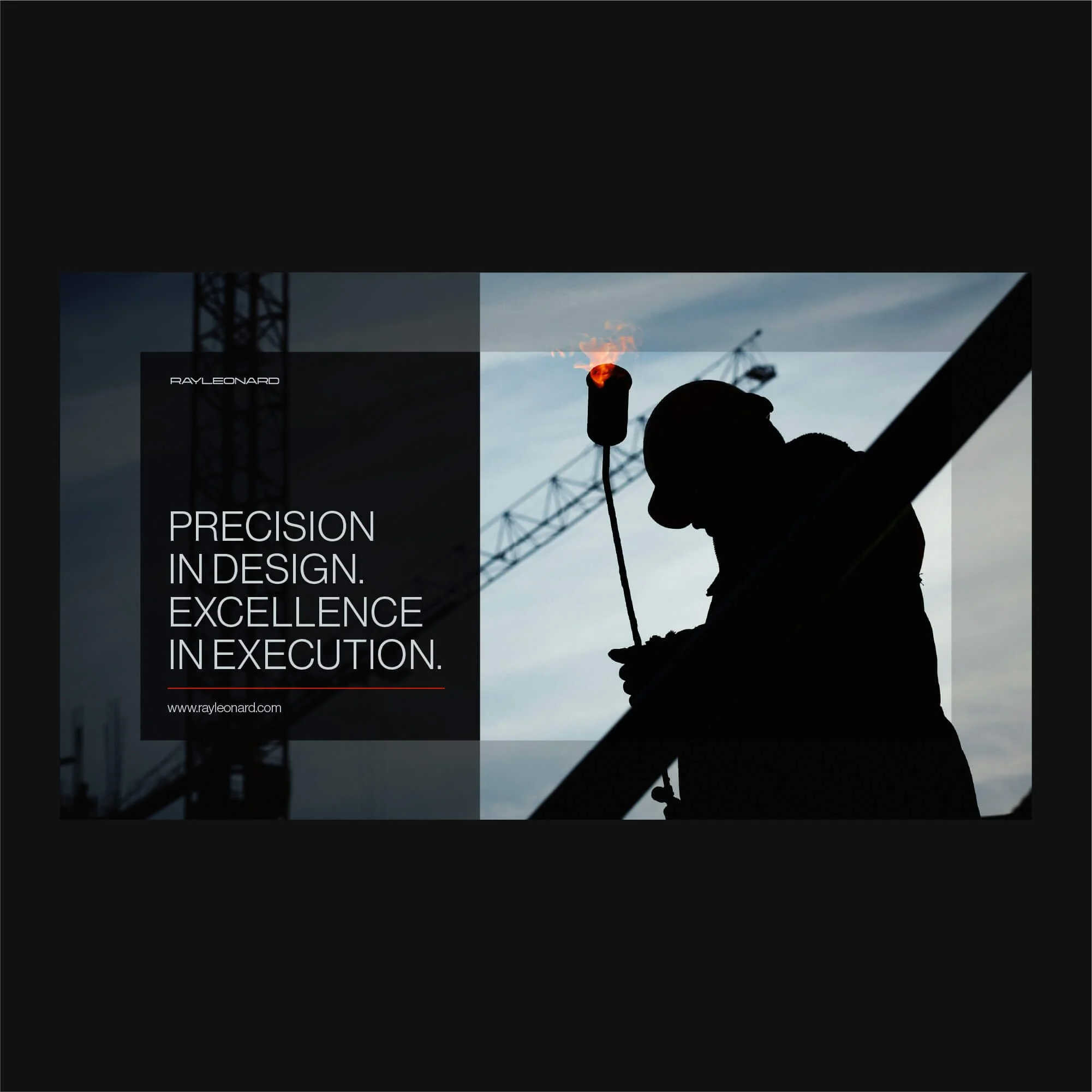
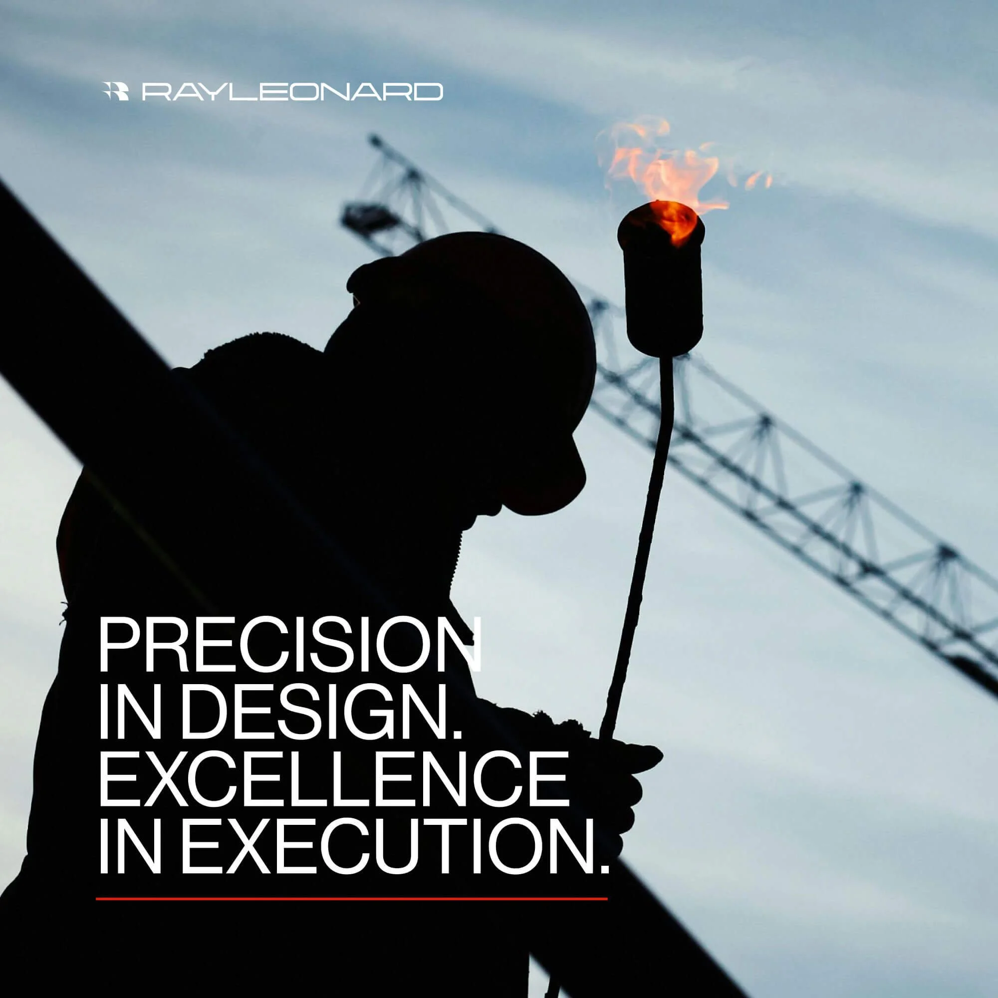
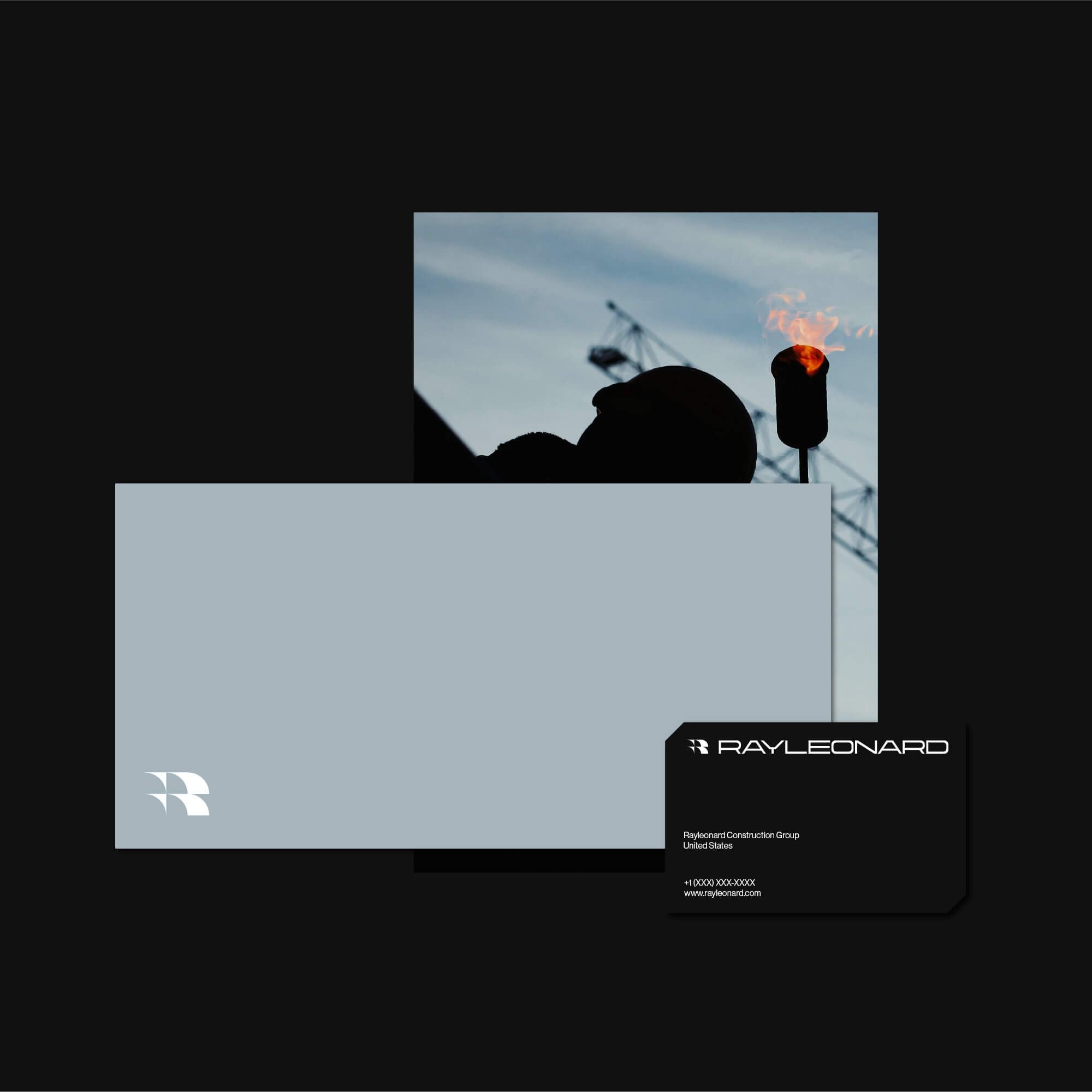
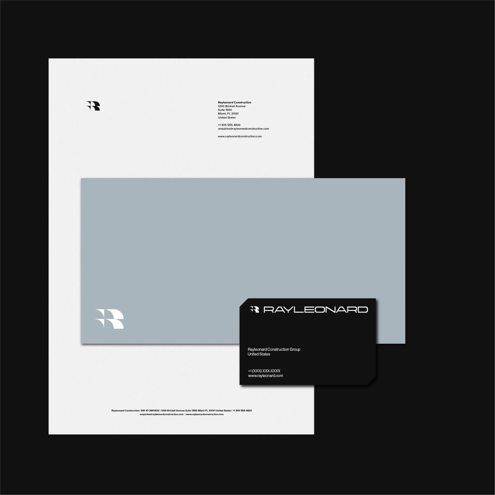
Brand Applications for Construction Businesses
The visual identity was designed to work across practical construction brand touchpoints, including stationery, site materials, digital communications, signage, vehicles, and branded documents.
Each application maintains a consistent and recognisable visual style, helping the business present itself clearly across both physical and digital environments. This gives the brand the flexibility needed for everyday use and long-term growth.
Logo Design for Construction Companies and Contractors
Logo design for construction companies needs to communicate trust, clarity, and strength from the first impression. The identity must be simple enough to work across signage, uniforms, vehicles, and site materials, while still feeling distinctive enough to be remembered.
For Ray Leonard, the final brand identity creates a bold and scalable visual system built around structure, reliability, and professional recognition within the construction industry.
Explore more logo design and brand identity projects to see how each identity is applied across different industries and brand contexts.
Have a Project in Mind?
For logo design, brand identity, or visual identity projects, get in touch to discuss your brief.