Electric Motorcycle Logo Design
Maeving is an electric motorcycle brand focused on modern urban mobility, clean transportation, and considered engineering. This branding concept explores a refined logo design and visual identity system created to feel precise, contemporary, and aligned with the future of electric vehicles, including a distinctive logo mark, clean typographic direction, stationery design, and a minimalist speedometer interface for the motorcycle dashboard experience.


Electric Motorcycle Brand Identity for Maeving
Project Overview
Maeving was developed as a modern electric motorcycle brand identity concept focused on clean mobility, refined engineering, and contemporary urban transport. The aim was to create a visual identity that feels precise, minimal, and forward-thinking while still remaining clear and easy to recognise.
The direction needed to reflect the qualities of the electric motorcycle market, where innovation, efficiency, and design clarity are central to the brand experience.
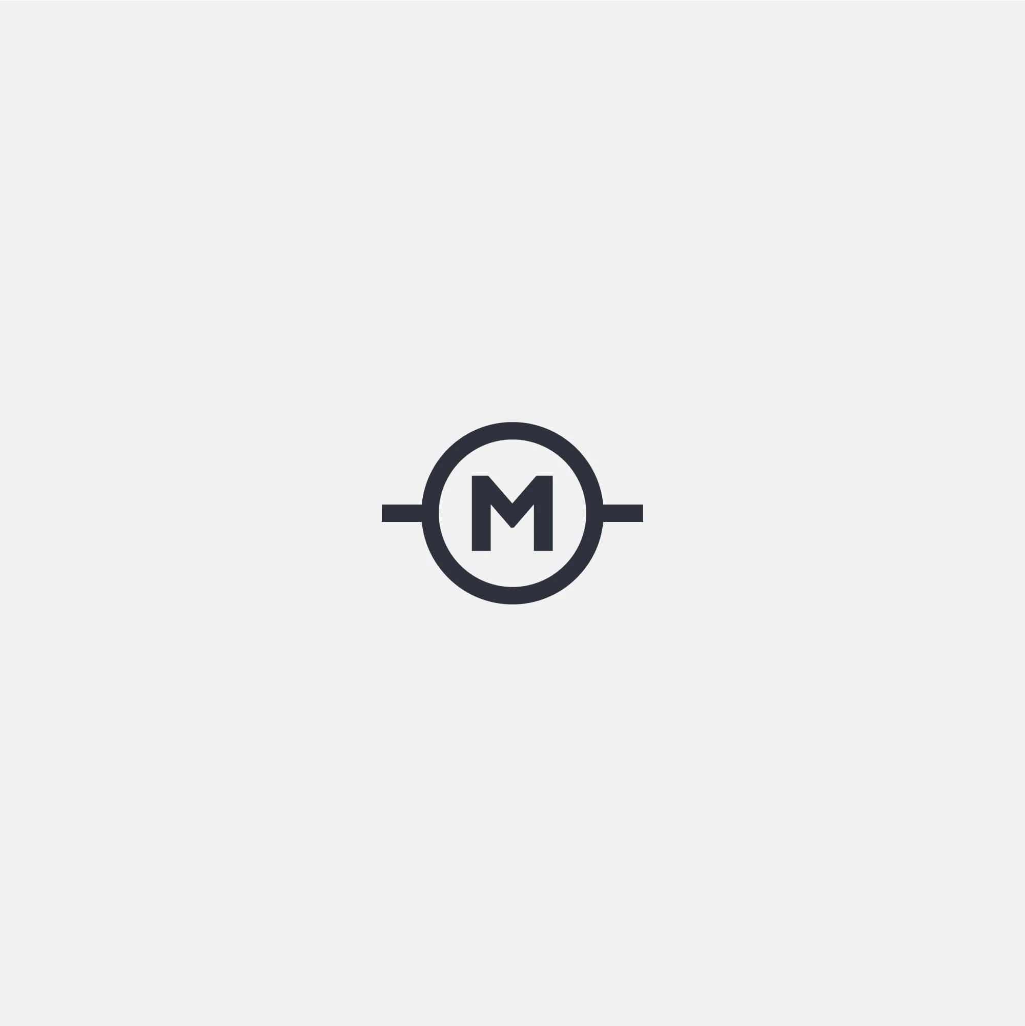
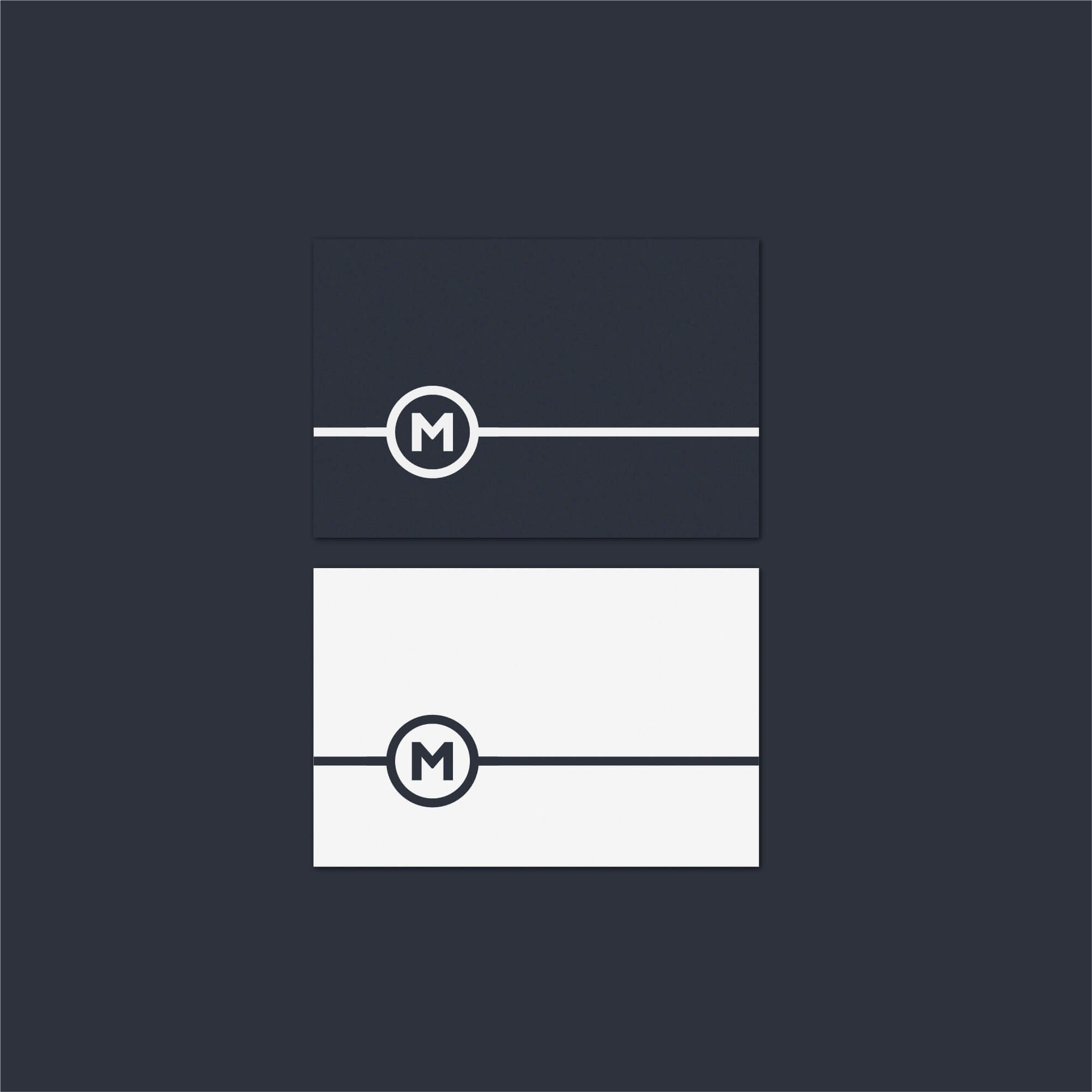
Electric Motorcycle Logo Design Approach
The logo design centres on a clean typographic wordmark supported by a simple geometric brand mark. This creates a balance between clarity and distinction, allowing the identity to feel modern without becoming overly complex.
A restrained visual approach was used throughout the project, with careful attention to spacing, proportion, and legibility. The result is a logo identity that feels precise, engineered, and adaptable across both digital and physical applications.
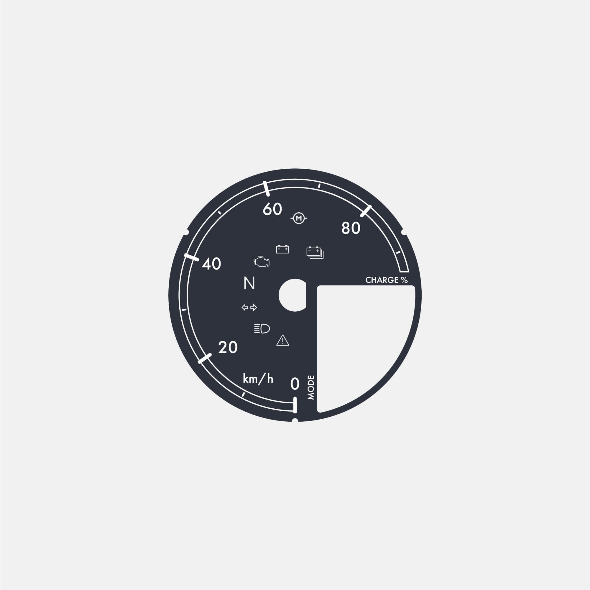
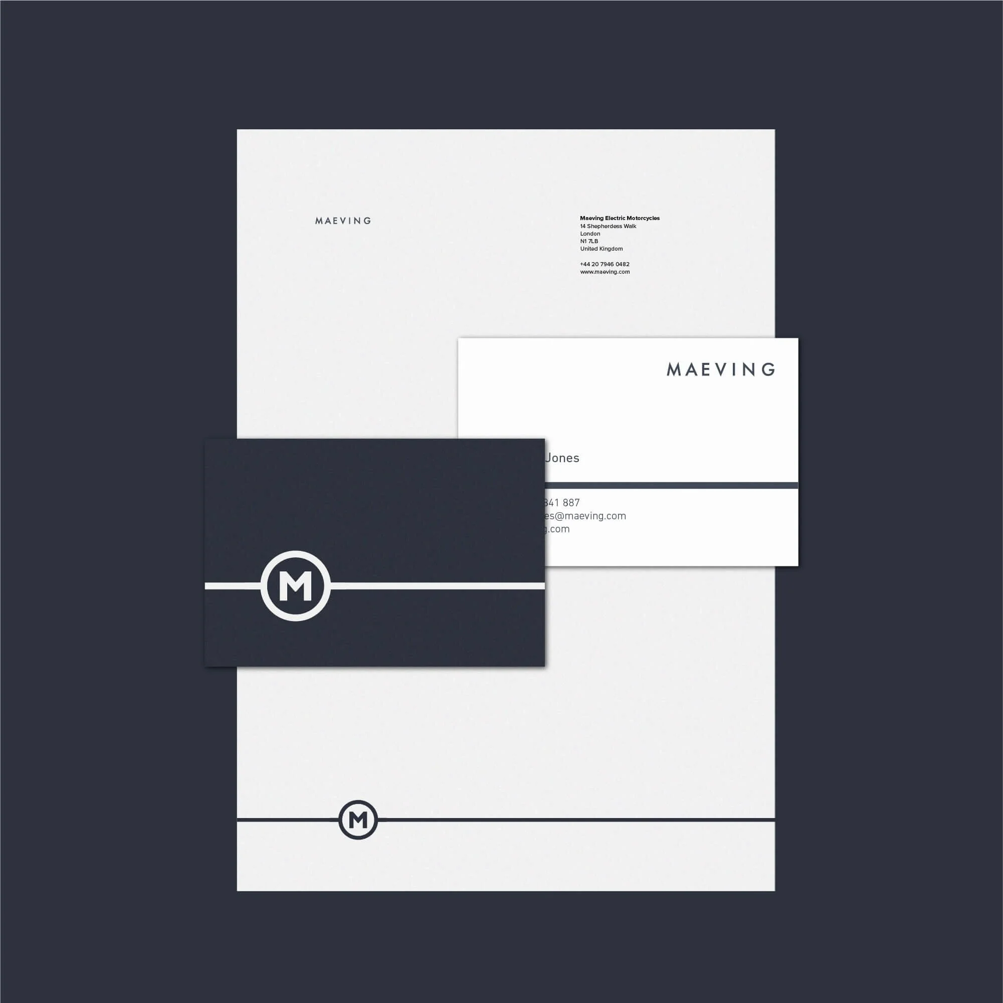
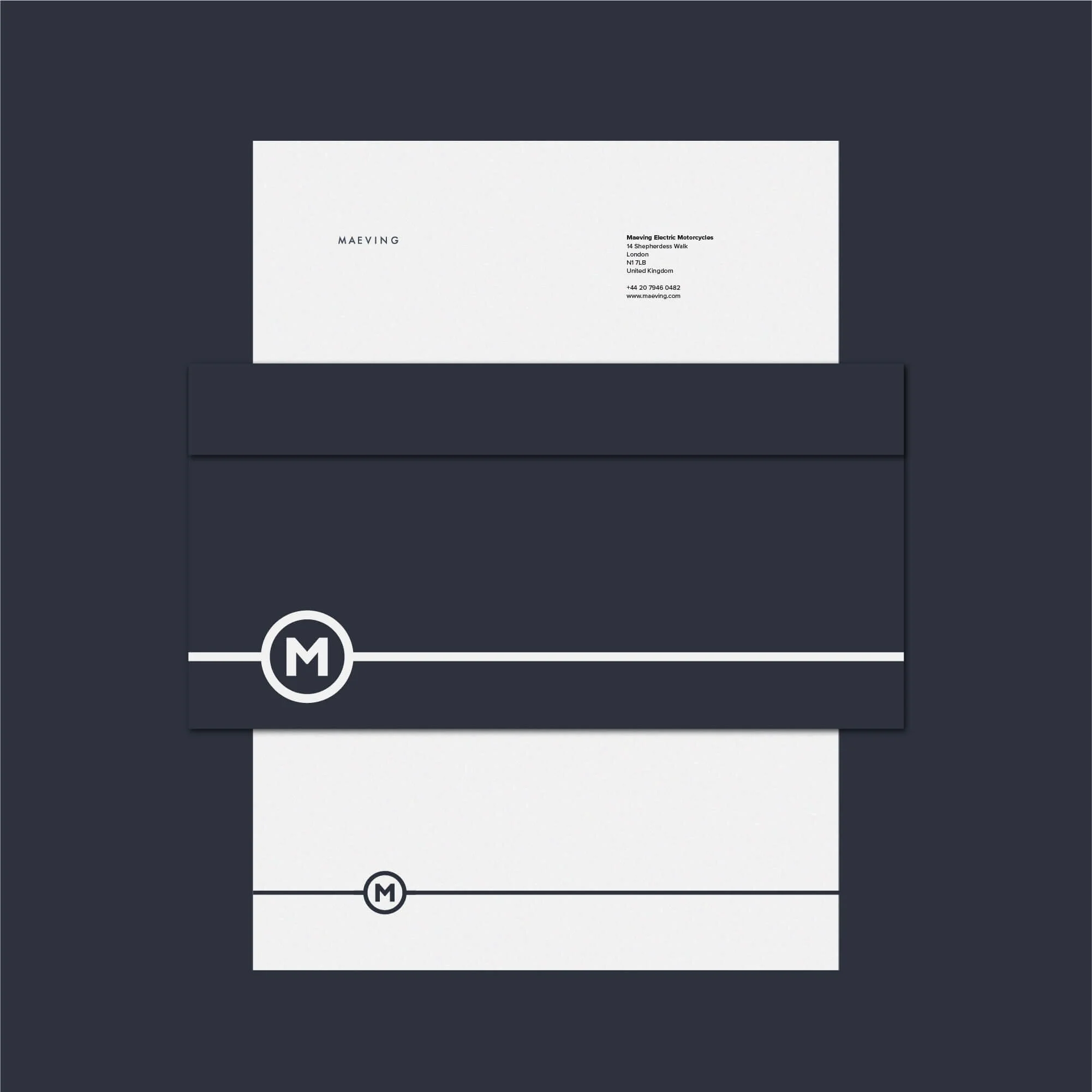
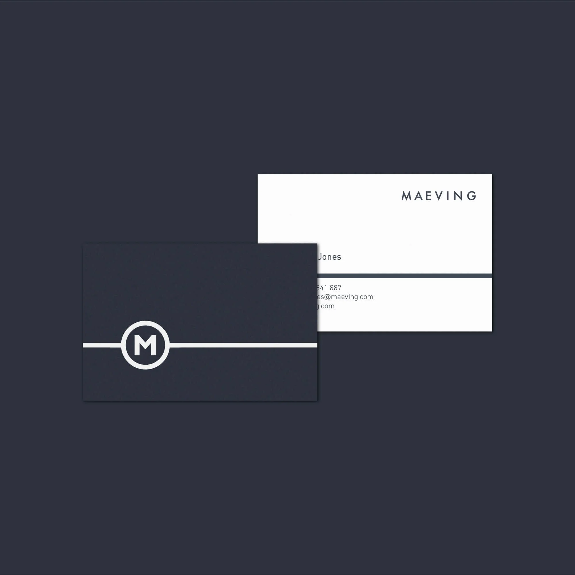
Brand Applications and Product Integration
The visual identity was applied across key brand touchpoints, including business stationery and product-focused elements such as the motorcycle speedometer interface.
This helped connect the brand identity with the product experience itself, creating a more cohesive visual system. From communication materials to dashboard design, the identity was built to feel simple, functional, and consistent.
Logo Design for Electric Vehicle and Mobility Brands
Branding for electric vehicle and mobility companies needs to balance innovation with clarity. The identity has to communicate precision, efficiency, and forward-thinking design while still feeling simple, recognisable, and practical to use.
For Maeving, the final direction creates a clean and modern brand identity concept suited to the electric motorcycle sector, supporting a visual presence that feels sharp, considered, and ready for real-world application.
Explore more logo design and brand identity projects to see how each identity is applied across different industries and brand contexts.
Have a Project in Mind?
For logo design, brand identity, or visual identity projects, get in touch to discuss your brief.