Property Developer Logo Design
Continental Developments is a luxury property developer focused on premium residential and architectural real estate in global urban centres. The logo design and brand identity were created to reflect sophistication, stability, and precision, using a refined “C” monogram, structured geometric lines, and a restrained deep navy and copper palette. The result is a premium property developer brand identity designed to feel established, architectural, and built for long-term recognition.


Property Developer Brand Identity
Project Overview
Continental was developed as a premium property developer brand identity for a business focused on residential and architecture-led real estate projects. The aim was to create a visual system that communicates sophistication, stability, and long-term value, while giving the brand a refined and recognisable market presence.
The identity needed to feel controlled, professional, and high-end, aligning with the expectations of premium property development, investment-led real estate, and architectural project presentation.
Property Developer Logo Design Approach
The logo design centres on a refined “C” monogram supported by a structured typographic wordmark. The mark uses clean geometric lines inspired by architectural frameworks, creating a visual identity that feels precise, elegant, and built around structure.
A restrained design language was used throughout the brand, with careful attention to spacing, proportion, and form. The result is a property developer logo that feels premium, confident, and highly considered without becoming overly decorative.
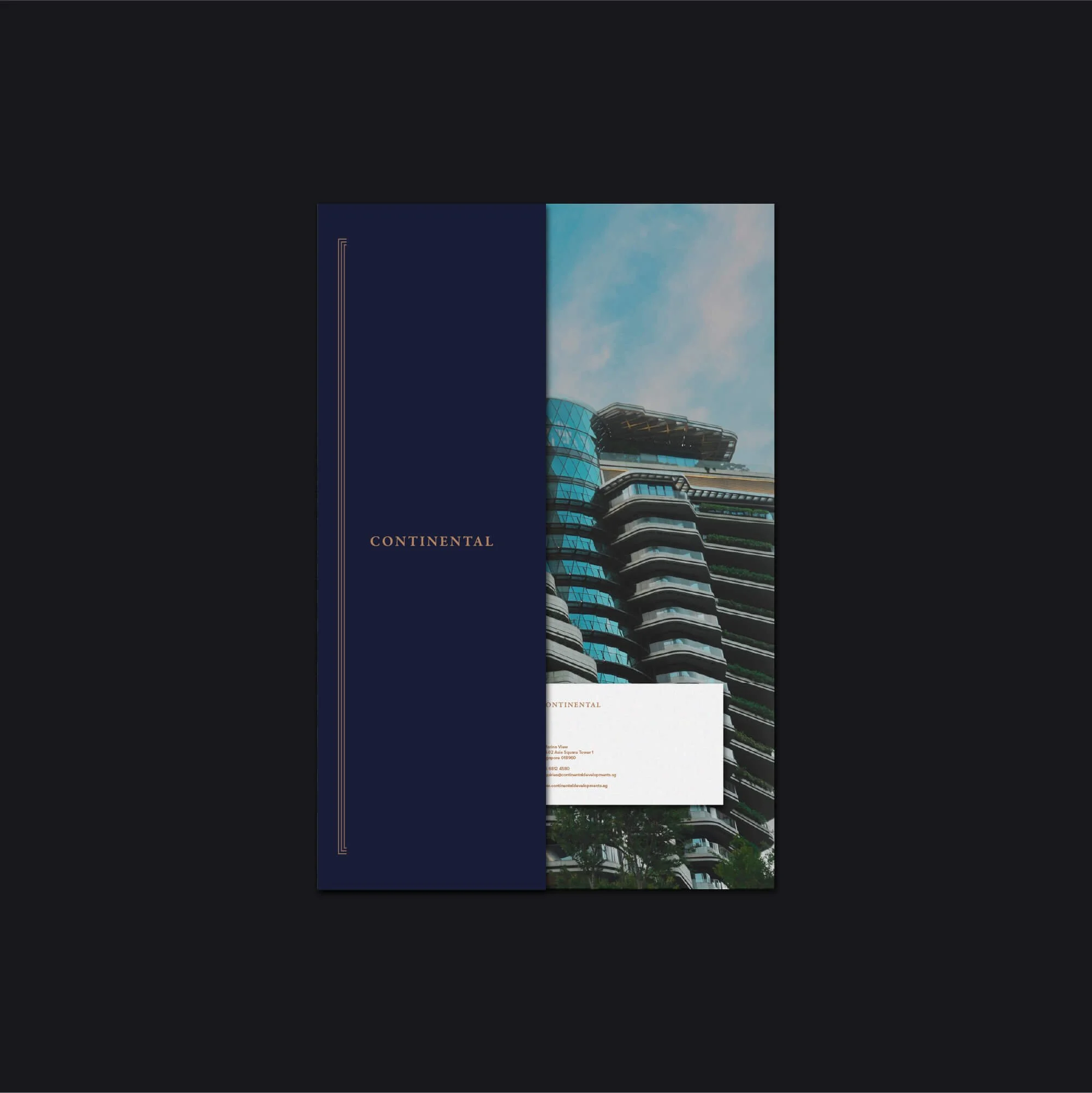
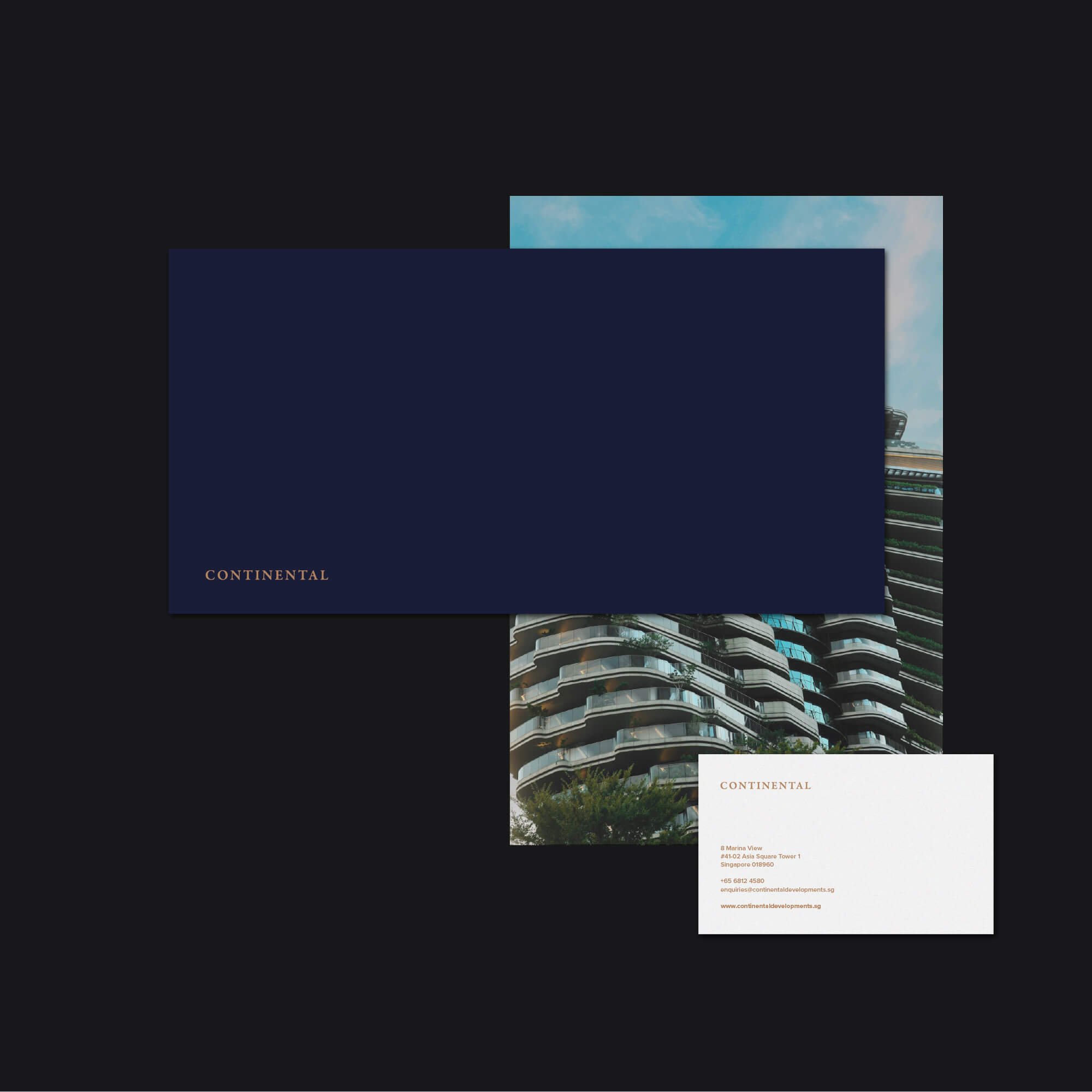
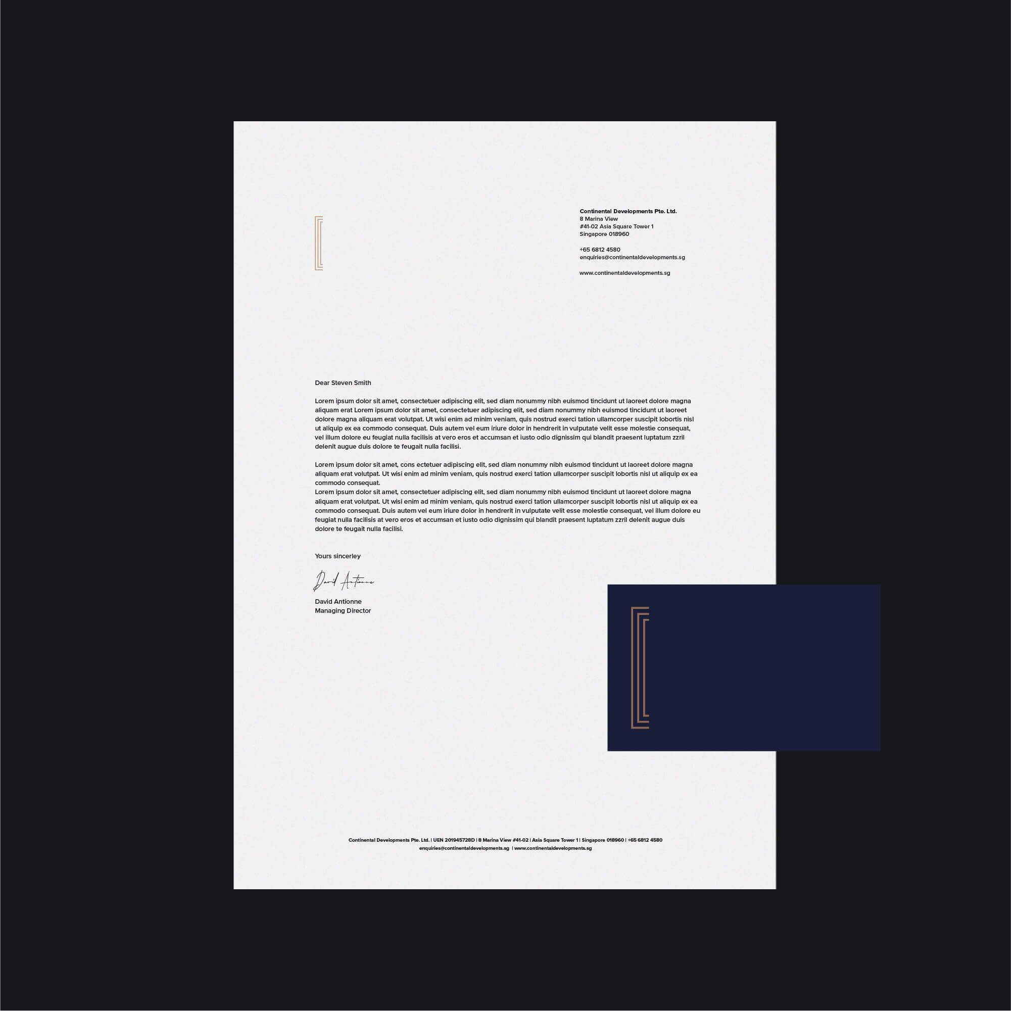
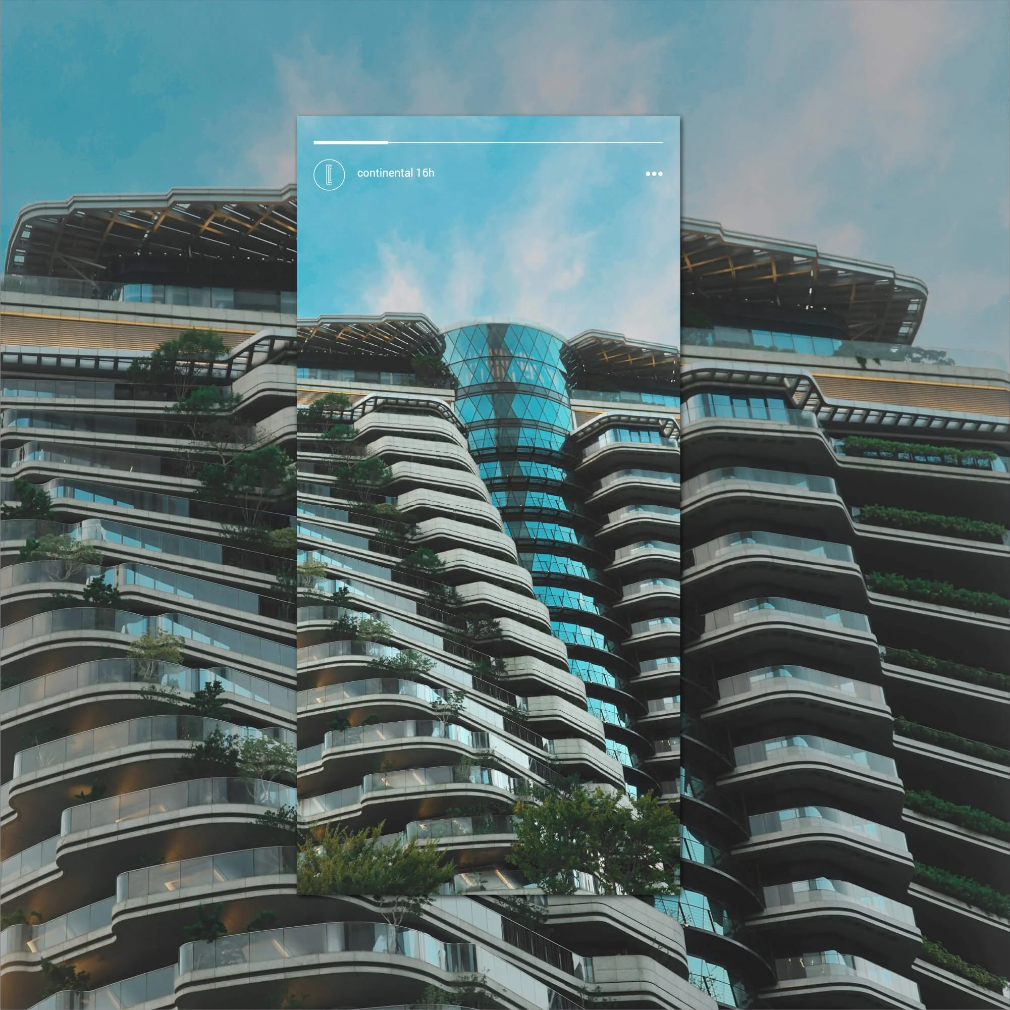
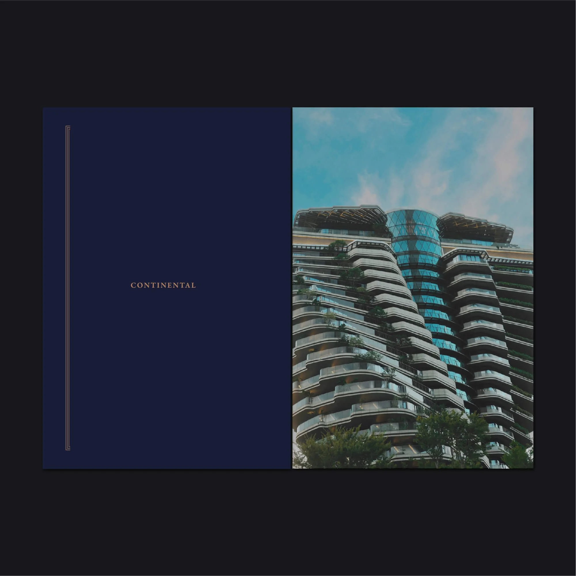
Brand Applications Across Property Development
The visual identity was designed to work across selected property development touchpoints, including stationery, printed materials, digital communications, investment documents, and development presentations.
Each application maintains a cohesive visual language, helping Continental present itself consistently across both physical and digital formats. The system supports a polished and professional brand presence suited to high-end real estate development.
Logo Design for Property Developers and Real Estate Brands
Logo design for property developers needs to balance architectural refinement, commercial credibility, and visual distinction. The identity has to communicate trust, quality, and professionalism while reflecting the value of the developments themselves.
For Continental, the final brand identity creates a premium visual system built around structure, sophistication, and long-term recognition within the property development sector.
Explore more logo design and brand identity projects to see how each identity is applied across different industries and brand contexts.
Have a Project in Mind?
For logo design, brand identity, or visual identity projects, get in touch to discuss your brief.